
Official websites use .gov
A .gov website belongs to an official government organization in the United States.
Secure .gov websites use HTTPS
A lock (
) or https:// means you’ve safely connected to the .gov website. Share sensitive information only on official, secure websites.

Topics
Data & Maps
Surveys & Programs
Resource Library
Survey News Volume 6, Issue 5
Survey News Volume 6, Issue 5
In This Issue:
- 2018 Police-Public Contact Survey
- National Teacher and Principal Survey – Teacher Incentives Experiment to Improve Overall Teacher Response Rates
- 2019 American Housing Survey Field Representative Training
- Quality or Quantity? The Impact of Reducing the Number of Contacts on Response in the National Survey of College Graduates
- 2018 Consumer Expenditure Quarterly Worksheet Test
- The American Community Survey’s Journey Into Data Visualization
- Nonemployer Establishments in Taxi and Limousine Service Grew by 45.9 Percent
- Postsecondary Enrollment Before, During and After the Great Recession
- Women’s Earnings by Occupation
- Recent Data Releases
2018 Police-Public Contact Survey
by Rebecca Rubiera, Survey Statistician, National Crime Victimization Survey
Data collection for the 2018 Police-Public Contact Survey (PPCS) began this July and will continue through December 2018. The PPCS is a supplement to the National Crime Victimization Survey (NCVS) and both are sponsored by the Bureau of Justice Statistics. The PPCS collects data on the nature and outcomes of respondents' interactions with police, and their perceptions of police behavior during these interactions. All respondents age 16 or older who complete the NCVS by self-interview are eligible for the PPCS.
The PPCS differentiates between police contacts that are voluntary for the respondent (such as when a respondent reports a crime or suspicious activity to the police), and contacts that are initiated by the police (such as when a respondent is pulled over by the police while driving). The survey collects basic information on all police contacts during the twelve-month reference period, and more detailed information about the respondent’s most recent police contact during the reference period. Depending on the contact type, this can include information about the demographic characteristics of the police officer(s), the reasons why a respondent was approached or stopped by the police, the outcome(s) of the police interaction, and whether or not the respondent filed a complaint against the police officer(s).
Significant changes were implemented in the 2018 PPCS instrument in order to improve flow, maximize data quality, and respond to feedback provided in the 2015 PPCS Field Representative debriefing questionnaire. The contact screener questions were reordered, and questions about the number of times a specific type of police contact took place, whether or not it was a face-to-face interaction, and whether or not it resulted in an arrest now immediately follow each screener question. After completing the screener questions, the respondent is asked a new verification question to confirm all of the screener information on police contacts is correct. If there are inaccuracies, subsequent questions allow the respondent to make corrections. Finally, revisions were made to streamline questions about the most recent police contact details, officer characteristics, and outcomes of contacts so that questions are no longer repeated in multiple sections of the questionnaire.
The PPCS underwent cognitive testing by the U.S. Census Bureau’s Center for Survey Measurement (CSM) to test the new and revised questions. CSM researchers completed an expert review of the PPCS content and later conducted four iterative rounds of cognitive pretesting. The purpose of the pretesting was to examine if respondents were reporting their police contacts in response to the appropriate screener question, and if they were being routed down the correct survey path based on the contact they identified as most recent.
We will share further results when they become available.
National Teacher and Principal Survey – Teacher Incentives Experiment to Improve Overall Teacher Response Rates
by Kayla Varela, Mathematical Statistician and Allison Zotti, Mathematical Statistician, Center for Adaptive Design
The National Teacher and Principal Survey (NTPS), sponsored by the National Center for Education Statistics (NCES), is a multi-level survey with four forms. The school and principal questionnaires, and the Teacher Listing Form (TLF) are all completed at the school level. Then, the teacher questionnaire is completed by sampled teachers. The 2017-18 school year is the second data collection cycle for public schools and the first for private schools. Because so much of the NTPS is conducted at the school level, it is functionally similar to an establishment survey. Almost all contacts take place during the day, including contacts to specific teachers for their individual questionnaires. At the start of data collection, an attempt to establish a Survey Coordinator (SC) at the school is made. The SC serves as the main point of contact, or gate keeper, throughout data collection and is typically the school principal or a staff member in the administrative office. When attempts to establish a SC are not successful, the principal is treated as the default SC. Teachers are sampled from the TLF, which is completed at the school level, so multiple stages of response may happen simultaneously, with the teacher data collection happening at a lag.
For the 2017-18 data collection cycle, NCES expressed interest in utilizing incentives as a way to increase teacher response rates. The decision was made to implement a teacher incentive experiment to test the effectiveness of sending incentives on teacher response rates. To meet this request, the Center for Adaptive Design developed the design and implementation of the teacher incentives experiment that was being conducted during the 2017-18 NTPS data collection cycle.
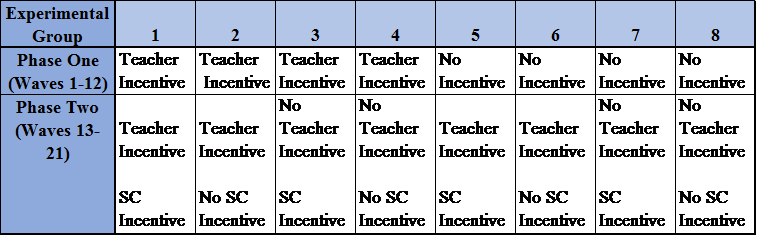
Table 1. NTPS Teacher Incentives Experiment - Final Experimental Design
Table 1, above, shows the breakdown of the eight experimental groups in the final design of the experiment. The teacher sample was selected on a flow basis as the TLFs are returned, resulting in 21 waves of teacher samples. The experiment was conducted in two phases. During Phase One, only teachers were eligible to receive incentives. During Phase Two, a combination of teachers and/or school coordinators/principals were eligible to receive incentives. Phase One of the teacher incentives experiment consisted of waves 1-12. Phase Two of the experiment started with wave 13 of the teacher sample. This was the first wave where teachers were eligible to be selected from a purchased vendor list if a TLF had not been returned for that school.
Given this complicated experimental design, our next challenge was figuring out how best to select the schools into the eight treatment groups. One of the challenges this experiment faced was having to select the schools and the teachers into groups before the data collection, not knowing whether the schools were going to return the TLF, or at what point the school would return the TLF.
It was necessary to prevent the random phenomenon of all schools returning the TLFs ending up in the same experimental group(s), while all schools not returning the TLFs ending up in other experimental group(s). This would result in all sampled teachers being in only a few of the experimental groups, as opposed to spread amongst the eight groups. In an attempt to combat this challenge, we developed two response propensity models and a time-to-event model predicting whether and when a school would return the TLF. The covariates selected for these models were then used to create a sort order for the schools prior to the experimental group selection. The outcome of one of the logistic regression models, the binary response variable of whether or not a school would return the TLF during data collection, was also used in the final sort order.
Within both public and private schools, no two incentive groups’ TLF response rates tested significantly different. Therefore, the modeling work was successful at distributing the likely TLF responding schools and the non-likely TLF responding schools evenly among the eight treatment groups for both public and private schools. Ultimately, this is what allows us to attribute the following results from Phase One of the teacher incentives experiment to the incentive itself, as opposed to poor randomization.
In Phase One of the teacher incentives experiment, all cases from experimental groups 1-4 received a non-contingent $5 cash incentive in their first mail-out. The remaining cases, cases in experimental groups 5-8, received no incentive. Preliminary results show that the $5 cash incentive was significant overall for increasing both public and private school teacher response rates. The $5 cash incentive significantly increased response rates for all but three public school teacher domains and for about half of the private school teacher domains. Additionally, for all public and private school teacher domains, there is no evidence of the incentive significantly decreasing response rates. Finally, for both public and private teachers, the group that received the incentive had a more representative respondent population, with respect to covariates related to survey characteristics of interest, than the group that did not receive the incentive following the second mail-out. Ultimately, the teacher incentive seemed to increase both response rates and representativeness in Phase One of the teacher incentives experiment.
2019 American Housing Survey Field Representative Training
by Denise Pepe, Assistant Survey Director, Housing Surveys Team
In the past, the American Housing Survey (AHS) training has conformed to the traditional methods of self-study and verbatim classroom training to train thousands of new Field Representatives (FRs) each survey year. In 2015, we implemented a virtual training that provided an innovative and interactive component to the pre-classroom studies that was well received by the FRs. This was a step in the right direction in improving the training, but we knew we could make more improvements. In reviewing the 2017 FR debriefing data and the training and field observation reports, it became apparent that the traditional style of training was not going to work anymore. In short, we learned that the FRs needed more AHS content, hands-on activities, scenario role play, and more information on the importance of the survey, the data, and the FR role. From these data, we compiled a comprehensive list for improving training and the survey as a whole.
As it turns out, the FRs’ and observers’ suggestions for improvement coincide with a key principal of adult learning. For example, consider the following suggestions 1) the scenario driven role play, and 2) more hands on activities. Both concur with the U.S. Department of Education’s Teaching Excellence in Adult Literacy’s (TEAL) idea that adults learn best when they perform or do an activity rather than reading about it or listening to a lecture. We also discovered that adults have preferred learning styles which can include visual, auditory, kinesthetic, verbal, logical, social, and solitary learning styles. In order to meet the needs of different learning styles, we concluded that we needed to add a variety of presentation methods to have a truly effective training.
In October 2017, we began documenting ways to improve the AHS training package, developing a training outline and drafting a rigorous schedule to have all training materials finalized by the end of December 2018 to begin the classroom training in March 2019. This allows time to conduct newly developed train-the-trainer sessions. The purpose of train-the-trainer is to fully prepare the trainers, many of whom are new, for the classroom and to provide an opportunity for them to ask questions before entering the classroom. The train-the-trainer sessions are critical to the success of the new training package since we have many new interactive lessons with less verbatim instruction. Headquarters staff will train the Regional Office (RO) staff who will in turn train the field supervisors. During the train-the-trainer sessions, we will provide some educational tips on training adults and walk through all of the revamped training materials.
The pre-classroom activities have been revisited and revised to provide a strong AHS background that will prepare the FR for the classroom material. For assessment purposes, the FRs will take a test on the self-study and virtual training material on the Commerce Learning Center (CLC) which will be monitored by the ROs. Both tests require a passing grade of 80 percent and can be taken as many times as needed to pass. The ROs will have the authority to allow or not allow FRs to attend the classroom training based on the completion results.
The classroom training, by far, will have the most revisions and innovations. Since the AHS is conducted every other year, most of our FRs are completely new to the Census Bureau. These new FRs will attend one day of generic training (which is also being revised in the Field Division) and then three days of AHS specific training, which was extended by one day from previous years. We established concrete learning objectives for skills and concepts the FRs will obtain each day of the training. We are budgeting for two trainers and one experienced FR in every classroom training. This will allow the trainers to keep the FRs on task with minimum interruptions and will enhance real life AHS situational discussions. Highlights of the new interactive training include: partner and group work, role play and practice with intro speeches, FAQs and disgruntled respondents, instrument practice with the three types of completed interviews, the three types of noninterviews, AHS specific videos that demonstrate real life scenarios and best practices, hands-on experience with the AHS table creator, instructional games, and exercises.
For the post classroom training, we are planning more instrument practice and a final exam that will cover all of the training concepts from the pre-classroom and classroom training. Like the pre-classroom tests, the FRs will take the test on the CLC and will need to pass the test with 80-percent or above. There will be no limits for the attempts to pass and the ROs will monitor the progress.
Other materials such as the FR manual and Information Booklet are also being updated. The FR manual will be revised to become an electronic consolidated reference that contains everything needed to know about the AHS. We reorganized our Information Booklet to make it more user friendly. It is a compact hand-carried reference containing both FR and respondent references. We are also providing FRs with materials such as the AHS fact sheets, Infographics, and data wheels to leave with the respondent.
We currently are working on all of the materials in close collaboration with the RO staff. We had a very successful in-person 1 ½ day working meeting with the RO staff at Headquarters at the beginning of May from which we developed finalized plans for many of our training materials. The ROs bring a different perspective to the planning table because they have experienced the field work first hand. We are planning at least two more working meetings to review and finalize materials. We have a few hurdles to overcome such as the rigorous schedule, conducting train-the-trainer for the first time, and ensuring all training sites have Internet access and the proper technology. Despite these challenges, we are excited about the new training package and expect that the FRs will greatly benefit from the new material and classroom experience.
Quality or Quantity? The Impact of Reducing the Number of Contacts on Response in the National Survey of College Graduates
by Rachel Horwitz, Lead Scientist, Demographic Statistical Methods Division
In 2017, the National Survey of College Graduates (NSCG) tested changes to their respondent contact strategy in an attempt reduce costs and respondent burden while maintaining response rates, sample representativeness, and key estimates. The experiment tested three treatments in a fully factorial design: a new mailing strategy, the inclusion of an infographic, and a limit on the computer-assisted telephone interview (CATI) calls. The new mailing strategy reduced the number of mailings, used different types of mailings (i.e., perforated letters, tabbed postcards), and included letters with less text that were designed to attract readers to key information and inform them of how their data are used. Additionally, email reminders were sent immediately following a mail contact instead of as stand-alone reminders. The infographic was also intended to inform sample cases of how their data are used as well as the importance of their response. Respondents from previous NSCG cycles received the infographic several months before the 2017 survey as a thank you for participating, while everyone else received it in the first mailing with the invitation letter. The final treatment limited CATI to 10 calls. A 2015 analysis showed that calls were rarely productive after this threshold.
Results suggested that the most successful combination of treatments in terms of response and sample representativeness was the new mailing materials, no infographic, and no call limit. Relative to the control, this strategy resulted in a nominally higher response rate of approximately one percentage point for new sample cases and three percentage points for returning cases. Additionally, this strategy reduced the overall number of mail contacts, which saves money from mailouts and reduced effort for the National Processing Center.
We also found that a call limit of 10 could save almost $8 per sample case compared to no call limit. However, response rates were nominally lower for both cohorts and there was one statistically different key estimate. Instead of an across-the-board limit, it may be more productive to set limits for different CATI outcomes, such as fax machines, busy signals, and ring no answers. This strategy would still save money by reducing the number of calls, but with less risk of missing a productive contact.
This research suggests that we can successfully reduce respondent burden and cost by limiting the number of contacts sample cases receive if the contacts are more unique and compelling. The most successful mailings in generating response were the perforated envelope, the large, non-standard sized envelope, and emails that directly followed postal mailings. Additional research can look into the best point in data collection to use these contacts (early versus late) as well as target language in the letters to target specific groups.
2018 Consumer Expenditure Quarterly Worksheet Test
by John Gloster, Assistant Survey Director, Richard Schwartz, Assistant Survey Director, and Patricia Holley, Survey Statistician, Consumer Expenditure Surveys Team
The Consumer Expenditure Quarterly Interview Survey (CEQ) collects detailed expenditure data from households in surveys conducted in four consecutive quarters. This allows us to collect a year’s worth of expenditure data from each sample household. The survey averages a little over an hour in length. Unlike some surveys where most questions can be answered with relative ease by the respondent, the CEQ attempts to collect very specific information on the purchases made in the last three months by responding households. For example, CEQ asks about utility costs for a three-month period: e.g. how much was your electric bill last month, the month before that, and the month before that. These are difficult questions to answer accurately without referring to utility bills, a check book register, bank statement or some other type of record.
In our advance letters we encourage households to prepare for the interview by collecting pertinent records. Our Field Representatives (FRs) also remind the household respondent on the need for records in preparation for the next quarter’s interview. The FRs provide the household a “home file” to store their records between interviews. Despite these efforts, respondents forget and are not as prepared for the interview as they could be. This can increase the length of the interview, increase costs, and affect data quality.
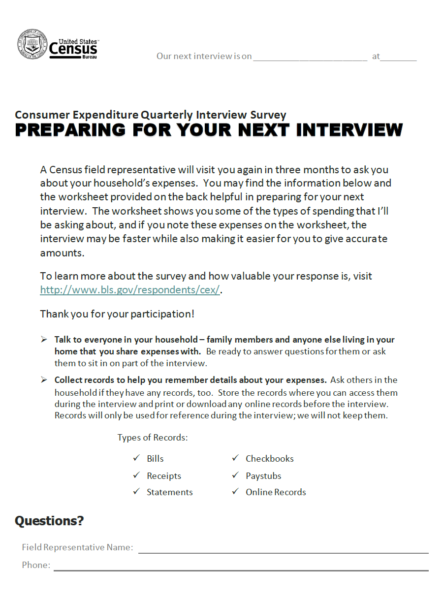
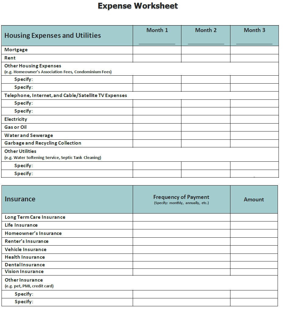
This summer we will be testing the use of an expense worksheet entitled “PREPARING FOR YOUR NEXT INTERVIEW.” The front page of the worksheet provides the respondents with a reminder of the types of information they should have available at the time of the interview. The back page provides the respondents with a worksheet they can use to record monthly expenditures for specific household expenses including mortgage/rent, utilities, and insurance.
We will conduct this test in the third quarter of 2018 (July-September) with households who will be participating in the CEQ for the third time. We will select 600 households (200 per month) who will be eligible to receive this worksheet at the discretion of the FR.
At the conclusion of the interview, the FR will be asked whether he or she wants to offer the respondent the worksheet. The FR will have full discretion on whether or not to offer the respondent the worksheet. If the FR decides not to offer the worksheet, the computer assisted personal-interviewing (CAPI) instrument will capture the reason for this decision.
If the FR decides to offer the respondent the worksheet, the CAPI instrument will prompt the FR to inform the respondent that they have a worksheet that may be useful in preparing for the fourth interview. If the respondent accepts the offer of the worksheet, the FR will record acceptance as a “Yes” in the CAPI instrument and will provide the worksheet to the respondent. If the respondent does not want the worksheet, the FR will record “No” in the CAPI instrument and will be prompted to ask the respondent why he or she does not want the worksheet.
Three months later the FR will return to the household to conduct the fourth and final interview. At this time, the FR will ask the respondent if he or she used the worksheet. If the respondent reports not using the worksheet, the FR will ask why it was not used. If the respondent reports using the worksheet, the FR will ask a series of follow up questions designed to determine the usefulness of the worksheet. The FR will not collect the worksheet.
The results from this test will be sent to Bureau of Labor Statistics (BLS) staff who in turn will analyze the results. BLS staff will document these results in a final report.
Another project the Consumer Expenditure Surveys Team is working on is the Consumer Expenditure Diary- Business Process Modeling. From March 26 – March 28, staff from the Consumer Expenditure Diary (CED) Team within CESB attended a workshop at the National Processing Center (NPC) to develop a detailed process model of data handling procedures. Facilitated by staff from the Office of Risk Management and Program Evaluation (ORMPE), the goal of the workshop was to document all aspects of forms and data handling at NPC for the CED Survey. The ORMPE staff used Visio software to generate a detailed and extensive flow diagram to capture all processes related to CED data capture from the time monthly input files are sent from Census HQ, to the time physical expenditure diaries are scanned and stored on pallets at NPC. The experience of fleshing out the data handling process from start to finish was a beneficial process for both the Demographic Directorate and NPC. Both areas were better informed about the purviews and responsibilities of other participating branches involved in the CED data handling process, including the required inputs and resulting outputs from various activities. Formulating the activity model also highlighted key areas where particular sub-processes could be made more efficient.
Finally, the Receipts Capture Project for the Consumer Expenditure Diary (CED) Survey asks respondents to fill out two one-week diary forms with all of their daily expenses. These physical diaries are then shipped to NPC, by way of the Regional Offices (ROs), where the data in the paper diaries is captured and coded. For a minimum of 20 years, our survey has allowed FRs to informally collect receipts from respondents and transcribe them into the diary forms. This likely started out as an occasional practice, but it has become more frequent over time. In 2016, roughly 15 percent of completed diaries were completed with receipts in some manner. Statistics Canada has been formally collecting diary receipts for their Survey of Household Spending for years. Therefore, this spring the CED Survey implemented a new team to explore the different options and effects of receipt collection for our survey.
The Receipts Capture Project is managed by a joint Census and Bureau of Labor Statistics (BLS) team aimed at exploring the different options of formalizing receipt collection in the CED survey and recommending the best method for implementing receipts collection and capture. The team is currently exploring both new technologies that can be used such as receipts scanning hardware and software, as well as current technology used by the Census, such as the CAPI instrument. The team is also exploring different avenues during the current diary collection and capturing process where receipts collection could be implemented, whether this would be performed by FRs, ROs, or the NPC. This project is a two-year long exploratory project that will have its official recommendation by the end of 2019.
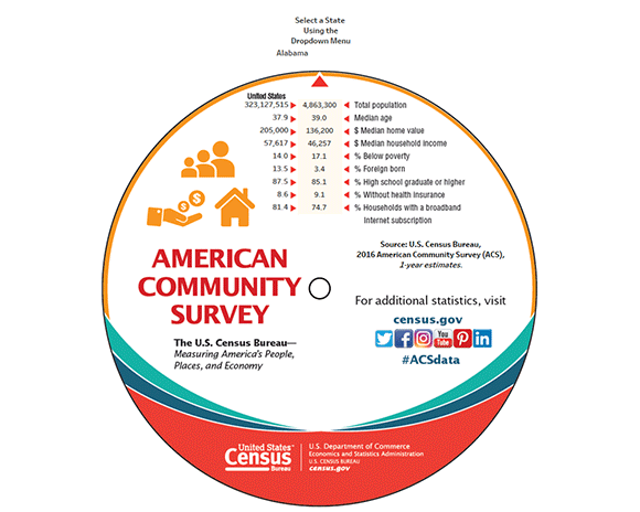
The American Community Survey’s Journey Into Data Visualization
by R. Chase Sawyer, American Community Survey Office
The U.S. Census Bureau’s American Community Survey (ACS) provides billions of statistics every year for states, counties and places across the United States. One of the Census Bureau’s most popular data-related items has been the ACS data wheel, which provides basic statistics for each state. People love picking it up and spinning to find their state to see how it stacks up.
Last year, we decided to go one step further and create an online, interactive data wheel highlighting 2016 ACS one-year data. This visualization allows data users to explore online key information about any state with a simple click instead of a spin of the paper data wheel.
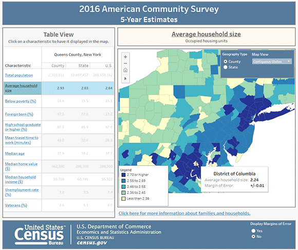
We then took the data from the wheel and put it in map form with the ACS Interactive Data Map. It illustrates 2016 data to let the public see how topics such as median age and median home value vary by state.
Along with our one-year release, which provides data for larger geographic areas, we also release data each year for all geographic area using five years’ worth of data. For county-level statistics, the ACS State and County Dashboard uses our five-year 2012-2016 data to let users view data at smaller geographic levels.
We are working on more data visualizations that show off other sources of information compiled by the Census Bureau from the ACS. To keep up-to-date with the newest visualizations available, sign up to receive emails about new releases and be sure to check out the data visualization library. This is where the most up-to-date and relevant data visualizations from the Census Bureau are available.
Nonemployer Establishments in Taxi and Limousine Service Grew by 45.9 Percent: June Data Release
Nonemployer establishments, which are establishments without paid employees, in the Transportation and Warehousing sector (North American Industry Classification System (NAICS 48-49) increased by 22.0 percent from 1,528,264 in 2015 to 1,864,990 in 2016, according to U.S. Census Bureau statistics released June 21, 2018. This sector also had the largest percentage increase in receipts, 3.7 percent, from $83.9 billion in 2015 to $87.0 billion in 2016.
The Transit and Ground Passenger Transportation subsector (NAICS 485) led the growth with an increase of 291,243 establishments, an increase of 50.4 percent. This subsector also grew by the most nonemployer establishments among all three-digit NAICS across all sectors. Examples of the Transit and Ground Passenger Transportation subsector include taxi and limousine services, chartered bus, school bus and special needs transportation. Specifically, the industry Taxi and Limousine Service (NAICS 4853), which includes ridesharing services, grew by 45.9 percent, an increase of 220,261 establishments. The top three states with the highest growth in nonemployer establishments in this industry are California (adding 38,928 or 43.7 percent), Florida (adding 21,858 or 72.3 percent), and New York (adding 17,378 19.7 percent).
Nationally, nonemployer establishments increased 2.0 percent from 24,331,403 in 2015 to 24,813,048 in 2016. Receipts increased 1.5 percent from $1.15 trillion in 2015 to $1.17 trillion in 2016.
Other highlights include:
- Nevada, the District of Columbia and Utah led all states in the rate of increase in the number of nonemployer establishments between 2015 and 2016. Nevada rose 7.2 percent (adding 14,806), the District of Columbia increased 5.4 percent (adding 3,039), and Utah saw a 4.2 percent increase (adding 9,103). Receipts increased the most in Delaware up 6.9 percent or $254 million in 2016.
- Among the 50 counties with the most nonemployer establishments, Clark County, Nevada, led the Transit and Ground Passenger Transportation industry (NAICS 485) in annual growth in the number of nonemployer establishments increasing 187.7 percent in 2016.
- Among the top 50 U.S. Counties with the most nonemployers, four of the top ten for nonemployer establishment growth were in Texas:
- Collin County, Texas (whose largest city is Plano), with a growth of 5.1 percent and an increase of 4,373 nonemployer establishments.
- Tarrant County, Texas (whose largest city is Fort Worth), with a growth of 4.4 percent and an increase of 7,224 nonemployer establishments.
- Bexar County, Texas (whose largest city is San Antonio), with a growth of 4.2 percent and an increase of 5,524 nonemployer establishments.
- Dallas County, Texas (whose largest city is Dallas), with a growth of 3.9 percent and an increase of 8,866 nonemployer establishments.
- In these four Texas counties, the Transit and Ground Passenger Transportation sector (NAICS 485) drove the increase between 2015 and 2016.
- The number of nonemployer establishments with receipts $5 million or more decreased from 355 in 2015 to 316 in 2016. Over 70 percent of those earning $5 million or more were in the Finance and Insurance sector (NAICS 52) in 2016.
These data are all part of Nonemployer Statistics: 2016, which publishes statistics on nonemployer businesses in over 450 industries at varying levels of geography, including national, state, county, metropolitan statistical area and combined statistical area. The data are also presented by Legal Form of Organization, and by Receipt Size Class.
A nonemployer business is defined as one that has no paid employees, has annual business receipts of $1,000 or more ($1 or more in the construction industries), and is subject to federal income taxes. Most nonemployers are self-employed individuals operating very small unincorporated businesses, which may or may not be the owner’s principal source of income. Nonemployer statistics originate from Internal Revenue Service tax return information. The data are subject to nonsampling error, such as errors of self-classification by industry on tax forms, as well as errors of response, nonreporting and coverage. Receipts totals are slightly modified to protect confidentiality. All dollar values are expressed in current dollars, i.e., they are not adjusted for price changes. Further information about methodology and data limitations is available here.
Postsecondary Enrollment Before, During and After the Great Recession
by Erik P. Schmidt, Survey Statistician, Education and Social Stratification Branch, Social, Economic, and Housing Statistics Division
The Great Recession of 2007 to 2009 influenced significant changes in American postsecondary education, according to a new report by the U.S. Census Bureau.
The number of students enrolled in college in the United States increased from 2.4 million in 1955 to 19.1 million in 2015. From 2006 to 2011, total college enrollment grew by 3 million, contributing to the overall growth of postsecondary enrollment during the Great Recession period.
The Postsecondary Enrollment Before, During and Since the Great Recession report found that the enrollment boom created many changes that are still evident today.
- The recession saw a 33 percent increase in enrollment in two-year colleges from 2006 to 2011. In 2010, 29 percent of all students enrolled were in two-year colleges. By 2015, this share had fallen to 25 percent, below the prerecession average level of 26 percent. However, the number of students enrolled in two-year colleges was still 10 percent above the level in 2006.
- Compared to the prerecession period (2000 to 2007), male undergraduate enrollment was 18 percent higher postrecession (2012 to 2015). Female enrollment also grew, but only by 14 percent.
- Hispanic college enrollment experienced growth through the recession and beyond. The number of Hispanics enrolled in college increased by 1.5 million — an approximate doubling (184.0 percent) of the prerecession level. Before the recession, 13.2 percent of Hispanics ages 15 to 34 enrolled in undergraduate college, while 20.2 percent of Hispanics enrolled in college after the recession.
Overall enrollment levels fell after the recession from 19.8 million (2008 to 2011 recession period average), to 19.4 million (2012 to 2015 postrecession period average). Part of this was the result of students who had returned to college after being in the labor market or otherwise out of school. The number of college students in this category grew by 30 percent from 2006 to 2010, but by 2015, it had returned to a level that was not significantly different from the level of 2006.
School enrollment estimates come from the School Enrollment Supplement to the Current Population Survey, which is administered in October, and includes 20 questions on school enrollment and recent degree completion. The Current Population Survey has collected data on school enrollment since 1945.
Women's Earnings by Occupation
by Lynda Laughlin, Chief, Industry and Occupation Statistics Branch, Social, Economic, and Housing Statistics Division
In 2016, median earnings for women was $40,675 compared with $50,741 for men. While the female-to-male earnings ratio has narrowed over the last 50 years, women continue to earn less than men in nearly all occupations. The earnings disparity between men and women is present in occupations that predominantly employ men, and in occupations with a similar mix of men and women. Women are also more likely to be employed in lower-paying occupations.
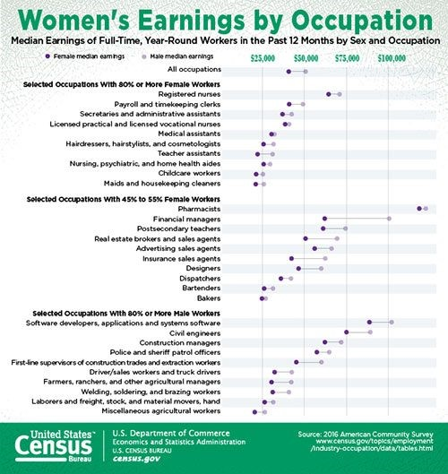
The data highlighted above comes from a recently released detailed table available from the American Community Survey and offers a good starting point for those interested in understanding women’s and men’s paid work for more than 300 occupations.
Using this table, we can easily explore which occupations have small or large wage gaps, as well as the occupations in which women earn the most. For example, many occupations in finance and sales had a larger wage gap between men and women. Among the highest-paying occupations for women were several health occupations, such as physicians and surgeons, nurse anesthetists, and dentists. Pharmacy has among the lowest earnings gap between men and women. Full-time, year-round female pharmacists earned 97 cents for every dollar male pharmacists earned.
As women’s labor force participation and educational attainment levels have increased, they have been employed in a broader range of occupations. This has contributed to a reduction in the wage gap over time and to the economic well-being of women and their families. We encourage you to check out the earnings in your occupation and access other resources from the Census Bureau. Additional information can be found at https://www.census.gov/data/tables/time-series/demo/industry-occupation/median-earnings.html.
Recent Data Releases
June 2018 Releases
Census Bureau Announces New 2017 Annual Business Survey- The Annual Business Survey (ABS) is a new joint project between the U.S. Census Bureau and the National Science Foundation’s National Center for Science and Engineering Statistics. The ABS is a new survey that replaces three existing surveys: the five-year Survey of Business Owners (SBO) for employer businesses, the Annual Survey of Entrepreneurs (ASE), and the Business Research and Development and Innovation Survey for Microbusinesses (BRDI-M), and includes a new innovation content module https://www.census.gov/newsroom/press-releases/2018/annual-business-survey.html (June 19).
2017 Economic Census Deadline Extended- The U.S. Census Bureau has granted a one-week extension for the 2017 Economic Census due to high call volumes and long wait times. The economic census response due date of June 12, has been extended to June 19, 2018 https://www.census.gov/newsroom/press-releases/2018/economic-extended.html (June 14).
2017 Economic Census Deadline Approaches- The 2017 Economic Census is currently collecting data for approximately 3.7 million business locations. With the June 12 deadline approaching, U.S. businesses nationwide, including those in U.S. territories, are asked to report their 2017 year-end numbers for each business location, including sales or revenue, employment, payroll and industry-specific information https://www.census.gov/newsroom/press-releases/2018/econ-deadline.html (June 5).
May 2018 Releases
Census Bureau Reveals Fastest-Growing Large Cities- Eight of the 15 cities or towns with the largest population gains were located in the South in 2017, with three of the top five in Texas, according to new population estimates released today by the U.S. Census Bureau. https://www.census.gov/newsroom/press-releases/2018/estimates-cities.html (May 24).
Page Last Revised - December 16, 2021
✕
Is this page helpful?
 Yes
Yes
 No
No
 Yes
Yes
 No
No✕
NO THANKS
255 characters maximum
 255 characters maximum reached
✕
Thank you for your feedback.
Comments or suggestions?

Comments or suggestions?