
Official websites use .gov
A .gov website belongs to an official government organization in the United States.
Secure .gov websites use HTTPS
A lock (
) or https:// means you’ve safely connected to the .gov website. Share sensitive information only on official, secure websites.

Topics
Data & Maps
Surveys & Programs
Resource Library
Survey News Volume 6, Issue 2
Survey News Volume 6, Issue 2

In This Issue:
- Planned Implementation of the CE Large-Scale Feasibility Test
- The Eating and Health Module to the American Time Use Survey
- National Survey of College Graduates – Usability Testing on Mobile Devices
- Spanish Translation Process for the Redesigned Questionnaire in the National Health Interview Survey
- Uncovering Trends in Income and Poverty Using Model-Based Estimates
- Understanding the Relationship Between Individual Earnings and Household Income
- Parents Burning the Midnight (and Weekend) Oil
- Examining the Effect of Off-Campus College Students on Poverty Rates
- Recent Data Releases
In 2009, the Bureau of Labor Statistics (BLS) Consumer Expenditure Survey (CE) initiated the multi-year Gemini Project for the purpose of researching, developing, and implementing an improved survey design. The objective of the redesign is to improve the quality of the survey estimates through a verifiable reduction in measurement error. The data collection for a large-scale, nationally representative feasibility test (Large-Scale Feasibility Test or LSF) will commence in 2019. This test will incorporate all decisions and research findings from prior Gemini Redesign Field Tests to create modified data collection instruments, materials, and procedures for conducting a full “dress rehearsal” test. The goal of the LSF is to ensure that all the methodological components work as intended, both individually and together, to collect high quality expenditure data from a sufficient number of respondents.
The Gemini Redesign Plan for CE involves two waves of data collection scheduled 12 months apart. Each wave contains the same interview structure consisting of two personal visits and a 1-week expenditure diary for each eligible household member. Visit 1 is an in-person interview made up of two parts. The first part identifies the roster of the household, while the second is a recall interview that collects large, easily recalled household expenditures. Additionally, Visit 1 incorporates instructions to collect relevant expenditure records for the Visit 2, records-based interview, as well as training for and placement of the personal diaries (available via paper or online through a PC, smartphone or other mobile device). Following Visit 1, the diary is maintained for one week by all household members 15 years old and older during this recording period. Visit 2 is an in-person, records-based expenditure interview on household expenditures, income and assets that can reasonably be found in records such as receipts, utility bills, and bank statements. The target number of completed interviews is 2000 for one wave of data collection – with a “complete interview” defined as a completed Visit 1 interview, at least one completed Diary in the Consumer Unit, and a completed Visit 2 interview. Exhibit 1 below provides an overview of the original redesign plan.
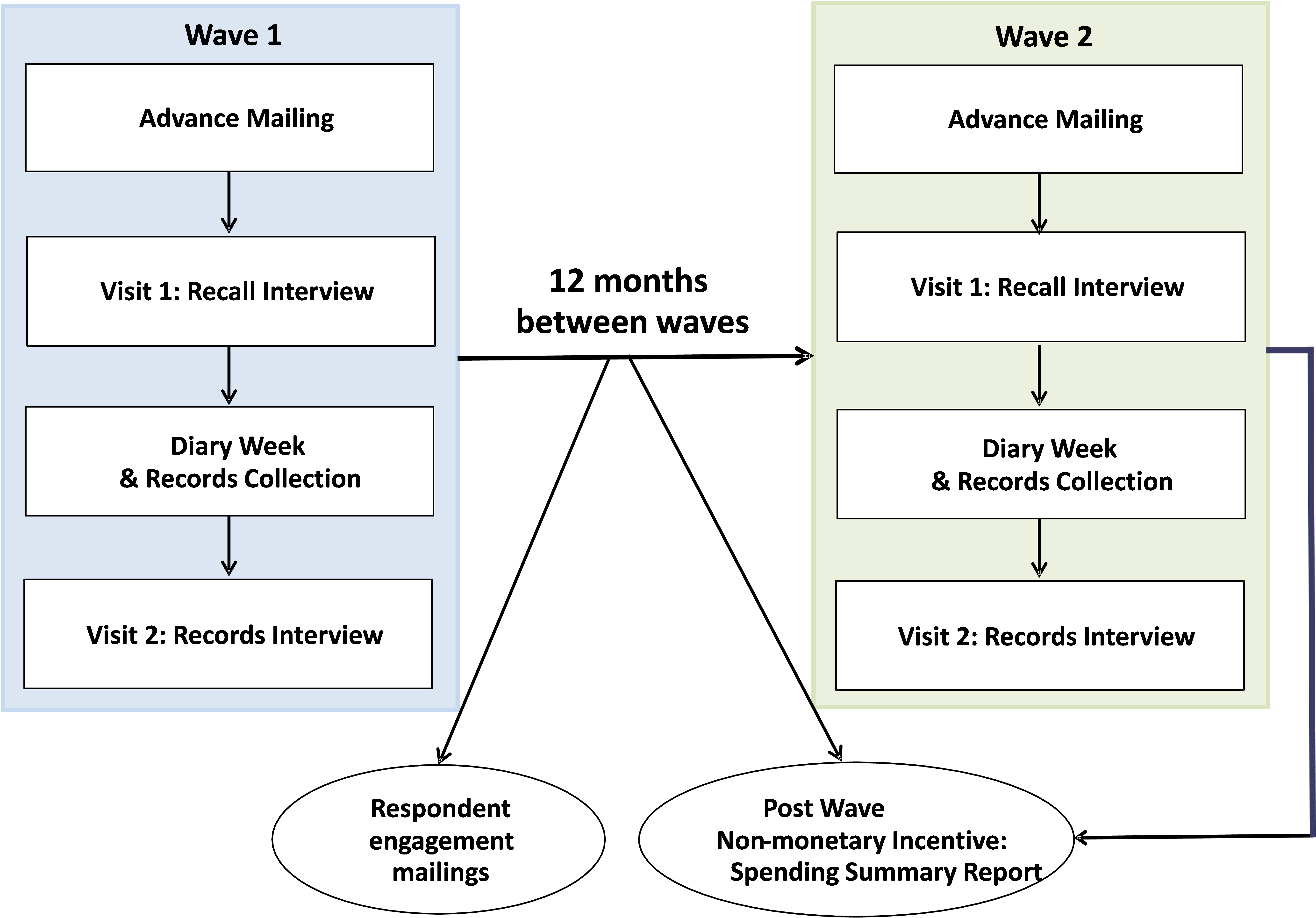
The incentive structure for the LSF includes a $5 prepaid cash incentive per household sent with the advance letter, a $40 household incentive (debit card) provided to the respondent after Visit 1, a $20 individual incentive (debit card) for each member who completes the diary, and a $40 household incentive (debit card) provided to the respondent after Visit 2. An additional incentive of $20 is provided to the household if they used at least one record in Visit 2. Households will also be provided with a non-monetary incentive of a Spending Summary Report that summarizes the spending their household reported in the survey compared to the spending of similar households.
The Eating and Health Module to the American Time Use Survey
by Beth Capps, Assistant Survey Director, American Time Use Survey
Examining the eating patterns of the U.S. population is a key factor in better understanding the determinants of the nutrition and health status of Americans. An analysis of the time that Americans spend in various activities, and in particular, food-related activity, may provide some insight into why nutrition and health outcomes vary over time and across different segments of the population. Such insights could help improve programs and policies targeted at reducing obesity and improving overall nutrition.
The Eating and Health (EH) Module was fielded with the American Time Use Survey (ATUS) from 2006 to 2009 and again from 2014 to 2016. The ATUS is a nationally representative, annual survey that started in January 2003. The Eating and Health Module is sponsored by the U.S. Department of Agriculture’s Economic Research Service (ERS) and the National Institutes of Health’s National Cancer Institute.
The EH Module consists of questions designed to examine relationships between time use; purchasing, preparing, consuming food, and obesity. It contains questions on secondary eating habits (eating while doing other activities such as driving or watching TV); soft drink consumption; fast food purchases; respondent’s height, weight and general health; his/her household’s participation in the Food Stamp Program; grocery shopping and meal preparation; and household income. Data were collected for all ATUS respondents and represents individuals 15 years of age and older.
Some interesting findings from the EH Module are as follows:
- Comparing data from the 2014 survey (64 minutes) versus 2006-2008 (67 minutes), time spent in primary eating and drinking declined by an average of 3 minutes a day while secondary eating stayed about the same at 16 minutes.
- On average, in 2015, men spent more time engaged in primary eating and drinking than women (67 minutes for men compared to 62 minutes for women) and more women reported engaging in secondary eating (57.6%) than men (50.7%).
- In 2015, Participants in the Supplemental Nutrition Assistance Program (SNAP), WIC Program (Special Supplemental Nutrition Program for Women, Infants, and Children) participants, and those with household income less than 185 percent of the poverty threshold all spent more time preparing food and cleaning up, on an average day, than others.
- Low income persons, those with household incomes less than 185 percent of the poverty threshold, were less likely to grocery shop on an average day than others, 13.6% shopped for groceries on an average day in 2015, which is equivalent to grocery shopping every 7.4 days; whereas 14.2% of others grocery shopped on an average day, equivalent to shopping every 7.0 days. Those who reported being food insufficient reported the lowest grocery shopping rate, 11.9% on an average day, equivalent to grocery shopping every 8.4 days.
The final results of the 2016 collection cycle will be released by the end of 2017. The final results of the most recent 3 year collection cycle, combined with the prior cycle, will provide a wealth of information on the relationship between time use, eating and health. For more information, please visit the USDA-ERS website at //www.ers.usda.gov/data-products/eating-and-health-module-atus/
National Survey of College Graduates – Usability Testing on Mobile Devices
by Elizabeth Nichols, Center for Survey Measurement
The past decade has seen a steady shift of surveys moving from a paper-based questionnaire to an online survey mode. More recently, online surveys that were designed to display optimally on PCs are being redesigned so that they also display optimally on smaller devices such as tablets and smartphones. Back in 2009, the National Survey of College Graduates (NSCG) was an early adopter of online reporting because the targeted respondents (college graduates) were more likely to use the internet. The NSCG, sponsored by the National Center for Science and Engineering Statistics at the National Science Foundation, provides data on the number and characteristics of individuals with a bachelor's or higher degree. Because the NSCG was one of the first surveys to offer an online data collection mode, it was one of the first to go through usability testing.
Usability testing is a method used to evaluate interactions between users and a product. During testing, potential users attempt to accomplish tasks using the product. Any difficulties users have with the product can then be identified prior to the official release of the product. In the Census Bureau’s usability lab, the most recent testing of the NSCG included users completing the survey on their mobile phone. The NSCG was redesigned so that it would display correctly whether it was accessed on a PC or on a mobile device. We worked with the usability lab to make sure the design decisions for mobile devices were in fact optimal.
Designing a survey for smaller mobile devices can be challenging. There is simply less screen real estate to work with than on a PC. The design of the survey needs to ensure that the same answer to a question would result no matter the device the respondent decides to use. One particularly challenging question design for smaller devices is the “grid” question. Grid response options use a row and column matrix design where there is typically one question stem above the matrix, each question item or topic is a label on a row, and the column headings have unique response options that do not vary across those question items. Grids help save space on paper forms because the same question stem and response options are used across items and the response option labels only have to be printed once. Grids also have the unique feature of easily allowing respondents to compare their answers across question items.
In the NSCG, for mode consistency, the same grid question format on paper (Figure 1) was used in the online response options as shown in Figure 2 for a PC and Figure 3 for a mobile phone.
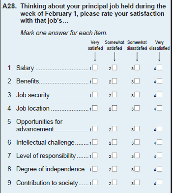
Figure 1: Question A28 from the 2017 NSCG paper form demonstrating a grid response design
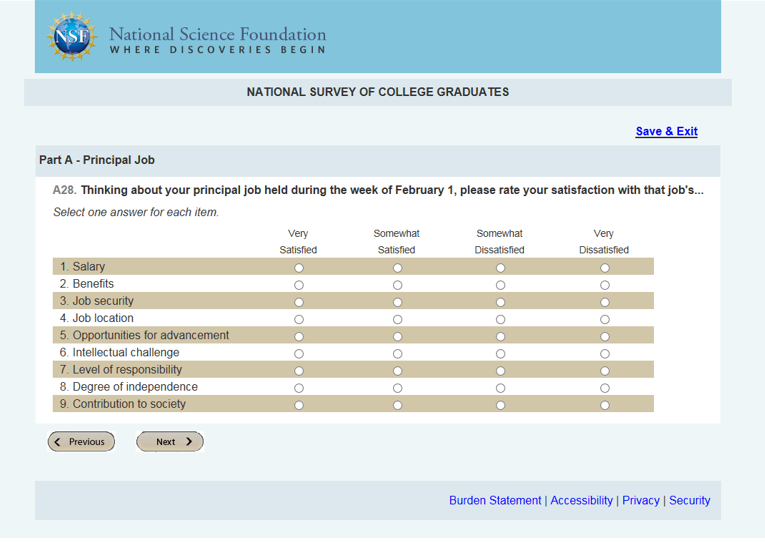
Figure 2: Question A28 from the 2017 NSCG PC optimized version for usability testing demonstrating a grid response option
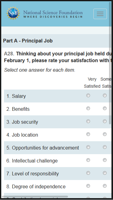
Figure 3: Question A28 from the first round of usability testing for the 2017 NSCG mobile optimized version - demonstrating a grid response option where the response option labels fall off the right side of the page.
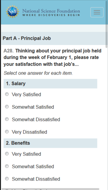
Figure 4: Question A28 from the 2017 NCSG mobile version in Round 2 of usability testing demonstrating an item-by-item design.
Other researchers have also documented the advantages of an item-by-item solution for grids on mobile (de Bruijne 2015; Borger and Funke 2015; McClain & Crawford, 2013; Lattery & Park Bartolone, 2013), and although we can’t tell how the change affects the distribution of responses, we can say that during usability testing, the item-by-item design elicited no negative comments and all users answered each sub-question with ease – which equals a user experience success story.
For more information about CSM’s usability support, please contact Paul Beatty, CSM Center Chief, at paul.c.beatty@census.gov.
Spanish Translation Process for the Redesigned Questionnaire in the National Health Interview Survey
by Anne T. Furnia, Survey Director, National Health Interview Survey
The National Health Interview Survey (NHIS), sponsored by the National Center for Health Statistics (NCHS), has undertaken a wholesale redesign of the survey questionnaire. The goal is to review all aspects of the questionnaire and include elements that improve the flow and shorten the interview length. The final, new questionnaire is scheduled to be in the field for data collection in all sample areas in January 2019. Part of the overhaul process included incorporating a new procedure for Spanish translation of the survey questions. We started the Spanish translation process early in order to avail ourselves of additional phases of review after the initial translation. Our first deliverable was ready for the translators in March 2017, which was about 15 months before our first field test of the instrument scheduled for June 2018. Subsequent to the first deliverable, three more deliverables are planned with the fourth and final deliverable being sent for translation in December 2017.
The Census Bureau’s NHIS Team devised an approach to ensure high-quality translations. Cynthia Guerrero who is a certified translator was a lead person in this effort for the NHIS Team. Our colleague at NCHS, Maria Villarroel, was also involved in every step of the process, and Mikelyn Meyers of the Census Bureau’s Center for Survey Measurement (CSM) managed the expert review phase. The approach consisted of a series of steps for each deliverable:
- translation services from certified translators under contract with Decennial Translation Office,
- expert review from three colleagues in the CSM with final proposed language,
- translation review by our Spanish-speaking field representatives (FRs) and focus groups to gather their feedback with comments incorporated by CSM
- a thorough review and final adjudication period between the Census Bureau’s NHIS Team, NCHS staff, and the CSM staff
Following the translation of the English text, the questionnaire specifications needed to be carefully updated and uploaded to our specifications application called SPIDER for programming. The process has been very successful and incorporating these many phases of translation and review has resulted in an improved translation of the NHIS questionnaire.
Uncovering Trends in Income and Poverty Using Model-Based Estimates
by Carolyn Gann, Social, Economic, and Housing Statistics Division
Each year, the U.S. Census Bureau’s Small Area Income and Poverty Estimates (SAIPE) program models estimates of income and poverty for small geographies. The program’s main goal is to provide the U.S. Department of Education with yearly estimates of children in poverty as the basis for allocating Title I funding to school districts. In order to estimate school district level poverty, the SAIPE model begins by estimating poverty at the state and county levels, which act as controls for smaller geographic poverty estimates. The SAIPE program achieves this through combining high-quality survey estimates from the Census Bureau’s American Community Survey (ACS) with administrative record data.
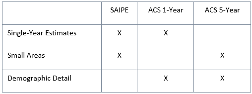
The ACS surveys over 3 million households each year and publishes income and poverty statistics with abundant demographic detail; however, due to the small sample sizes within many counties, the one-year tabulations of survey data cannot be released for all counties. Instead, ACS estimates for small areas are strengthened by combining the data over a five-year period and are published in the ACS five-year data product. SAIPE models one-year ACS data with timely administrative record data from the Internal Revenue Service, Social Security Administration, Bureau of Economic Analysis, and Supplemental Nutrition Assistance Program, which increases precision and stability of the estimates for small areas, allowing the SAIPE program to release single-year estimates for all states, counties, and school districts annually. This is especially useful during periods of rapid economic change where multiyear estimates might miss, delay, or underestimate short-term impact. The ACS one-year, five-year and SAIPE estimates complement each other, and all provide quality data catered to different analytical needs.
When choosing a data product for analysis, it is important to consider population size of the geographic area, demographic detail required and timeliness of the data. SAIPE estimates are best used when timeliness and small population sizes are the focus of a study. The ACS provides timely, detailed demographic data in the one-year product and detailed demographic data over a five-year period for small areas in the five-year product. The table below provides a quick summary of when to use certain data products (indicated by an X). More information on when to use ACS estimates can be found here.
To demonstrate the differences in these three products, we analyzed the poverty estimates over the past nine years, since the most recent economic recession that occurred from December 2007 to June 2009. Figure 1 shows three poverty estimate sources for Franklin County, Ohio (part of the Columbus metro area), before, during, and after the recession. Franklin County, which is featured in the SAIPE methodology tutorial video, has a large enough population for comparison to ACS one-year data, ACS five-year data, and SAIPE estimates. While all three sources indicate an increasing trend in poverty following the start of the recession, the SAIPE and ACS one-year estimates reflect the immediate impact on the county’s poverty rate during and after the recession, because they are based on data collected from a single-year period. The effect of the recession is muted and delayed slightly in the ACS five-year estimates, since each release contains data from the five years prior. For example, in 2011, the estimate was based on data collected before, during and after the recession.
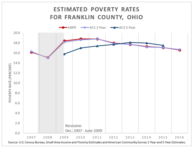
Figure 1. Comparing Poverty Rate Sources for Franklin County, Ohio: 2007 to 2016
The ACS also publishes poverty estimates for the nation (the official national poverty rate comes from the Current Population Survey Annual Social and Economic Supplement). According to the ACS, from 2007 to 2011, the estimated poverty rate increased almost three percentage points, but dropped almost two percentage points after its peak in 2011 and 2012, to a level of 14.0 percent in 2016. This indicates that the poverty rate has possibly not recovered from the most recent recession, though since 2013, it appears to be trending in that direction.
With the SAIPE program’s state and county poverty estimates, we can uncover the more complex story lying beneath this national trend. Figure 2 is a map showing the percent change in state-level poverty rates comparing 2007 estimates to the newly released 2016 SAIPE program estimates.
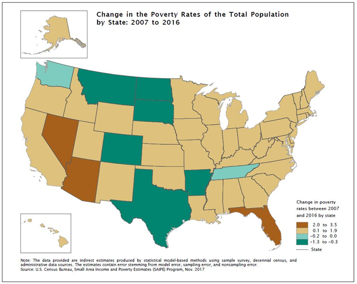
Figure 2. Percent Change in the Poverty Rate by State: 2007 to 2016
Figure 3 delves further down to the county level showing broader variation between counties and uncovers regional trends. In many counties in the Northern states (particularly in the Dakotas and Montana) and in Southwest Texas, we see the strongest decreases in poverty compared to their prerecession estimates. Many of these counties are rural with small population sizes, which means SAIPE is their only source of single-year estimates of income and poverty.
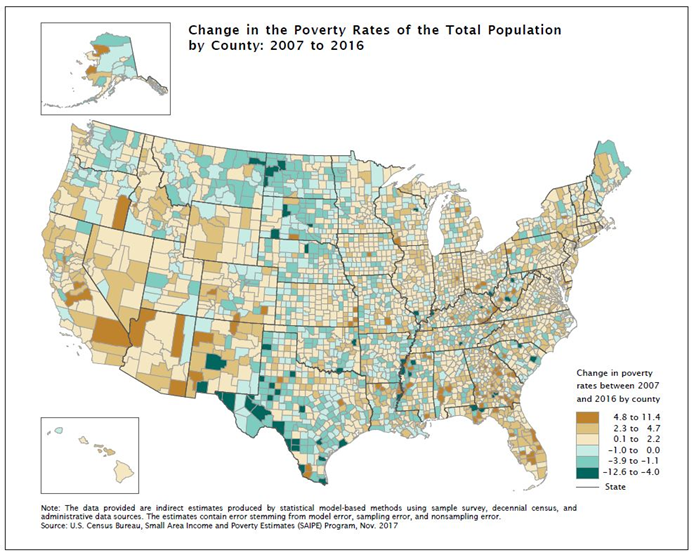
Figure 3. Percent Change in the Poverty Rate by County: 2007 to 2016
With SAIPE, we can also track the changes in median household income. Figure 4 shows the percent change in median household income for all counties from 2007 to 2016 (adjusted for inflation using CPI-U). It is interesting to note the differing trends in median household income between the Great Plains region (running from the Northern states through Texas) and much of the remainder of the country during the nine-year period since the recession. While overall it appears that median household income for many counties in the Great Plains region has increased compared to prerecession estimates, these counties have experienced rapid increases and decreases in median household income in recent years.
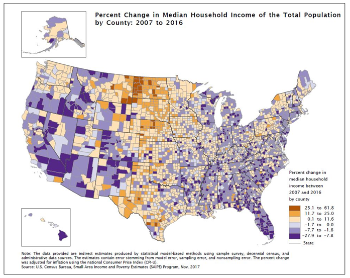
Figure 4. Change in Median Household Income by County: 2007 to 2016
The change in median household income over the past two years for the Great Plains region can be seen in the following figure. Figure 5 displays two maps of one-year change in median household income for all counties. The top panel shows the change in median household income from 2014 to 2015, and the bottom panel shows the change from 2015 to 2016. While many of the counties in the Great Plains region saw an increase in median household income from 2014 to 2015, in the following year from 2015 to 2016, many of these same counties saw a sudden decrease in median household income. So even though median household income is still higher than it was prerecession for these counties, the growth has not been steady and has changed dramatically year-to-year.
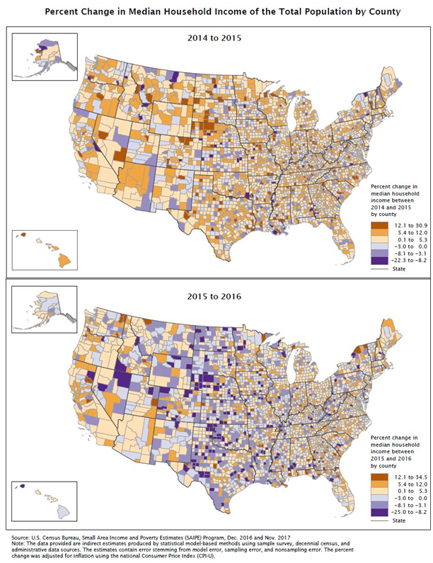
Figure 5. Change in Median Household Income by County: 2014 to 2015 and 2015 to 2016
With SAIPE, we can detect and analyze timely annual changes in income and poverty for small areas. Further analysis of state- and county-level trends of income and poverty can be found in the SAIPE report accompanying today’s release of the 2016 SAIPE program estimates. All SAIPE data can be downloaded from the SAIPE website or the Census Bureau’s application programming interface (API), giving public access to quality, single-year estimates for all counties and school districts.
Understanding the Relationship Between Individual Earnings and Household Income
by Adam Bee and Jonathan Rothbaum, Social, Economic, and Housing Statistics Division
One question we often receive after our annual release of the income and earnings estimates from the Current Population Survey Annual Social and Economic Supplement is the extent to which the changes in the estimates of individual earnings and in household income are related.
For example, in 2016, real income for a “typical”, or median, household increased by a statistically significant 3.2 percent from 2015, but real earnings for “typical”, or median, full-time, year-round male and female workers in 2016 were not statistically different from 2015. These results appear inconsistent with each other: how could income for the “typical” household increase if earnings for the “typical” full-time worker did not?
There are two factors at play here. First, earnings includes only wages, salaries, and income from self-employment for individual workers. Household income, however, includes not just earnings for each household member but also income from social security, interest, dividends, and many other sources. Second, it also turns out that the “typical” worker is not necessarily a member of a “typical” household. In fact, the “typical” full-time, year-round worker is a member of a higher income household. Let us walk you through how this could be true.
To demonstrate this, we look at households with incomes very close to the median (between the 48th and 52nd percentiles, for this example). These near-median households have incomes that are very similar to the median household; the average income of these near-median households was $59,074 in 2016, which is not statistically different from the 2016 median household income of $59,039. By examining a group of households that are near the median, we avoid focusing on just one particular median household whose characteristics may not be representative.
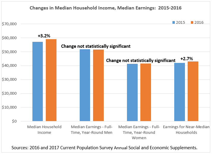
We can then examine these near-median, households to see what their members earn. The full-time, year-round workers in these households earn on average $41,410 for men and $37,543 for women. Each of these is significantly lower than the corresponding overall median earnings for men and women working full time, year-round: $51,640 and $41,554, respectively. Put differently, workers in “typical” households earn less than the “typical” full-time, year-round worker. Further, not all near-median households have workers that work full time and year-round. Some may have part-time or part-year workers, or no workers at all. In fact, these near-median households have 1.3 workers on average, with about 0.8 of those workers working full time, year-round.
Let’s return to the concrete example of 2016. Recall that even though median earnings for full-time, year-round men and women were not statistically different between 2015 and 2016, median (and near-median) household income increased by 3.2 percent. This seeming contradiction is resolved when we look at earnings in these near-median, “typical” households (including earnings from part-time or part-year workers), which increased 2.7 percent in 2016.
Therefore, “typical” households have workers who may work full-time, year-round and others who work less. These workers earn less than the “typical” full-time, year-round worker; however, their earnings grew from 2015 to 2016 while the earnings of the “typical” full-time, year-round workers did not. These increased earnings were responsible for most of the increase in “typical” household income (with the rest from other income sources, such as Social Security, interest, dividends, etc.).
To conclude, the statistics for median household income and full-time, full-year workers can often change in different directions. This is because (1) household income includes income sources besides earnings, and (2) earnings in median (and near-median) households generally come from workers who are different from the median full-time, full-year worker.
Parents Burning the Midnight (and Weekend) Oil
by Brian Knop, Fertility and Family Statistics, Social, Economic, and Housing Statistics Division
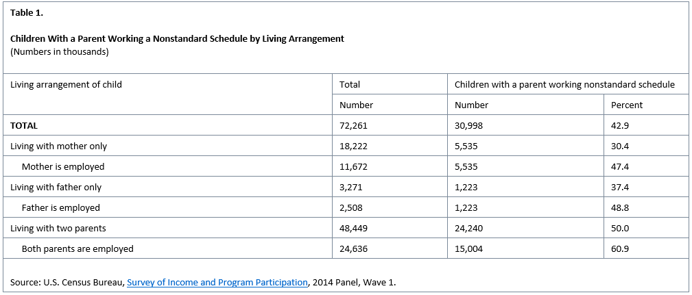
Of the 72.3 million children in the United States living with at least one of their parents, 43 percent (31.0 million) live with a parent who is working a nonstandard schedule (Table 1). Any schedule that does not reflect the traditional Monday through Friday daytime schedule is considered nonstandard. Parents with more than one job are considered nonstandard workers if any of the jobs have nonstandard schedules, such as evenings/nights, irregular or weekend hours.
Note: Children not living with at least one parent excluded from analysis. Source: U.S. Census Bureau, Survey of Income and Program Participation, 2014 Panel, Wave 1.
However, in today’s 24/7 economy, many jobs exist outside the traditional daytime, Monday-Friday work schedule. It is common for a child to live with a parent who works at least some shifts in the late (or early) parts of the day or during the weekend. For example, there are 5.5 million children living with their mother only who works a nonstandard schedule. This accounts for 30 percent of all children living with their mother only (Figure 1).
Both mothers and fathers, and parents with or without another parent in the home engage in nonstandard work schedules, as reflected in Table 1, which draws upon data from the Survey of Income and Program Participation (SIPP). This survey is the premier source of information for income and program participation. SIPP collects data and measures change for many topics including, economic well-being, family dynamics, education, assets, health insurance, childcare and food security. This survey includes detailed questions about family living arrangements and employment.
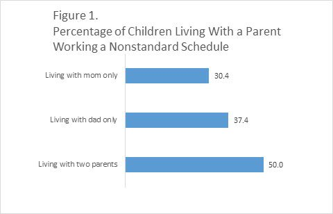
Table 1 shows that of the 3.3 million children living with only their father, 37 percent have a dad who works a nonstandard schedule. The percentage with a father who works a nonstandard schedule increases to 49 percent when we consider only those children whose father is employed. This is similar to the corresponding percentage for children living only with an employed mother who is working a nonstandard schedule (47 percent) (Figure 2). Among the 48.4 million children living with two parents, 50 percent have at least one parent working a nonstandard schedule. When restricted to children living with two working parents, 61 percent have at least one parent who works a nonstandard schedule.
Source: U.S. Census Bureau, Survey of Income and Program Participation, 2014 Panel, Wave 1.
A higher share of children in two-parent families have a father with a nonstandard schedule (38 percent) than a mother with a nonstandard schedule (22 percent) (Table 2). If we look within this group of children and focus on those with two working parents in the home, 37 percent have a mother working a nonstandard schedule and 43 percent have a father working a nonstandard schedule. Of course, these may overlap so that some children live with parents who both work nonstandard schedules. What percentage of children living with two employed parents have only mom or only dad working a nonstandard schedule? Figure 3 shows that while 18 percent of children living with two working parents have both parents working nonstandard schedules, it is more common that only the father works a nonstandard schedule — 24 percent. About 18 percent of children living with two working parents have only a mother who works a nonstandard schedule.
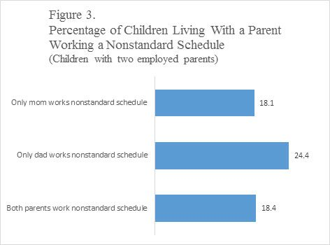
Source: U.S. Census Bureau, Survey of Income and Program Participation, 2014 Panel, Wave 1.
It is important to note that this blog does not address the circumstances that lead parents to work nonstandard schedules. However, SIPP data do allow us to see that many children live with a parent who works a nonstandard schedule.
To learn more about SIPP and the statistical guidelines used in producing this article, visit the SIPP page, the SIPP 2014 source and accuracy document and the nonresponse bias report.
The estimates presented here are subject to sampling and nonsampling error. For more information, visit the SIPP sampling page.
Examining the Effect of Off-Campus College Students on Poverty Rates
by Craig Benson and Alemayehu Bishaw, Poverty Statistics Branch, Social, Economic, and Housing Statistics Division
The U.S. Census Bureau’s American Community Survey 5-year estimates give users the tools and ability to ask and answer many questions. One interesting question is how different populations affect an area’s poverty rate.
For example, how do college students, specifically students living off-campus, affect poverty rates in the places they live while enrolled in school? Earlier Census Bureau research investigated the impact of off-campus college students on community poverty rates and found that smaller communities were more likely to have poverty rates affected by students. (Students living on campus are not included in the poverty universe and therefore do not impact poverty rates).
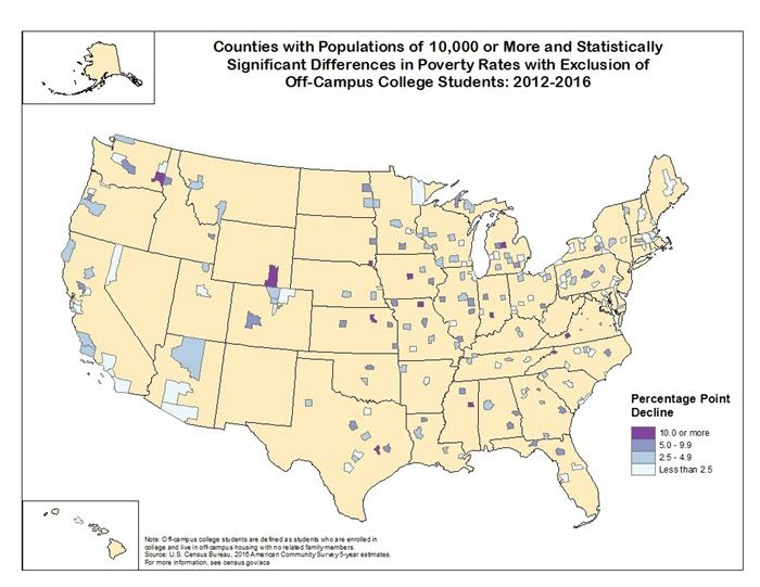
Using data from the 2012-2016 American Community Survey five-year estimates, we have updated this research with the release of two tables that list all counties and places with more than 10,000 residents where the presence of off-campus students significantly impacts poverty rates. The findings, similar to earlier research, show that the presence of large numbers of off-campus college students can affect an area’s poverty rate.
Source: 2012-2016 American Community Survey 5-year Estimates.
The map and detailed tables online display all counties with populations above 10,000 that had statistically significant differences between their original poverty rates and their rates when adjusted to exclude college students living off campus.
Of the 2,437 counties in the United States with populations above 10,000, 211 counties (8.7 percent) had statistically significant decreases in their poverty rate when excluding off-campus college students. Excluding off-campus college students did not result in increased poverty rates in any of these counties. We find poverty rates are impacted by off-campus students in both small counties that house large universities, as well as in some of the largest counties in the United States, many of which are home to multiple colleges and universities. In fact, 87 of the 100 largest colleges and universities based on on-site enrollment are located within these 211 counties.
The map shows a geographic representation of the 211 counties with statistically significant changes. The majority of these counties had decreases of 5 percentage points or less (157 counties or 74.4 percent of all counties that experienced a decline). A smaller number of counties had a 10 percentage point or more decrease from the original poverty rate (16 counties or 7.6 percent of all counties that experienced a decline). These counties with the largest differences tended to have smaller total populations.
An additional table shows places with populations greater than 10,000 people that had statistically significant differences between their original and adjusted poverty rates. Of these 3,943 places, 226 (5.7 percent) had significant declines in poverty rates with the exclusion of off-campus college students. Poverty rates did not increase for any of these places as a result of excluding off-campus college students. Of the 100 largest on-site enrollment colleges and universities, 81 were located in places that showed a significant impact of college students on poverty rates.
The estimates and figures presented here are designed to stimulate further thought about how college students impact poverty rates, and how those estimates might be interpreted in those communities. In a number of areas, the inclusion of off-campus students had a statistically significant effect on local poverty rates, in some cases increasing the rate by 10 or more percentage points.
Recent Data Releases
December 2017 Releases
Commuting Times, Median Rents and Language other than English Use in the Home on the Rise- The nation experienced an increase in commuting time, median gross rent and a rise in English proficiency among those who spoke another language. These are only a few of the statistics released in early December from the U.S. Census Bureau’s 2012-2016 American Community Survey American Community Survey five-year estimates data release, which features more than 40 social, economic, housing and demographic topics, including homeowner rates and costs, health insurance and educational attainment https://www.census.gov/newsroom/press-releases/2017/acs-5yr.html (December 7).
November 2017 Releases
U.S. Census Bureau Releases Small Area Income and Poverty Estimates for Counties- In 2016, the median household income for all counties ranged between $22,045 and $134,609, with a median county-level value of $47,589, according to the new Small Area Income and Poverty Estimates report released today by the U.S. Census Bureau https://www.census.gov/newsroom/press-releases/2017/small-area-income-poverty.html (November 30).
Services Sector Revenue Rises to $15.5 Trillion- Revenue generated by service sector firms increased 4.4 percent between 2015 and 2016, according to statistics from the U.S. Census Bureau’s 2016 Service Annual Survey (SAS). Revenue for all service sectors covered by the program is estimated at $15.5 trillion for 2016 https://www.census.gov/newsroom/press-releases/2017/service-annual-survey.html (November 21).
New Survey of Income and Program Participation Data Now Available- The U.S. Census Bureau released a new brief “Participation Rates in Other Assistance Programs: 2013,”. highlighting the measurement of participation in assistance programs which are not part of the major federal funded social safety net programs. The Survey of Income and Program Participation (SIPP) asks respondents about the use of other assistance programs: food, transportation, clothing and housing assistance https://www.census.gov/newsroom/press-releases/2017/sipp.html (November 17).
More Children Live With Just Their Fathers Than a Decade Ago- The percentage of children living with one parent who live with just their father saw an increase from 12.5 percent in 2007 to 16.1 percent in 2017. That’s according to new statistics from the U.S. Census Bureau’s 2017 America’s Families and Living Arrangementstable package https://www.census.gov/newsroom/press-releases/2017/living-arrangements.html (November 16).
Declining Mover Rate Driven by Renters, Census Bureau Reports- The rate at which renters moved in 2017 was at a historic low of 21.7 percent, compared to 35.2 percent in 1988, according to new U.S. Census Bureau data released today from the Current Population Survey. However, renters still moved at a higher rate than owners (21.7 percent compared with 5.5 percent, respectively) https://www.census.gov/newsroom/press-releases/2017/mover-rates.html (November 15).
Highlighting Our Nation’s Veterans- The U.S. Census Bureau has released a new report “The Wealth of Veterans” that uses data from the 2014 Survey of Income and Program Participation to look at how military service may influence the lifelong financial well-being of veterans. The report describes differences in the components of wealth between male veteran householders and nonveteran householders 25 years and older https://www.census.gov/newsroom/press-releases/2017/nations-veterans.html (November 8).
Page Last Revised - December 16, 2021
✕
Is this page helpful?
 Yes
Yes
 No
No
 Yes
Yes
 No
No✕
NO THANKS
255 characters maximum
 255 characters maximum reached
✕
Thank you for your feedback.
Comments or suggestions?

Comments or suggestions?