
Official websites use .gov
A .gov website belongs to an official government organization in the United States.
Secure .gov websites use HTTPS
A lock (
) or https:// means you’ve safely connected to the .gov website. Share sensitive information only on official, secure websites.

Topics
Data & Maps
Surveys & Programs
Resource Library
Survey News Volume 6, Issue 1
Survey News Volume 6, Issue 1

In This Issue:
- 2017 Supplemental Fraud Survey
- Use of Hunting License Data to Define Primary Sampling Units in the National Survey of Fishing, Hunting, and Wildlife-Associated Recreation
- Median Earnings over the Last 40 Years
- Health Insurance Coverage of Veterans
- Who Are the Uninsured?
- Housing Unit Growth and Decline in the Last 10 Years
- Women in Manufacturing
- Recent Data Releases
2017 Supplemental Fraud Survey
by Jamie Choi, Survey Statistician, National Crime Victimization Survey
October marked the start of data collection for a new National Crime Victimization Survey (NCVS) supplement, the Supplemental Fraud Survey (SFS). The SFS is designed to measure the prevalence, characteristics, and consequences of being a victim of personal financial fraud. Both the NCVS and SFS are sponsored by the Bureau of Justice Statistics (BJS). The Census Bureau is collecting the SFS data from October to December of 2017. Respondents ages 18 or over who complete the NCVS are eligible for the SFS.
For the SFS, fraud is defined as intentionally and knowingly deceiving the victim by misrepresenting, concealing, or omitting facts about promised goods, services, or other benefits and consequences that are nonexistent, unnecessary, never intended to be provided, or deliberately distorted for the purpose of monetary gain. The specific types of fraud measured by the supplement align with a taxonomy of fraud developed by the FINRA Foundation, Stanford Center on Longevity, BJS, and other researchers and experts from relevant federal agencies (//162.144.124.243/~longevl0/wp-content/uploads/2016/03/Full-Taxonomy-report.pdf). The victim must lose money in the transaction in order for the incident to be considered fraud. The supplement collects information on the type of fraud committed, how much money obtained by the offender, how much money was recovered, if the incident was reported to law enforcement or a consumer protection agency, and any negative social, emotional, or financial consequences of the fraud incident.
For more information on fraud, please visit the Financial Fraud Enforcement Task Force at www.stopfraud.gov.
Use of Hunting License Data to Define Primary Sampling Units in the National Survey of Fishing, Hunting, and Wildlife-Associated Recreation
by David Hornick, Supervisory Mathematical Statistician, Demographic Statistical Methods Division
The Fishing, Hunting, and Wildlife-Associated Recreation (FHWAR) Survey Team is in the process of preparing final data products for the 2016 survey and recently conducted a lessons learned. One innovation for the 2016 survey that we found helpful was the use of hunting license data to define Primary Sampling Units (PSUs). Current Population Survey (CPS) PSUs were used in the past. The 2016 sample size was smaller than the past national surveys and the team sought to locate those sample cases in areas with higher likely participation rates in order to collect more precise and detailed estimates.
For the 2016 FHWAR, the Census Bureau was required to produce the national fishing, hunting and wildlife-watcher estimates along with individual state estimates for four selected states. The prerequisite housing unit sample sizes for the four states were required to result in estimated coefficients of variation (CVs) no larger than 15% for the number of hunters.
The U.S. was divided into thirteen sample areas, the four selected states plus the balance of the U.S. divided into the nine census divisions. Within each sample area, the overall sampling interval (SI) was calculated as the ratio of the sample area’s total 2015 valid housing units (VHUs) to the sample area’s sample size. The percentage of the population per county that obtained a hunting license for 2013 was calculated. The expected sample size was calculated as the total 2015 VHUs divided by the SI.
For self-representing (SR) PSUs (PSUs that consisted of only one county), a combined score was formulated. The combined score was comprised of the county’s number of hunters (with a weight of 30%), percentage of hunters (with a weight of 25%), and 2015 valid housing unit count (45% weight). The combined score was then sorted lowest to highest and the SR PSUs selected using the Ward’s hierarchical clustering method.
The creation of non-self-representing (NSR) PSUs involved many more steps. Geographical makeup was a key concern because the FHWAR asked specific questions on species of wildlife hunted, fished, and watched and great care was taken to ensure the PSUs were created in such a way as to have relatively similar environmental makeup and were not far apart from each other.
Using the hunting license counts met the requirements set forth by the sponsor and was a cost-effective way to better target our sample cases. The FHWAR team looks forward to publishing final 2016 estimates early in 2018.
Median Earnings over the Last 40 Years
by Jonathan Rothbaum, Survey Statistician, Social, Economic, and Housing Statistics Division
In the recently released 2016 income and poverty report, we show estimates of median earnings for full-time, year-round workers, from which we calculate the most widely accepted measure of the male-female earnings gap. However, we can dig a little deeper — how do earnings in 2016 for all workers (not just full time, year-round) compare to those over the last 40 years? By looking at all workers, our estimates can account for changes in earnings if someone goes from working full time to part time, from year-round to only part of the year, or into full-time, year-round work.
For all female workers, the story is simple (Figure 1 below) — real median earnings in 2016 were higher than in any of the last 40 years. Median female earnings have been rising — from $16,483 in 1976 to $30,882 in 2016, an increase of 87 percent (or 1.6 per year, on average).
For all male workers, the picture is more complicated. During and following each recession, men experienced declines in real median earnings. In the expansions that followed, median earnings rebounded. This decline in earnings occurred during the 2007-2009 recession, as well. However, compared to their peak in 1999 ($43,360), median male earnings in 2016 ($42,220) were 2.6 percent lower. Across the last 40 years, median male earnings were higher in 2016 than any year prior to 1998 and each year from 2008 to 2014. However, compared to 40 years ago, median male earnings have increased only 6.8 percent from $39,523 in 1976 to $42,220 in 2016, which is an average annual increase of 0.17 percent over the period.
")
If we instead focus our attention on full-time, year-round workers, the picture is different (Figure 2). For men, we do not see the same decline in median earnings at each recession with a subsequent rebound. This reflects the fact that recessions can affect both earnings and how many hours people work (including whether they work full time and year-round). Additionally, full-time, year-round male workers did not earn statistically significantly more in 2016 than they did in 1976 ($51,624 in 1976 compared to $51,640 in 2016).
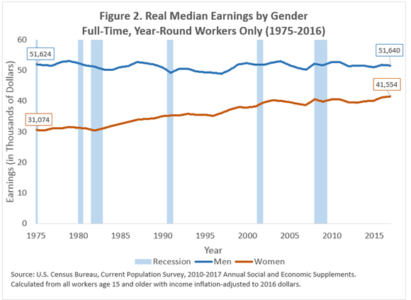
For women, Figures 1 and 2 tell roughly the same story – earnings have increased over time without generally declining during recessions. However, the differences in Figures 1 and 2 for women reflect the changing nature of work for women, as more women moved into full-time and year-round work. For full-time, year-round female workers, real median earnings were 33.7 percent higher in 2016 ($41,554) than 1976 ($31,074), for an average annual increase of 0.73 percent.
This analysis highlights the importance of keeping in mind who is in the group when we evaluate earnings. Over time, there can be changes in the share of the population that works (which is not directly reflected above), how many weeks they work per year, how many hours they work per week, and how much they earn per hour. As these change over time or over the business cycle (recessions and expansions), our estimates of annual earnings will be affected.
Health Insurance Coverage of Veterans
by Kelly Ann Holder and Jennifer Cheeseman Day, Social, Economic, and Housing Statistics Division
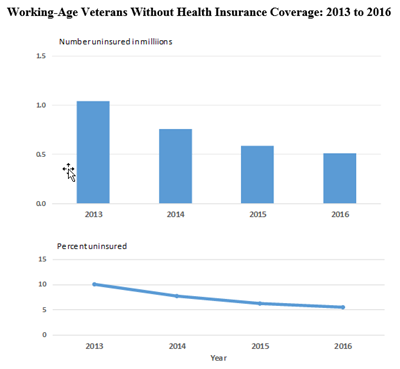
Financing the health care of veterans is of particular concern to the American public given the unique medical needs many require as a result of illnesses and injuries incurred while serving in the military. About half of all veterans in 2016 had health insurance coverage through Medicare, as they were age 65 or older. For the other half of the veteran population, who were of working age (ages 19 to 64), 510,000 (5.5 percent) were uninsured in 2016. Both the number and rate of working-age veterans without health insurance declined to a new low during the past four years.
Note: For more information, see www.census.gov/programs-surveys/acs/ Source: U.S. Census Bureau, American Community Survey, 2013 to 2016.
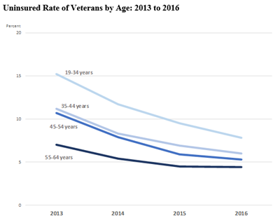
Working-age veterans under the age of 35 experienced the largest declines in their uninsured rates between 2013 and 2016, closing an age gap in health insurance coverage between themselves and the oldest working-age veterans (from a difference of 8.2 percentage points to 3.4 percentage points).
Note: For more information, see www.census.gov/programs-surveys/acs/ Source: U.S. Census Bureau, American Community Survey, 2013 to 2016.
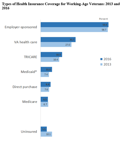
Between 2013 and 2016, health insurance coverage rates increased across most health insurance coverage types. Employer-sponsored health insurance was the most common health insurance coverage for working-age veterans, followed by health care provided by the Department of Veterans Affairs, TRICARE, Medicaid or other means-tested government programs and direct purchase.
* Medicaid includes other government-assistance plans for those with low incomes or a disability. Note: Types of coverage are not mutually exclusive. Veterans can be covered by more than one plan. For more information, see www.census.gov/programs-surveys/acs/ Source: U.S. Census Bureau, American Community Survey, 2013 and 2016.
Veterans have a unique source of health care available through the VA; however, it is not universally available to all veterans. Eligibility for the VA health care system is based on veteran status, service-connected disability status, income level and other factors. Moreover, not all eligible veterans actually use VA for their health care, and some may not realize they are eligible for VA health care. In fact, among uninsured veterans, about one-quarter could potentially qualify to use VA health care based on their service-connected disability status or income level.
About one-third of working-age veterans (2.8 million) used or were enrolled in the VA health care system in 2016. About 732,000 working-age veterans (25.8 percent) relied on VA as their sole source of health insurance coverage, while most veterans using VA (74.2 percent) had an additional type of health insurance coverage.
Having coverage through multiple plans can fill gaps in less comprehensive plans, though it may lead to discontinuity or duplication of care. About three in ten working-age veterans had more than one type of health insurance plan, and among these veterans with multiple coverage plans, about three-quarters had VA health care as one of their coverages.
Additionally, one in 10 working-age veterans (almost 1 million) relied on Medicaid or other means-tested government health care programs. Between 2013 and 2016, the percentage of working-age veterans who had Medicaid increased most for those who lived in poverty. The number of working-age veterans with Medicaid also increased during this period most notably for veterans whose income-to-poverty ratio was between 100 percent and 399 percent of the poverty threshold. The income-to-poverty ratio gauges the depth of poverty and shows how close a family’s income is to its poverty threshold.
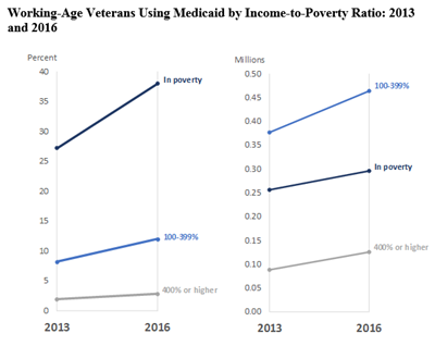
Note: For more information, see www.census.gov/programs-surveys/acs/ Source: U.S. Census Bureau, American Community Survey, 2013 and 2016.
For more information on veterans, visit www.census.gov/topics/population/veterans.html.
Who Are the Uninsured?
by Edward Berchick, Social, Economic, and Housing Statistics Division
In 2016, there were about 27.3 million people (8.6 percent of the population) who lacked health insurance coverage according to the latest American Community Survey data. You may wonder what the uninsured population looked like. Were the uninsured young or old? Were they more likely to live in certain parts of the nation?
Let’s begin by considering age. As shown in Figure 1 below, where the blue bars represent the distribution of the uninsured population and the green bars represent the distribution of the overall U.S. population, 12.0 percent of uninsured people were under 18 years old. At first glance, this number may seem a bit high, but it is relatively low considering that children were almost one-quarter of the U.S. population. That’s nearly a two-fold difference. We see that only a small fraction of the uninsured were people ages 65 and over — just 1.4 percent.
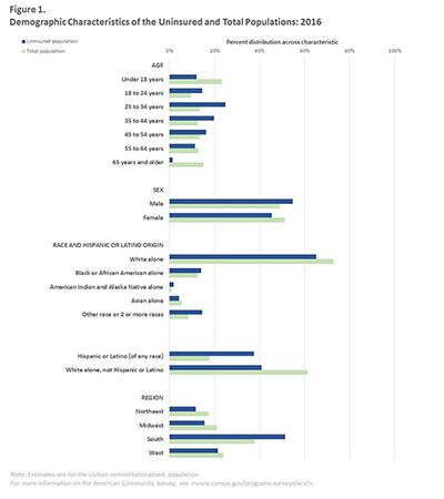
Working-age adults made up a much larger share of the uninsured population than any other age group. In fact, most uninsured people (86.7 percent) were 18 to 64 years old. We see that 25- to 34-year-olds and 35- to 44-years-olds were the two largest groups in this age category, respectively. Indeed, about 1 in 4 uninsured people were 25 to 34 years old. Similarly, about 1 in 5 uninsured people were 34 to 44 years old. Similarly, about 1 in 5 uninsured people were 35 to 44 years old.
But that’s not all the figure tells us. Over half of all people without health insurance coverage were male (54.7 percent), even though the U.S. population has more women than men. About 4 in 10 uninsured people were non-Hispanic white, while 6 in 10 people in the United States were non-Hispanic white. In other words, other races and ethnic groups made up the majority of the uninsured population but less than half (37.3 percent) of the total population. Uninsured people were also more concentrated in the South.
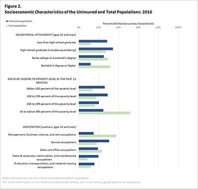
We can also see the socio-economic profile of the uninsured population (Figure 2). Most people without health insurance coverage had just a high school education or less. People who did not complete high school made up a much larger part of the uninsured population (28.6 percent) than the overall population (12.3 percent). The uninsured population was also disproportionately prone to live in poverty. Looking at occupations, about 1 in 3 uninsured people were in service occupations, compared with only about 1 in 5 people in the United States overall.
So who were the uninsured? Uninsured people tended to be 18 to 64 years old, male, have less than a high school education and/or have lower incomes. This profile is fairly different from the profile of the overall U.S. population.
The large sample size of the American Community Survey allows us to take a detailed look at the characteristics of populations, such as the uninsured. To find out more about the uninsured population (such as additional information about their employment characteristics, disability status, nativity and residence) and for information about the uninsured population in smaller geographic areas (such as states, counties and zip codes), see Table S2702 in American FactFinder (“Selected Characteristics of the Uninsured in the United States”).
Housing Unit Growth and Decline in the Last 10 Years
by Luke Rogers and David Armstrong, Population Evaluation, Analysis and Projections Branch, Population Division
In counties across the United States, the patterns of change in the overall number of housing units, whether an increase or decrease, have shifted over the last decade. Housing unit estimates, available through the U.S. Census Bureau’s Population Estimates Program, allow us to take a closer look at these shifts.
The total number of housing units is generally measured using information on the number of permitted housing units (indicating additional housing units from construction) and the number of recorded demolitions (indicating lost housing units).
Let us examine three points in time that represent roughly the beginning, middle, and end of the last decade: 2006 to 2007, 2010 to 2011, and 2015 to 2016. First, consider Figure 1, which shows the net change in the number of housing units between 2006 and 2007.
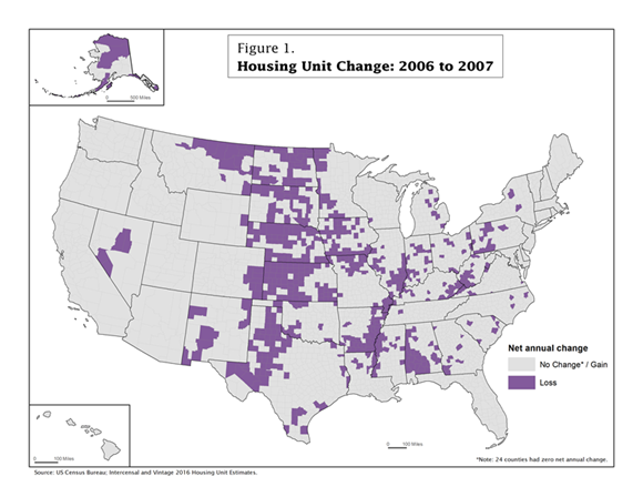
Between 2006 and 2007, the majority of counties (2,476 or 79 percent), stayed the same or had an increase in the number of housing units (shown in light gray). However, 666 counties (21 percent) experienced a decrease in housing units (shown in purple). Many places that experienced a decrease were clustered in the Midwest, along the Mississippi River, and in parts of Appalachia.
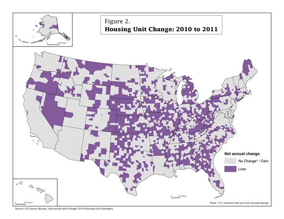
However, between 2010 and 2011 (Figure 2), the number of counties that experienced no change or gained housing units dropped to 1,829 (58 percent), and the number of counties that lost housing units increased to 1,313 (42 percent). The increase in the number of counties that lost housing units can be seen across the United States. Areas such as Appalachia and the Midwest that lost housing units between 2006 and 2007 continued to experience housing unit losses in additional counties. Other areas like the South, the Pacific Northwest and parts of the Northeast had numerous counties that gained housing units between 2006 and 2007 but then lost housing units between 2010 and 2011.
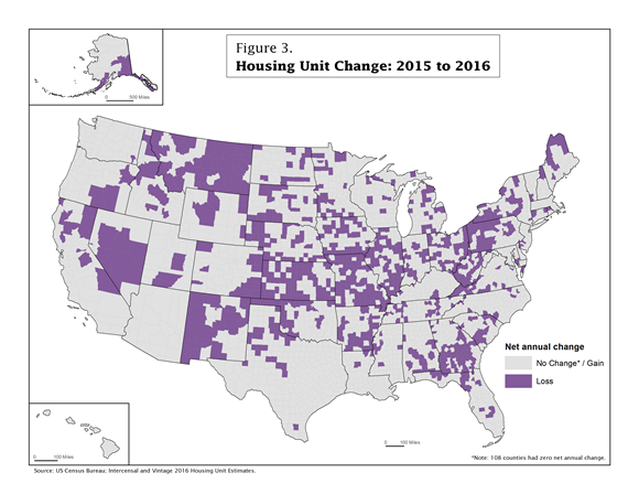
For 2015 to 2016 (Figure 3), the number of counties that stayed the same or gained housing units was 2,194 (70 percent) — an increase from 2010-2011, but still not as high as 2006-2007. Conversely, the number of counties that lost housing units between 2015 and 2016 decreased to 948 (30 percent). Compared to 2006-2007, the distribution of counties that lost housing units is somewhat different. Unlike the 2006-2007 map, which showed widespread housing unit declines in counties in Appalachia, the Midwest and along the Mississippi, the 2015-2016 map shows clusters of counties with housing unit losses in those areas as well as parts of the South, Northeast and West. States such as Florida, Oregon and Texas, which had numerous counties with housing unit loss between 2010 and 2011, showed more counties with gain between 2015 and 2016.
These three maps illustrate how housing unit change varies over time, both in the number of counties that gained or lost housing units and the geographic location of those counties. Some areas had counties that experienced housing unit loss at all three time points, while other areas had counties that experienced gain at some time points and loss at others.
To investigate the patterns of housing unit change for yourself, we invite you to dig into the recently released Vintage 2016 Housing Unit Estimates.
Women in Manufacturing
by Lynda Laughlin and Cheridan Christnacht, Social, Economic, and Housing Statistics Division
Women make up nearly one-third of the manufacturing industry workforce in the United States. Women play a number of roles in manufacturing from working on the production line to running their own manufacturing businesses. Today we explore the role of women in the manufacturing industry using household data from the American Community Survey. Industry refers to the kind of business conducted by a person’s employment organization; occupation describes the kind of work that a person does on the job.
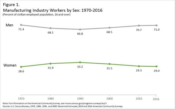
Although women make up nearly half of the working population (47.5 percent), they remain underrepresented in the manufacturing industry. Historically, men have held the majority of jobs in the manufacturing industry. Figure 1 shows that since 1970, women’s share of employment in the manufacturing industry has remained relatively constant, peaking at 33.2 percent in 1990 before declining to 29.0 percent in 2016.
In 2016, 60.0 percent of women working in the manufacturing industry were white, compared with 18.7 percent Hispanic and 11.3 percent black. Median earnings for female manufacturing industry workers was higher ($35,158) than that of women in all industries ($30,348) yet lower than that for male manufacturing workers ($48,849).
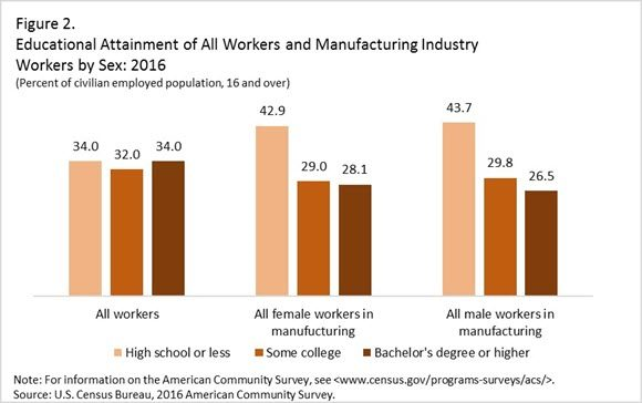
Compared with all workers, female manufacturing workers are less likely to have a bachelor’s degree or higher (see Figure 2). Just over four in 10 (42.9) women working in the manufacturing industry had a high school diploma or less, compared with 34.0 percent of all workers. Female and male manufacturing workers had comparable rates of education below the college level. However, a higher percentage of women working in manufacturing had a bachelor’s degree or higher (28.1 percent and 26.5 percent, respectively).
Analyzing occupations provides further insight into where women are working within the manufacturing industry. A wide range of skilled, professional or semi-skilled employees contributed to the manufacturing industry. Around 7.6 million production, transportation, and material moving workers were employed in the manufacturing industry in 2016 (Figure 3). While production, transportation, and material moving occupations employed the largest number of women within the manufacturing industry, women only made up about one-quarter (26.7 percent) of these workers. The most common detailed production occupations with over 100,000 female workers within the manufacturing industry include miscellaneous assemblers and fabricators; production workers, all other; and inspectors, testers, sorters, samplers, and weighers.
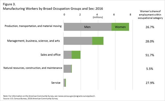
Women comprise a larger share of workers in sales and office occupations within the manufacturing industry (51.7 percent). Within this broad occupation group, occupations with over 100,000 female workers included secretaries and administrative assistants; sales representatives, wholesale and manufacturing; and customer service representatives.
What does the future of manufacturing hold for women? Advances in technology have changed the way that goods are produced. Many manufacturing jobs of the future will require highly specialized skills. Pursing a Science, Technology, Engineering and Mathematics (STEM) education may help prepare the future generation of manufacturing workers. Although women, especially younger women, have gained relative to their male counterparts in college completion, they are less likely to earn degrees related to STEM. Increasing the number of women who receive STEM related college degrees may help prepare women for careers in the manufacturing industries.
To view these statistics along with other social and demographic statistics for women workers, visit:
Recent Data Releases
October 2017 Releases
New American Community Survey Data Now Available-The U.S. Census Bureau’s 2016 American Community Survey one-year Public Use Microdata Sample (PUMS) files and Supplemental Estimates Tables are now available on census.gov. https://www.census.gov/newsroom/press-releases/2017/acs-pums.html (October 19).
Three Blogs to Help You Understand Population Estimates-The U.S. Census Bureau recently released the 2016 population estimates, which helps gauge change in the population since the 2010 Census. View the link below to understand the methodology behind these releases. https://www.census.gov/newsroom/press-releases/2017/blogs-population-estimates.html (October 11).
Census Bureau Releases Common Pay Patterns and Extra Earnings Brief-The U.S. Census Bureau released a new brief on “Common Pay Patterns and Extra Earnings: 2013,” highlighting earnings through different types of payments. These data come from the Survey of Income and Program Participation. https://www.census.gov/newsroom/press-releases/2017/pay-patterns.html (October 11).
Manufacturing Day: Oct. 6, 2017-During the week of Oct. 6, 2017, the U.S. Census Bureau joins a group of public and private organizations in celebrating the importance of the manufacturing sector of the nation’s economy. This marks the fifth annual organized observance of Manufacturing Day. The Census Bureau releases manufacturing statistics that inform businesses and policymakers. Collectively, the data paint a picture of the state of this important economic sector. https://www.census.gov/newsroom/press-releases/2017/manufacturing-day.html (October 6).
September 2017 Releases
Census Bureau Releases Statistics of U.S. Businesses- The U.S. Census Bureau released the 2015 Statistics of U.S. Businesses data tables by establishment industry. This release includes single-year estimates of the number of firms, number of establishments, employment and annual payroll. Data are presented by state, industry and enterprise employment size. https://www.census.gov/newsroom/press-releases/2017/businesses.html (September 29).
Startup Firms Created Over 2 Million Jobs in 2015- In 2015, the nation’s 414,000 startup firms created 2.5 million new jobs according to data from the Census Bureau’s Business Dynamics Statistics. In contrast, this level of startup activity is well below the pre-Great Recession average of 524,000 startup firms and 3.3 million new jobs per year for the period 2002-2006. https://www.census.gov/newsroom/press-releases/2017/business-dynamics.html(September 20).
New American Community Survey Statistics for Income, Poverty and Health Insurance Available for States and Local Areas- The U.S. Census Bureau released its most detailed look at America’s people, places and economy with new statistics on income, poverty, health insurance and more than 40 other topics from the American Community Survey. https://www.census.gov/newsroom/press-releases/2017/acs-single-year.html (September 14).
Page Last Revised - December 16, 2021
✕
Is this page helpful?
 Yes
Yes
 No
No
 Yes
Yes
 No
No✕
NO THANKS
255 characters maximum
 255 characters maximum reached
✕
Thank you for your feedback.
Comments or suggestions?

Comments or suggestions?