Visual List
Visual List components represent a collection of items in an organized grid. They can be used to display content as cards or tiles and may contain text or image elements, or both.
On This Page:
When to Use
The Visual List component should be used to improve the visual comprehension of the content being displayed. Since Visual Lists have a uniform container size, ratio, and padding, they are best used to display items of equal importance.
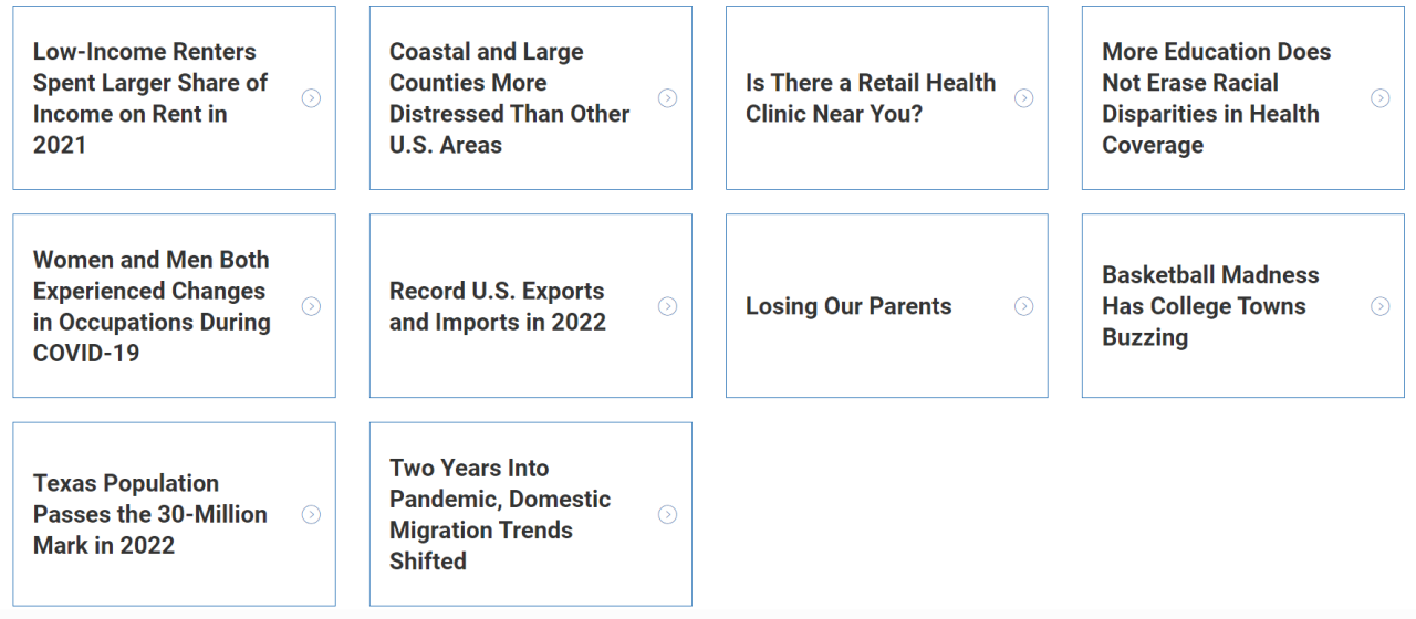
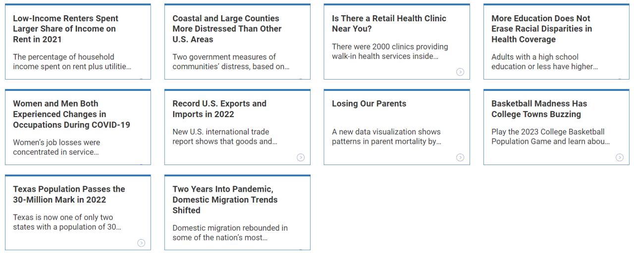
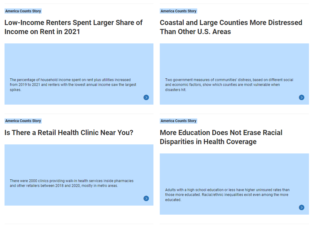
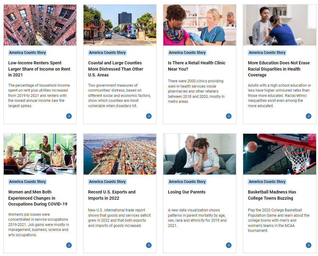
The styles of the Visual List component allows authors to display pages with thumbnail images (in a 16:9 format) or text-based cards.
Usage
The Visual List component can be used to create a dynamic list of child pages or a static list of arbitrarily defined items. The content author can select from available list types and decide how they would like to format the list elements in the configure dialogs.
Examples
View on public site:

Configure Dialog
The configure dialog allows the content author to configure the list and the list items.
List Settings Tab
The list can be built in different ways.
Regardless of how the list is built, there are Sort and ID Options that can always be configured.
Depending on how the content author chooses to build the list, the additional configuration options will change.
The list can be built of the child pages of the current page or another page.

Options for Child Pages:
- Parent Page: The list defaults to display the child pages of the current page being edited. Authors can manually choose a different parent page using the Parent Page field.
- Child Depth: Additionally, a content author can change how many levels down the list pulls by changing the Child Depth field.
The list can be built using a fixed list of items. Click the Add button to inset a new item to the list.

Options for Fixed List:
- Link: The link to the page an author would like to display. The link must be either:
- A fully-qualified URL or
- A relative URL to existing AEM content.
- Use the Selection Dialog to choose an item from AEM.
- Title: The page title of the URL. If left blank, the list will display the title from the selected AEM page. Entering text here will overwrite the page title.
- Description: Teaser text for the URL. If left blank, the list will display the teaser text from the selected AEM page. Entering text here will overwrite the teaser text.
Metadata:
- Tag Label: Option to add a tag for the content on the fixed list.
- Publication Date: Custom date of publication.
- Author: Name of author(s).
- Primary Topic: Option to add a topic to the page.
- Document Type: Option to include document type, such as Report Number, Release Number, Working Papers Number, or Memorandum.
- Document Number: A unique number to label the contents.
- Image: Link to the thumbnail image. The image must be uploaded to the DAM.
- Alt Text: Text description of the image.
Once more than one item is created for the list you can arrange the list by:
- Using the drag handle to re-arrange the items in the list.
- Using the trash can icon to delete items in the list.
The list can be built using pages that match certain tags under a particular location.

Options for Tags:
- Parent Page: This parameter determines where the matching should start.
- Use the Selection Dialog to choose the location in AEM.
- Leave blank to use the current page.
- Tags: This parameter is used to determine which tags should be matched. Multiple tags can be added.
- Use the Browse dialog to select the tags or
- If the tag name is known, authors can begin typing it in the field and then choose from the results.
- Match: This paramter can be use to adjust the list to match any tag entered in the above field or all tags entered.
Regardless of how you choose to build the list, there are certain sorting options that can always be defined.

Page Tags: Select the parent type of tag that will show as labels on list items.
- Content type
- Topic
- Program/Survey
Max Items: Maximum number of items displayed in the list. Leave empty to return all items.
Order by: How the list can be ordered.
- Default (How the pages are ordered in the backend of AEM.)
- Title
- Publication date
Sort Order: The order in which the items will be arranged.
- Ascending
- Descending
Secondary Order by: Provides an additional level of sorting.
- Default (How the pages are ordered in the backend of AEM.)
- Title
- Publication date
Secondary Sort Order: The second order in which the items will be arranged.
- Ascending
- Descending
Tabs by: Select a property to display the list in tabs. The tab titles will be built using the years of the option chosen.
- Collection year
- Reference year
- Publication date
Show "All" tab: When checked, the "All" tab is displayed when building tabs.
Item Settings Tab
Using the Item Settings tab, the formatting of the list elements can be configured.

This configuration dialog tab contains certain settings regarding labels to be added or excluded within the text list component. These include checkboxes where a content author can:
- Show description.
- Show publication date.
- Open links in a new tab.
Filtering Tab
Using the Filtering tab, content authors have the option to apply filters to the list of items or insert a search box.

Show text search filter: When checked, a search box will display above the list.
Text search placeholder: Insert a placeholder label to display in the search box when empty.
Filters: Add the tags that will act as filters to narrow down the list for users.
- Label - Insert a label to describe the filter.
- Tags - Select the tags that will be used as filters.
Styles Tab
Using the Styles tab, the style and display of the list elements can be configured.

Style: Choose how to display the visual list. The options include:
- Card - Description (Default)
- Card - Small
- Card - Large
- Color Card
- Tile
Labels: Choose whether or not to display tags in the list.

Developer Resources
Expand the section below to see the Visual List component's HTML output.
<div class="tagcloud aem-GridColumn--tablet--12 aem-GridColumn--phone--12 aem-GridColumn aem-GridColumn--default--7">
<div class="uscb-tag-cloud-header">
This story was filed under:
</div>
<br>
<div class="uscb-tag-cloud-rectangle">
<a href="/newsroom/blogs/director.html?tagfilter_List_556646074=Census:Topic/research/statistical-methods/administrative-records#List_556646074" class="uscb-tag-cloud-links" onclick="linkClick(this, 'Tag Cloud Component');">
Administrative Records
</a>
</div>
<div class="uscb-tag-cloud-rectangle">
<a href="/newsroom/blogs/director.html?tagfilter_List_556646074=Census:Topic/census-operations#List_556646074" class="uscb-tag-cloud-links" onclick="linkClick(this, 'Tag Cloud Component');">
Census Operations
</a>
</div>
<div class="uscb-tag-cloud-rectangle">
<a href="/newsroom/blogs/director.html?tagfilter_List_556646074=Census:Topic/Industry/information-communication-technology#List_556646074" class="uscb-tag-cloud-links" onclick="linkClick(this, 'Tag Cloud Component');">
Information and Communication Technology
</a>
</div>
</div>