Teaser Core
The Core Component Teaser Component displays a title, image, text, and link to direct users to further content.
On This Page:
Example
View on public site:

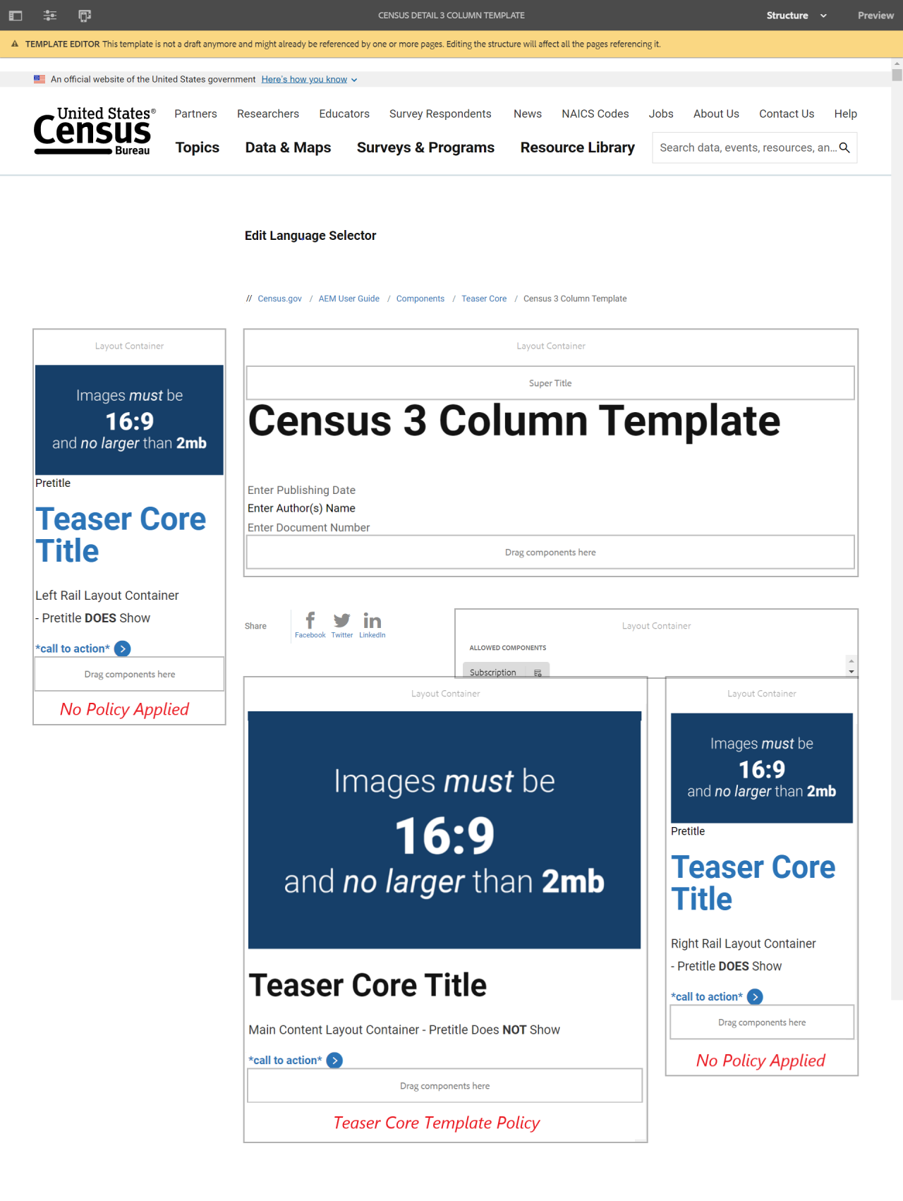
Examples by Template
Census 3 Column
When to Use
The Teaser Core component can be placed on any page in the site, including landing pages. It can be placed in the content, right rail, and left rail containers of the page.
When the Teaser Core is used in the left rail, it is used to display a sponsor logo. The sponsor logo should be sized to 300 pixels x 300 pixels.
The content author adds the title, teaser text, image, and link to a page. The teaser text is the text description of the page that displays when the page is provided within a list.
The Teaser Core display shows a hyperlinked title and hyperlinked asset with description text underneath. The link and asset can be selected by the user and selecting the link or image directly will navigate them to the new page (in the same tab).
Configure Dialog
The configure dialog allows the content author to define the image, text, link & actions displayed in the teaser.
Tab: Link & Actions
The teaser title, description and image can be inherited from the linked page, or from the page linked in the first call to action. If neither a link nor a call to action is specified, then the title, description and image will be inherited from the current page.
- Link - This file links to a content page, external URL, or page anchor.
- Open link in new tab - If enabled, the link will open in a new browser tab.
- Enable Call-to-actions - If enabled, this option allows linking to multiple destinations. The page linked in the first call-to-action is used when inheriting the teaser title, description, or image.
- Link - Enter the AEM link the call-to-action will navigate to.
- Checkbox - If checked, the link will be opened in a new browser tab.
- Text - Enter the call-to-action label.

Tab: Text
- Title - A title to display as the headline for the teaser.
- Title Type - The heading HTML element used for the teaser's title type.
- Get title from linked page - When checked, the title will be populated with the title from the linked page.
- Description - Defines a description to display as the subheading of the teaser.
- Get description from linked page - When checked, the description will be populated with the description from the linked page.
- ID - If left blank, a unique ID is automatically generated. This option can allow the user to control the unique identifier of the component in the HTML.
- If an ID is specified, it is the responsibility of the author to make sure that it is unique.

Tab: Image
- Image asset (Optional) - Drop an asset from the asset browser.
- Tap or click Edit to manage the renditions of the asset in the asset editor.
- Tap or click Clear to de-select the currently selected image.
- Tap or click Pick to select an image from the asset browser.
- Tap or click Edit to manage the renditions of the asset in the asset editor.

Styles
Use the drop-down menus to select the styles that you want to apply to the component. Selections made in the edit dialog have the same effect as those chosen from the component toolbar.


 255 characters maximum reached
Comments or suggestions?