Teaser Core
The Core Component Teaser Component displays a title, image, text, and link to direct users to further content.
On This Page:
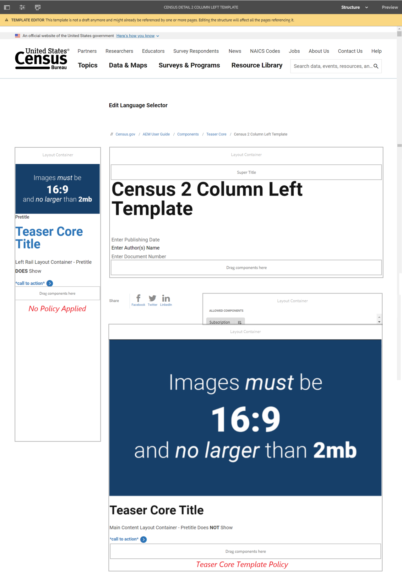
Example
View on public site:

Examples by Template
When to Use
Use a Teaser Core when you have a featured page with an image that you want to display from another page. The Teaser Core component can be placed on any page in the site, including landing pages. It can be placed in the content, right rail, and left rail containers of the page.
Be sure to verify that the title matches the title from the linked page and the description content accurately summarizes the page or matches the description text from the linked page.
Ensure that the asset has all the correct and necessary information attached to it, such as file size, and accurately matches the related image on the linked page.
Usage
Using the Teaser Core component, the content author can easily create a title, teaser text, image, and link to a page. Teaser Text is the text description of your page that displays when the page is provided within a list.
The component displays a hyperlinked title and hyperlinked asset the author specifies with description text underneath. The link and asset can be selected by the user and selecting the link or image directly will navigate them to the new page (in the same tab).
Configure Dialog
The configure dialog allows the content author to define the image, text, link & actions displayed in the teaser. See the section below to learn more about the Teaser Core dialog box.
Tab: Link & Actions
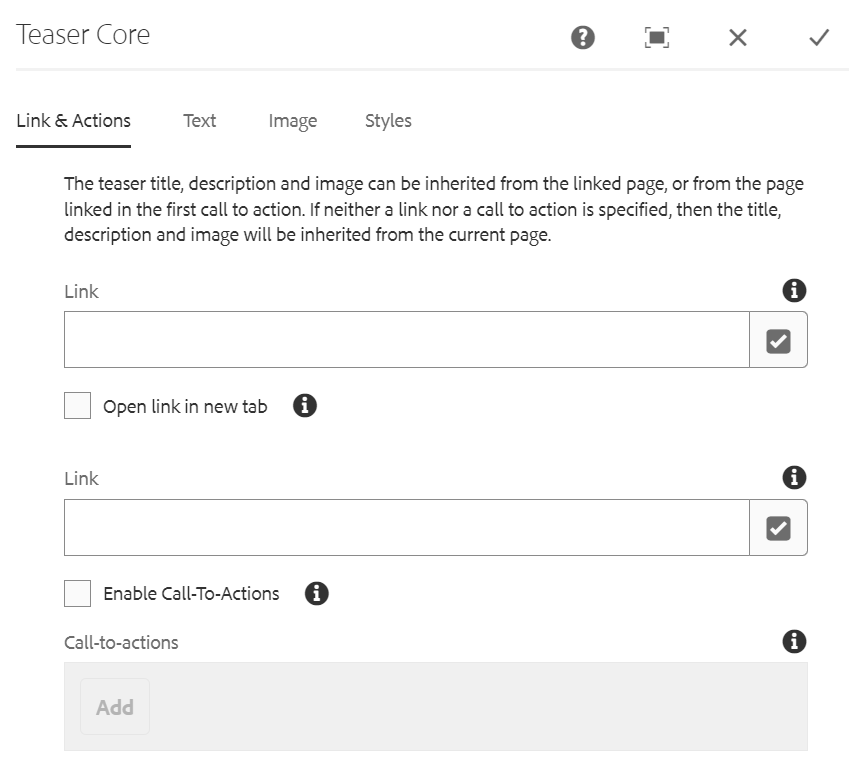
The teaser title, description and image can be inherited from the linked page, or from the page linked in the first call to action. If neither a link nor a call to action is specified, then the title, description and image will be inherited from the current page.
- Link - This file links to a content page, external URL, or page anchor.
- Open link in new tab - If enabled, the link will open in a new browser tab.
- Call-to-actions - This option allows linking to multiple destinations.
- The page linked in the first call-to-action is used when inheriting the teaser title, description, or image.
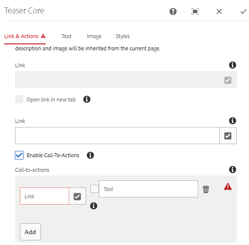
- Link - Enter the AEM link the CTA will navigate to.
- Checkbox - If checked the link will be opened in a new browser tab.
- Text - Enter the CTA label.
Tab: Text
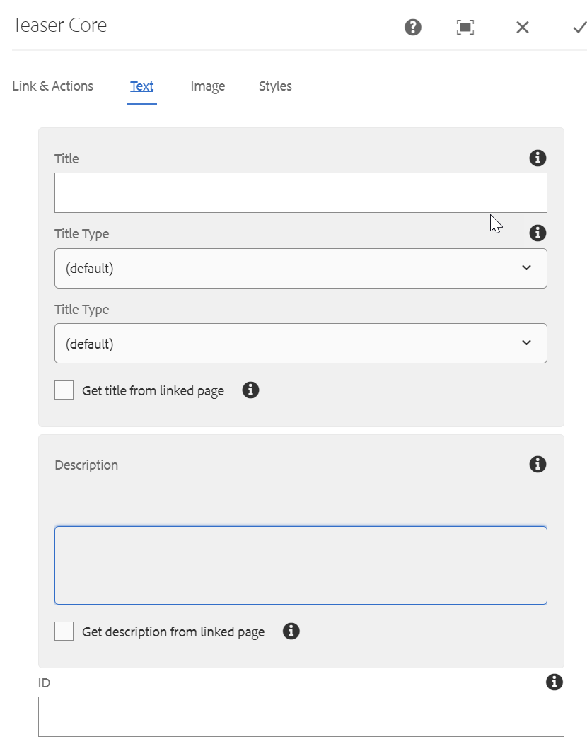
- Title - A title to display as the headline for the teaser.
- Title Type - The heading HTML element used for the teaser's title type.
- Get title from linked page - When checked, the title will be populated with the linked page’s title.
- Description - Defines a description to display as the subheading of the teaser.
- Get description from linked page - When checked, the description will be populated with the linked page’s description.
- ID - This option allows to control the unique identifier of the component in the HTML and in the Data Layer.
- If left blank, a unique ID is automatically generated for you and can be found by inspecting the resulting page.
- If an ID is specified, it is the responsibility of the author to make sure that it is unique.
- Changing the ID can have an impact on CSS, JS and Data Layer tracking.
Tab: Image
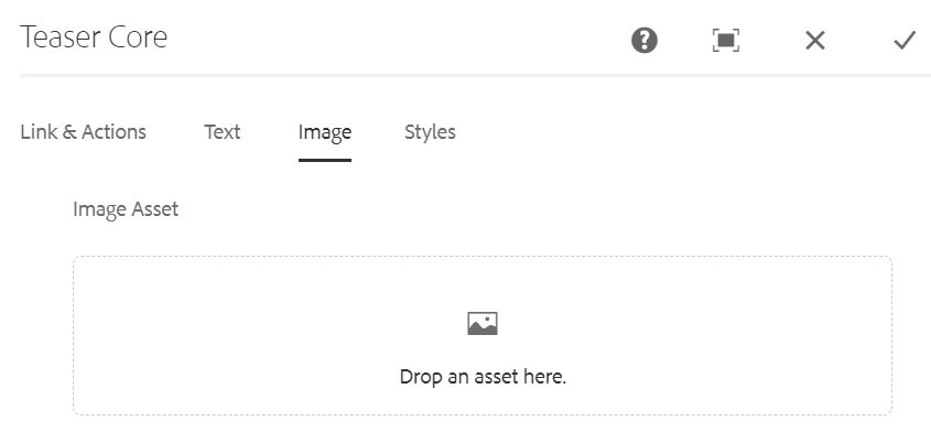
- Image asset (Optional) - Drop an asset from the asset browser
- Tap or click Clear to de-select the currently selected image.
- Tap or click Edit to manage the renditions of the asset in the asset editor.
Styles
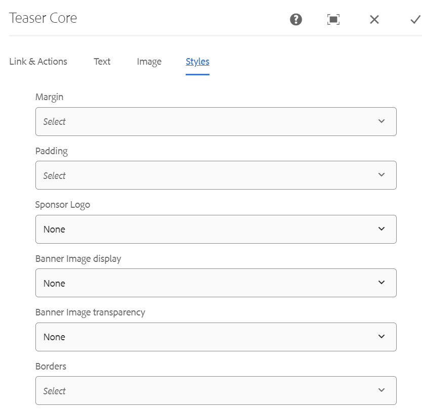
The Teaser Component supports the AEM Style System.
Use the drop-down to select the styles that you want to apply to the component. Selections made in the edit dialog have the same effect as those chosen from the component toolbar.
Styles must be configured for this component in the design dialog in order for the drop down menu to be available.
Component Policy
Teaser Core Component Policy
Rail Only Teaser Core Component Policy
 Yes
Yes
 No
No 255 characters maximum reached
Comments or suggestions?