Banner Alert
A full-width component that holds text, visually sections off the page with a solid background, and inherits to child pages. Used to inform or grab users’ attention. Can be dismissed by the user.
On This Page:
Example
View on public site:

View Banner Alert types:

When to Use
There are two types of alert banners: Passive Notification Banners and System Response Banners. Each has a Standard & Slim configuration. There are four alert messaging categories, each with their own color associations: Informative (blue), Warning (yellow), Error (red), and Success (green).
Furthermore, color use will be governed by which of the two types is being used: Passive Notification or System Response:
Passive Notification is general, non-urgent information (blue, gray, and occasionally gold; refrain from red and green unless urgent ie website, system or application is down, and this needs to be conveyed in a passive notification banner at the top of a page).
System Response is transactional, and is used as a system voice in response to user input (reserved for red and green).
Usage
- To provide feedback to users. Banner Alerts can be used to provide feedback to users on their actions. For example, you can alert users that their form or training request has been submitted successfully.
- To warn users of potential problems. Banner Alerts can be used to warn users of potential problems. For example, you can use an alert to inform users that they are about to leave a page without saving or that a required field is missing.
- To provide information to users. Banner Alerts can be used to provide information to users. For example, you can use an alert to inform users about a new feature or provide instructions for a particular function.
Configure Dialog
Authors can select the alert type by using the dropdown in the dialog box. The available alert banner types are Informative, Warning, Error, and Success.
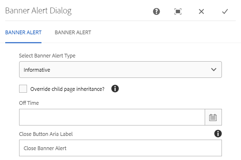
If the checkbox "Override child page inheritance?" is checked/selected, child pages will not inherit the banner. Leave the checkbox unselected to display the banner on child pages.
Authors can define the date and time the alert banner will be removed through the "Off Time" field.
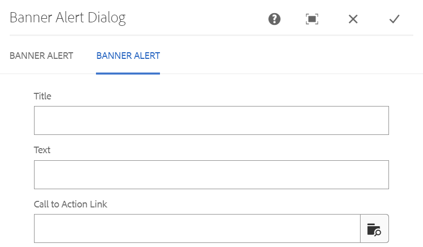
Under the second tab, authors can define the Banner Alert's title and the message it will display. If the author wishes to include a link in the alert, they can browse the DAM and add it here.