The American Community Survey's Journey Into Data Visualization
The American Community Survey's Journey Into Data Visualization
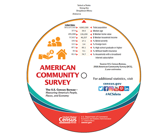
The U.S. Census Bureau’s American Community Survey (ACS) provides billions of statistics every year for states, counties and places across the United States. One of the Census Bureau’s best promotional items has been the ACS data wheel, which provides a few basic statistics for each state. People love picking it up and spinning to find their state to see how it stacks up.
Last year, we decided to go one step further and create an interactive data wheel highlighting 2016 ACS one-year data. This popular, interactive visualization allows data users to explore online key information about any state with a simple click instead of a spin of the data wheel.
We then took the data from the wheel and put it in map form with the ACS Interactive Data Map. It illustrates 2016 data to let the public see how topics such as median age and median home value vary by state.
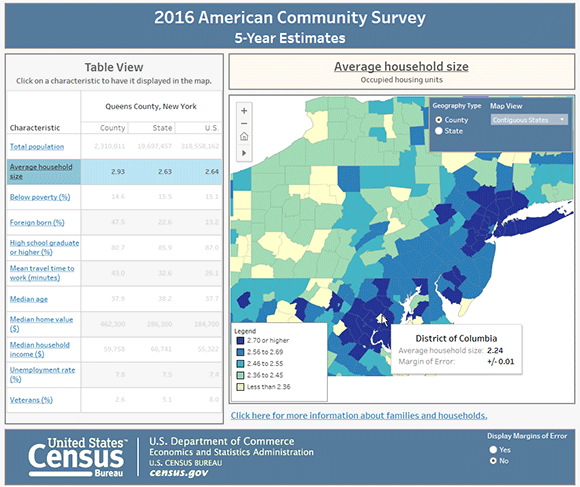
Along with our one-year release, which provides data for larger geographic areas, we also release data each year for all geographic area using five years’ worth of data. For county-level statistics, the ACS State and County Dashboard uses our five-year 2012-2016 data to let users view data at smaller geographic levels.
We are working on more data visualizations that show off some of the great information compiled by the Census Bureau from the ACS. To keep up-to-date with the newest visualizations available, sign up to receive emails about new releases and be sure to check out the data visualization library. This is where the most up-to-date and relevant data visualizations from the Census Bureau are available.


