Different Measures of Demographic Change and the Stories They Tell
Different Measures of Demographic Change and the Stories They Tell
When examining how the U.S. population shifts over time, demographers use several different methods to measure overall population change. Since each method provides a unique glimpse into a pattern of change, demographers rely on them in combination to get a holistic view of how America is changing. Let’s explore these measures and look at some commonly-used methods, focusing on change in the last year using the recently released Vintage 2016 Population Estimates.
Population Change
How does the Census Bureau measure population change? One way is to look at straightforward numeric change. This is calculated by taking the population in an area at a particular point in time and subtracting the population living there at an earlier time. Because numeric change is often larger in areas with sizeable populations and smaller for areas with small populations, we also calculate the percentage change in population. Percentage change is calculated by expressing numeric change per 1,000 population. If a population went from one to two people it would have a numeric change of one person and a percentage change of 100 percent. However, if a population went from 2 million to 2.1 million, it would have a numeric increase of 100,000 people, but its percentage change would be just 5 percent.
Another way of thinking about these two measures is that numeric change is the magnitude of change and percentage change is the speed of change over a specific time interval.
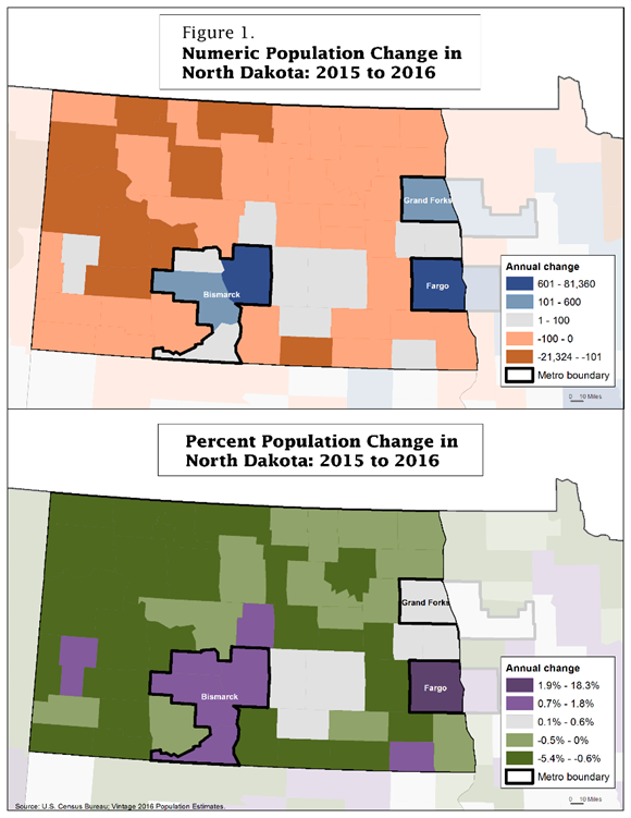
The North Dakota maps show both numeric change (top of Figure 1) and percentage change (bottom of Figure 1) between 2015 and 2016. These map classifications are based on county patterns across the United States, using quintiles that were adjusted to group positive and negative values. Notice that the map patterns look quite different. Over the last year, several North Dakota counties saw population declines that were small in numeric terms (top of Figure 1) but more substantial in percentage terms (bottom of Figure 1). The three largest metropolitan areas in North Dakota in the figure, Bismarck, Fargo and Grand Forks, have the largest numeric increases in the state.
So, what is the best measure? The answer is that both numeric and percentage change are correct and useful. Each measure tells only part of the story; in combination, a more complete picture emerges.
Areas with big populations can have large numeric change but small percentage change once you consider the context of population size. This is the case in Grand Forks County, which grew by 337 people in the last year. With a population of 70,746 people in 2015, a numeric increase of 337 people is only about 0.5 percent increase. Compared to other parts of North Dakota, the size of Grand Forks County’s numeric increase in the last year was large, but the speed of increase or percentage was slow.
While numeric and percentage population change show overall patterns, they do not provide any information about what caused these patterns. Populations change for three reasons: people are born, they die, and they move around (migration). For the rest of this blog, let’s look at two of these components of population change: births and deaths, and how they can be measured together.
Natural Change
When deaths are subtracted from births, we get a net gain or loss of population through natural causes — this is called “natural change.” When births exceed deaths it is called “natural increase,” and when deaths exceed births it is called “natural decrease.”
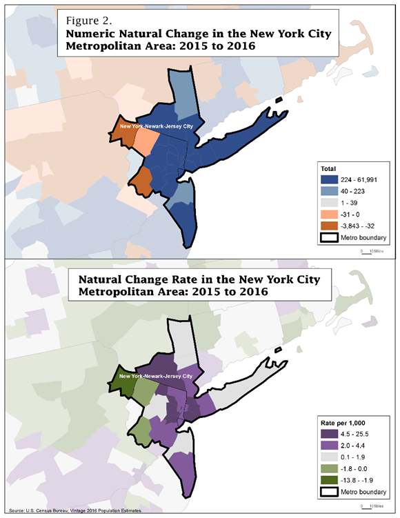
The maps for the New York-Newark-Jersey City metropolitan area (Figure 2) show natural change in the population between 2015 and 2016, both as a number (top of Figure 2) and rate (bottom of Figure 2), which reflect the size (numeric) and speed (rate) of natural change. In this case, the rate of natural change is calculated by taking the annual numeric natural change and dividing it by an estimate of the January 1, 2016 population and multiplying by 1,000. In the New York metro area, the population grew because there were many more births than deaths, making numeric natural change large and positive. However, the rate reveals that some counties, which show large numeric increases due to natural change, did not grow as rapidly as other counties once their population size is taken into account. This is why some counties are dark blue (large numeric natural change) on the top map but light gray (slow rate of natural change) on the bottom map. However, we can see areas with large change both in actual numbers and in terms of rates. When both numeric and rate measures are high, it signifies large, rapid growth due to natural change.
Natural Turnover
In addition to natural change, we sometimes look at natural turnover, which is births plus deaths. Since natural change is a “net” measure, births and deaths offset each other, and we only see the resulting difference between the two. Natural turnover, on the other hand, shows all of the change, representing the total number of people entering and exiting the population, more like a “total flow.” For example, an area with 100,001 births and 100,000 deaths would have natural change of just one, even though many people were born and died. Natural turnover in this example would be 200,001, giving us a better sense of the magnitude of these shifts. Even if the size of the population stays the same (natural increase of 0), natural turnover shows us how many of the actual residents of the area have changed through births and deaths. Like natural change, we can show natural turnover as either numeric or a rate.
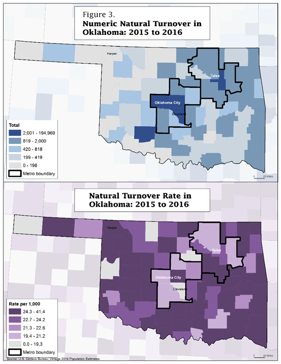
Let’s look at natural turnover for the counties in Oklahoma. Metropolitan areas like Oklahoma City and Tulsa contain some of the counties with the largest numeric turnover in the state of Oklahoma between 2015 and 2016 (top of Figure 3), but also some of the lowest turnover rates (bottom of Figure 3).
These areas experienced many births and deaths. However, compared to the number of people living there, the relative number of births and deaths is comparatively small. A good example is Cleveland County, which is part of the Oklahoma City metro area and had 3,098 births and 2,008 deaths in the last year. Its natural turnover was 5,106 people — a relatively high number for a county in Oklahoma. However, the population of Cleveland County is about 276,000, making the natural turnover rate 18.5 per thousand residents, which is among the slowest turnover rates in the state.
In contrast, in Harper County (just east of the state’s panhandle), there were 42 births and 69 deaths in the last year, making the numeric natural turnover 111 — a low number in Oklahoma. Nevertheless, considering that the total population of Harper County is around 3,700 people, 111 translates into a relatively fast natural turnover rate at 29.6 per thousand residents. That means that, in the last year, for every 1,000 people in the county there were 29.6 births or deaths.
Conclusion
In summary, each of these ways of looking at demographic change provides a unique perspective into the shifts occurring across the nation. Measures of numeric change provide information about how the number of people in an area has changed, while measures of percentage change consider the amount of change relative to the size of the population. Areas with large populations tend to have large numeric changes, while small numeric changes in areas with small populations result in larger measures of percentage change. The same principles apply for the measures of numeric natural increase compared to rates of natural increase and for numeric natural turnover relative to rates of natural turnover. How we measure change is important, and often it takes the use of multiple measures to get a clear picture of the nature of changing populations.
###


