An official website of the United States government
Here’s how you know
Official websites use .gov
A .gov website belongs to an official government organization in the United States.
Secure .gov websites use HTTPS
A lock (
) or https:// means you’ve safely connected to the .gov website. Share sensitive information only on official, secure websites.
-
//
- Census.gov /
- Census Blogs /
- Random Samplings /
- Housing Unit Growth and Decline in the Last 10 Years
Housing Unit Growth and Decline in the Last 10 Years
Housing Unit Growth and Decline in the Last 10 Years
In counties across the United States, the patterns of change in the overall number of housing units, whether an increase or decrease, have shifted over the last decade. Housing unit estimates, available through the U.S. Census Bureau’s Population Estimates Program, allow us to take a closer look at these shifts.
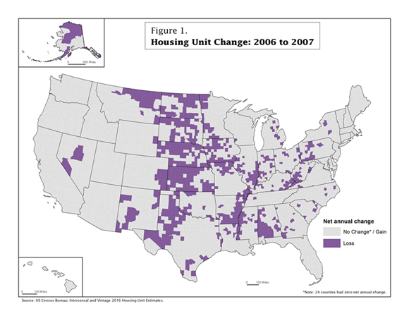
Between 2006 and 2007, the majority of counties (2,476 or 79 percent), stayed the same or had an increase in the number of housing units (shown in light gray). However, 666 counties (21 percent) experienced a decrease in housing units (shown in purple). Many places that experienced a decrease were clustered in the Midwest, along the Mississippi River, and in parts of Appalachia.
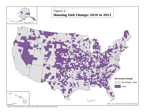
However, between 2010 and 2011 (Figure 2), the number of counties that experienced no change or gained housing units dropped to 1,829 (58 percent), and the number of counties that lost housing units increased to 1,313 (42 percent). The increase in the number of counties that lost housing units can be seen across the United States. Areas such as Appalachia and the Midwest that lost housing units between 2006 and 2007 continued to experience housing unit losses in additional counties. Other areas like the South, the Pacific Northwest and parts of the Northeast had numerous counties that gained housing units between 2006 and 2007 but then lost housing units between 2010 and 2011.
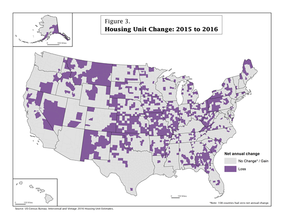
For 2015 to 2016 (Figure 3), the number of counties that stayed the same or gained housing units was 2,194 (70 percent) — an increase from 2010-2011, but still not as high as 2006-2007. Conversely, the number of counties that lost housing units between 2015 and 2016 decreased to 948 (30 percent). Compared to 2006-2007, the distribution of counties that lost housing units is somewhat different. Unlike the 2006-2007 map, which showed widespread housing unit declines in counties in Appalachia, the Midwest and along the Mississippi, the 2015-2016 map shows clusters of counties with housing unit losses in those areas as well as parts of the South, Northeast and West. States such as Florida, Oregon and Texas, which had numerous counties with housing unit loss between 2010 and 2011, showed more counties with gain between 2015 and 2016.
These three maps illustrate how housing unit change varies over time, both in the number of counties that gained or lost housing units and the geographic location of those counties. Some areas had counties that experienced housing unit loss at all three time points, while other areas had counties that experienced gain at some time points and loss at others.
To investigate the patterns of housing unit change for yourself, we invite you to dig into the recently released Vintage 2016 Housing Unit Estimates.
###
Share
 Yes
Yes
 No
NoComments or suggestions?


Top


