An official website of the United States government
Here’s how you know
Official websites use .gov
A .gov website belongs to an official government organization in the United States.
Secure .gov websites use HTTPS
A lock (
) or https:// means you’ve safely connected to the .gov website. Share sensitive information only on official, secure websites.
-
//
- Census.gov /
- Census Blogs /
- Random Samplings /
- Two Views of the Changes in Health Insurance Rates From 2008 to 2015
Two Views of the Changes in Health Insurance Rates From 2008 to 2015
Two Views of the Changes in Health Insurance Rates From 2008 to 2015
Today, the U.S. Census Bureau is releasing a tool to look at the history of health insurance coverage in the United States: an animated map showing changes in uninsured rates by state, going back to 2008. The shift in health insurance coverage rates begins slowly, with little change occurring from 2008 to 2013. Then in 2014, we see the colors for many states lighten on the map as uninsured rates dropped across the nation, when many provisions of the Patient Protection and Affordable Care Act (ACA) went into effect. Rates fell again in 2015, leaving only Texas and Alaska in the darkest shade of blue.
The map is effective in showing the sudden, widespread change in the uninsured rates, as well as regional differences in health insurance coverage. But maps like this one, which put states into broad groups to illustrate more general patterns, can show only approximate values. Can we learn anything by taking a more detailed view?
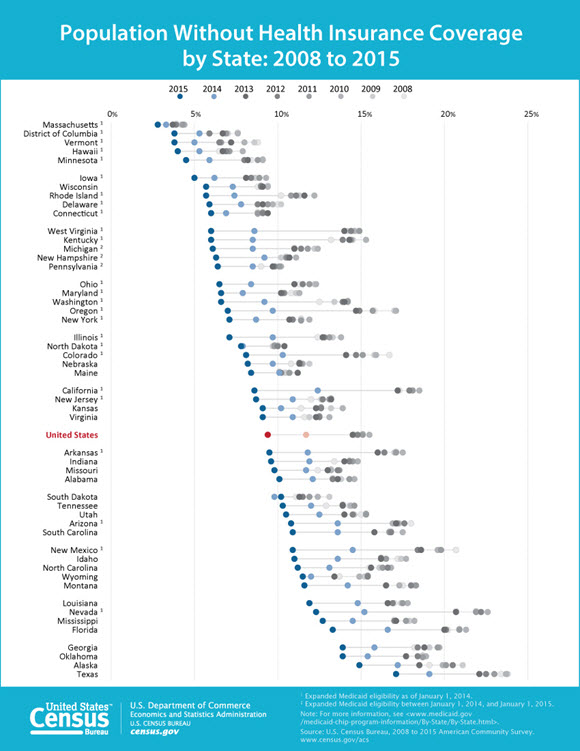
This dot plot displays the same dataset as the animated map, but with the states listed by their uninsured rates in 2015. On the right, dots for prior years cluster together, representing the fairly small movements in uninsured rates that occurred from 2008 to 2013. Then, in 2014, we see a shift for all states to lower uninsured rates (represented by the leftward movement of dots), followed by a further shift in 2015. It reflects the same pattern of sudden change as in the animated map. But we can now see that all states, including Texas and Alaska, experienced gains in health insurance coverage rates. We can also see that states that expanded Medicaid eligibility as part of the Affordable Care Act tended to experience larger decreases in their uninsured rates than did nonexpansion states. As shown in the figure, many Medicaid expansion states have uninsured rates close to or better than the national average, with few listed below it. States that did not expand Medicaid eligibility more often appear lower on the figure.
Share
 Yes
Yes
 No
NoComments or suggestions?


Top

