Homegrowns and Rolling Stones
Homegrowns and Rolling Stones
Most people in the United States — about 59 percent — live in the state where they were born. Nevertheless, that leaves a large share of people who have moved from their home state to another part of country. This migration dynamic varies, as some states are more likely to have a mostly homegrown population while other states have large shares of people born elsewhere.
The Census Bureau released two tables last month that make it easy for researchers and local communities to explore the places where people were born compared to where they currently reside, using American Community Survey data. The first table crosses state of birth by state of current residence. The second table is a Historic Place of Birth Dashboard, an interactive table that shows the total population over time and the population born in a selected state. This is the first time these tables have been available from the American Community Survey.
As you can see below, states in the South and Midwest regions have among the largest shares of homegrown populations. States in the West are among the states with the smallest shares, or have the largest population of residents flowing in and out of the state.
Table 1. States among the largest and smallest proportions of current residents born in state
| State | Percent born in state of current residence |
|---|---|
| Source: U.S. Census Bureau, 2014 American Community Survey | |
| Louisiana | 77.7% |
| Michigan | 76.7% |
| Ohio | 75.1% |
| Pennsylvania | 73.4% |
| Mississippi | 71.5% |
| … | … |
| Wyoming | 41.0% |
| Arizona | 39.0% |
| District of Columbia | 36.2% |
| Florida | 36.1% |
| Nevada | 25.8% |
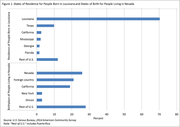
Table 1 presents data on people who currently live in the state where they were born, but there is another way to use this data. Instead of looking within a state to analyze who was born there and who was not, we can look at the distribution of all the states of current residence by the states where people were born (Figure 1). It is interesting to look at this table and ask ourselves: What varies among the set of states that makes for such different population distributions? It also begs the questions: Where do people born in these states move to and — particularly for the bottom five — where are they coming from?
To help answer these questions, we look at the two states at the extremes — Louisiana and Nevada. Of all people in the United States who were born in Louisiana, about 70 percent currently live there and about 30 percent are now scattered throughout the country. Most remain in the same general region. In comparison, only about one-quarter of people who were born in Nevada still live in Nevada. Just over 21 percent of Nevada’s current population was born outside the nation (i.e., in a U.S. island area or in a different country).
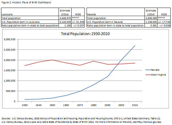
Using the second tool, we can look at the populations of Louisiana and Nevada going back to 1930. Below you can see a screen shot from the Historic Place of Birth Dashboard showing that from 1930 to 2010, Louisiana had a larger total population than Nevada, although Nevada’s population appears to be growing at a greater rate. When the ratio of the U.S. population born in a state to the state’s total population is greater than one, this indicates a net outmigration, or natives of the state have moved out at a higher rate than non-natives have moved into the state.
By using the data from Table 1 and the ratio of the total people born in a state to the state’s current population, we can make some assumptions about lifetime migration for Louisiana. About 77.7 percent of Louisiana’s population is made up of those who were born there, or “homegrowns,” (Table 1) meaning the remaining 22.3 percent are movers into Louisiana, or inmigrants. The ratio of 1.106 found on Figure 2 compares the population born in the state of Louisiana to Louisiana’s total population. This ratio means that homegrown Louisianans are about 10.6 percent larger a group than those currently residing in Louisiana. This indicates a net outmigration of homegrown Louisianans leaving compared to the number of inmigrants born elsewhere.
However, Nevada’s ratio of the population born in the state to Nevada’s current population is only 0.391. This implies that because Nevada’s current population is more than twice as large as the entire Nevada-born population, much of Nevada comprises people who moved to the state from somewhere else.
Using the 2014 state-to-state migration flows table, we know about 4.7 percent of Nevada’s population moved in from a different state in the last year, while the share of Louisiana’s inmigrants from other states and the national average is about 2.3 percent. In general, the migration rates for Nevada and Louisiana, including migration within the states, were 20.3 and 13.6 percent, respectively.
Together, these two products show how uniquely varied the populations are from state to state. Some states, like Louisiana, consist of people who are homegrown. Others, like Nevada, are made up of people from across the country.
Find data on place of birth and state-to-state migration flows, the Historic Place of Birth Dashboard, and more:


