Moving in the USA: Domestic Migration Before and After the Recession
Moving in the USA: Domestic Migration Before and After the Recession
Have you ever moved? If so, was it to a new state? Was it to a new county? Where we move has a big impact on our lives. In the same way, where people move can have a big impact on the United States. In many areas, it drives population change, and it can affect things from jobs, to services, to local infrastructure like buildings and roads.
Because it’s so important, we spend a lot of time measuring this movement when we create the U.S. Census Bureau’s official population estimates. Demographers call it “domestic migration,” and we get a lot of information about it from addresses reported on other government sources like Internal Revenue Service returns and Medicare enrollment (though if you’re interested, you can find Current Population Survey and American Community Survey migration data on census.gov). In 2014, about 18.9 million people moved between counties in the U.S., which is slightly down from about 19.1 million the year before.
Just as people moving around can have big impacts on social and economic events, the reverse is also true – social and economic events can influence migration. Take the Great Recession for example, which occurred from 2007 to 2009. We can see real differences in migration patterns across the country if we look at 2006 (the year before the recession) and numbers from our most recent estimates.
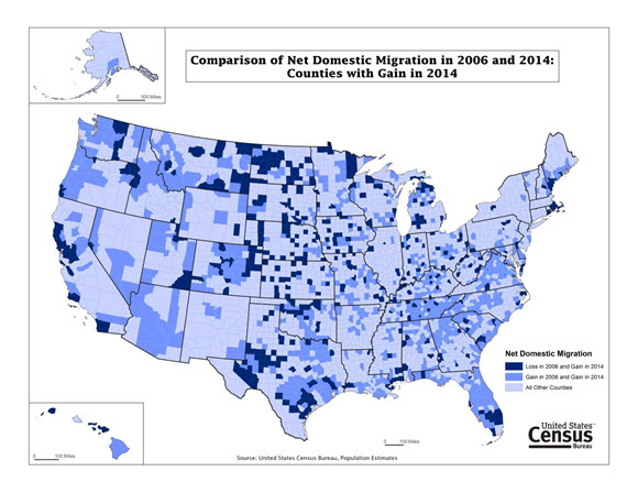
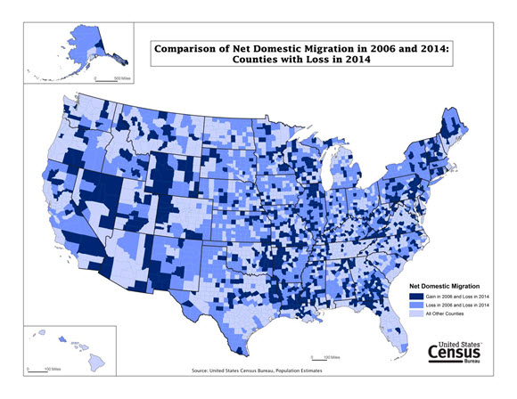
Below, we show two county-level maps that highlight areas with a net gain or loss of people through domestic migration in 2014. The counties that switched the net direction of their migration from 2006 to 2014 are shown in dark blue, whereas counties that gained or lost in both years are the middle blue.
Not including counties affected by Hurricane Katrina, the gaining county that shifted the most between the two years was San Diego, Calif. It lost almost 38,000 people through domestic migration in 2006. In 2014, it gained about 2,500. Broward County, Fla., also experienced a big shift, going from a loss of 27,000 to a gain of 2,400 in the same periods. From the map, we see several areas where gains were consistent in both years — Central Florida, some metropolitan counties in Texas, Northern Virginia and parts of the West. Other counties, like those in the central and northern Great Plains, seem like their gains popped up out of nowhere. While the pattern may seem unusual, it’s good to keep in mind that many of these shifts are fairly small (often less than a couple hundred either way). For example, Jackson County, Kan., changed from a loss of 24 to a gain of 126.
On the flip side, we can look at areas that lost people through migration in 2014. The biggest shift here was in Will County, Ill., which went from a gain of 17,000 in 2006 to a loss of about 2,900 in 2014. Again, a lot of the shifts this direction are small. Only three counties’ migration numbers changed by more than 10,000 (the other two being East Baton Rouge, La., and Kern, Calif.). Net loss counties are often located in rural areas in the Northeast and Midwest, and 2014 shows a number of new counties following that trend. We do see a few big changes, though, like many Nevada counties losing people through migration, where they were gaining them just eight years before. As you can see, social and economic trends, like the recession, often go along with changes in where people move.
Last week, the Census Bureau released a variety of migration data from the Current Population Survey, American Community Survey, and the Survey of Income and Program Participation. See the Random Samplings blog for more information.


