New Findings on Metropolitan and Micropolitan America and Change Between 2000 and 2010
New Findings on Metropolitan and Micropolitan America and Change Between 2000 and 2010
Within metro and micro areas, what were the geographic patterns of population growth between 2000 and 2010? How did growth compare in the central and outlying census tracts of the areas? How did population growth vary by age group, or by race and Hispanic origin? How does population growth for the decade compare when you examine different distances from city hall for a metro area’s largest principal city?
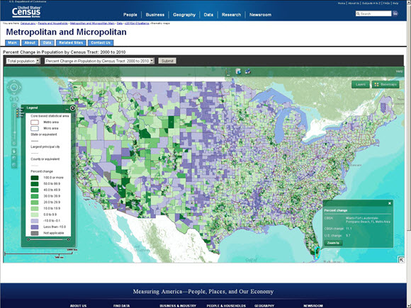
These are just a few of the questions that can be addressed with an online thematic map viewer, released today, or the recently released 2010 Census Special Report, Patterns of Metropolitan and Micropolitan Population Change: 2000 to 2010, and its associated online tools. The report examined population distribution and change in the nation’s largest centers of population and economic activity.
The thematic map viewer complements the report and provides a high-resolution view of 2010 Census residential patterns and changes in those patterns since Census 2000 using all census tracts in the United States and Puerto Rico. The map viewer displays data for 34 different characteristics, including population density and change, race and Hispanic origin, and broad age groups. With the map viewer, you can look at national patterns and zoom in to any metro or micro area. Alternatively, you can use a handy query tool that allows you to scroll through an alphabetized list of areas or find an area by typing in an area’s title. Clicking within a metro or micro area brings up a pop-up window containing summary data for the statistical area and the United States, adding context to the tract-level results.
In addition to the online thematic maps, three other online tools released with the report provide more detailed views of individual metro or micro areas:
- Population pyramids showing age and sex structure
- Comparative distance profiles that graph U.S. metro area populations and visualize how they are spatially distributed in relation to their largest city’s city hall
- Excel files containing Census 2000 and 2010 Census data for each metro or micro area, with population change for the decade already calculated
This suite of tools is a great way to examine both the broader patterns for all metro and micro areas as well as to dive a little deeper into the data. For example, the 2010 Census Special Report includes a section on metropolitan population distribution and change by distance from city hall. One of the findings showed metro areas with the largest population increase and decrease within two miles of the city hall for their most populous principal city, providing a general impression of the basic degree of centrality of a city’s population growth and decline. Using the data from the online distance profiles tool—which contains population data in one-mile increments from city hall—we see somewhat different patterns for the narrower one-mile distance. The Chicago area is still the largest gainer, just as it had been for two miles, but San Diego, CA and Portland, OR join the list of areas with the largest numeric gains in population.
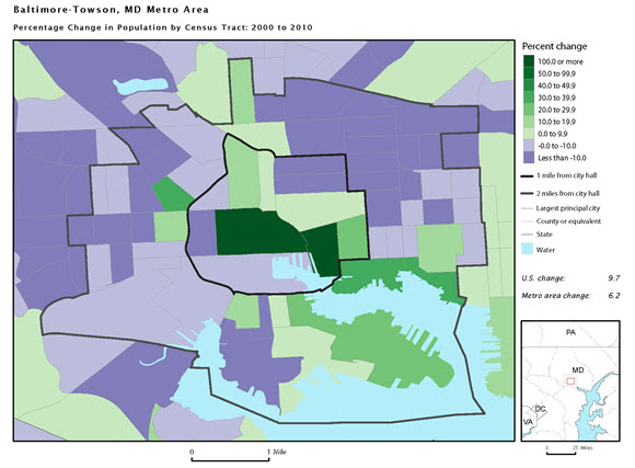
Intriguingly, some areas that declined in population within two miles saw population growth within the smaller one-mile distance. Baltimore, for instance, switches from population loss of about 10,000 at the two-mile distance to growth of almost 1,600 people within one mile. The pattern is visible in the below map of the central area of Baltimore City. Most of the census tracts in the one to two mile range from city hall show population declines, often of 10 percent or more, but within one mile of city hall, some tracts more than doubled in population. Other areas with losses of 5,000 or more at the two-mile distance but population gains in the smaller area include Toledo, Pittsburgh, and Grand Rapids.
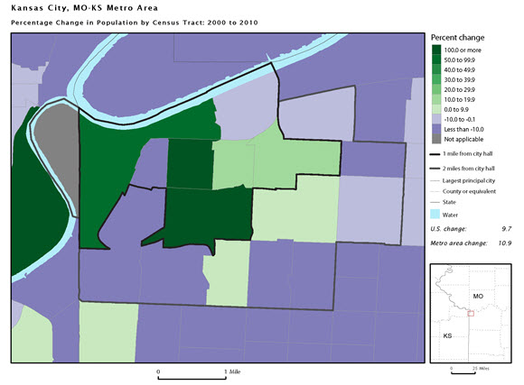
Similarly, some areas with overall population growth at the two-mile distance also saw faster population growth within one mile. In the Kansas City metro area, for instance, overall growth of about 1,000 persons at the two-mile distance reflected growth of 3,600 within one mile and population decline of 2,600 in the one-to-two mile range. In the map of the central part of the city of Kansas City, Mo., we see two census tracts more than doubled in population.
The report and additional content are available on the Census Bureau’s Internet site here.


