
Official websites use .gov
A .gov website belongs to an official government organization in the United States.
Secure .gov websites use HTTPS
A lock (
) or https:// means you’ve safely connected to the .gov website. Share sensitive information only on official, secure websites.

Topics
Data & Maps
Surveys & Programs
Resource Library
Visualizing Income and Poverty Estimates
Visualizing Income and Poverty Estimates
Recently the U.S. Census Bureau added interactive maps to the Small Area Income and Poverty Estimates program’s (SAIPE) website. This web-based interactive tool allows users to select, map, and display estimates of poverty by state, county and school district, and median household income by state and county.
The SAIPE program is the only source of poverty estimates for every county and school district based on the most recently available year of survey and auxiliary data. The school district poverty estimates are used by the U.S. Department of Education in the formula for allocating Title I funds, as directed by the No Child Left Behind Act of 2001. Currently $14 billion are allocated to school districts for Title I purposes.
COUNTY MAP: United States

The default display when you first click on the SAIPE interactive map link is state-level poverty for all people. To display the county map, choose counties in the first dropdown on the upper left, then press the Go button.
In addition to the poverty estimate for all ages, the user may also select percent in poverty for under age 18 or ages 5-17 in families. One can also view the county-level data for median household income.
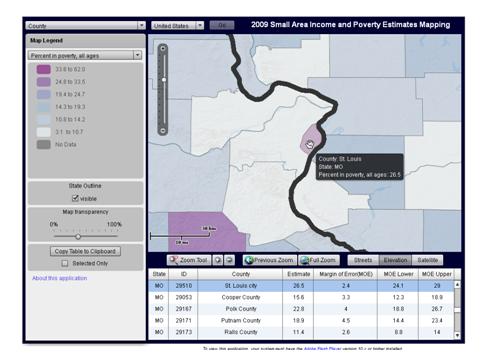
To see more detail on the interactive map, you can double-click to zoom in. There are also zoom controls below the map pane. This snapshot emphasizes the ability to concentrate on a specific geographic area. In this case, the range of median household income in the St. Louis area is the focus. Note that when one hovers over an individual area, a pop-up balloon displays the name and estimates value for that specific area. Also the table of estimates displayed below the map pane is linked to the area being highlighted.
MULTIPLE STATE COUNTY MAP: St. Louis Metropolitan Area
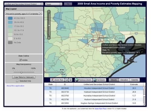
The final snapshot depicts school district poverty estimates for children age 5 to 17 in families, which can be viewed for each individual state. In the drop-downs at the top of the map pane, select “Unified and Elementary Districts” from the left drop down, and then Texas (for e.g.) from the right. The zoom feature allows you to focus on a detailed portion of the state and the hover feature allows you to view poverty estimates from one school district to another, as well as displaying the name to help one locate a specific district.
Note also you can select different backgrounds for the map from the dropdown box at the lower right of the map pane. You can have a blank background to present a clearer picture of the poverty differences in the area, or you can display street view as shown below, to assist in placing the district boundaries in the context of streets and cities in the area.
SCHOOL DISTRICT MAP: Houston Independent School District, Texas
The SAIPE interactive mapping tool was released in May 2011 and features estimates from 2009. More options for downloading the 2009 SAIPE estimates are also available. SAIPE estimates for 2010 are planned for release in December 2011.
Page Last Revised - June 11, 2022
✕
Is this page helpful?
 Yes
Yes
 No
No
 Yes
Yes
 No
No✕
NO THANKS
255 characters maximum
 255 characters maximum reached
✕
Thank you for your feedback.
Comments or suggestions?

Comments or suggestions?