Visualizing Foreign Trade Data
Visualizing Foreign Trade Data
Recently, the U.S. Census Bureau added interactive graphs to the U.S. international trade data released each month. For example, these two graphs help you better understand international trade in petroleum.
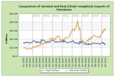
The first graph shows the effect of prices on petroleum imports. The orange line shows the “nominal value” of petroleum imports for the month. The blue line shows the “real dollar” value, adjusted for 2005 prices. While the nominal value has a range of over $40 billion, the real dollar value range is less than $8 billion. To see the values for a month, just hover over the data point. (Visit the Foreign Trade website to interact with the graph). You can also turn either data series on-and-off by clicking it in the ledger.
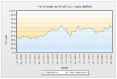
You may have already heard of the U.S.’s significant imports of petroleum, but are you aware of the role petroleum plays in the U.S. trade deficit? Since 2006, petroleum has accounted for between 32% and 65% of the U.S. trade deficit in a given month. This interactive graph shows petroleum as a percent of the U.S. deficit for each month. You can hover over a data point to see the exact figure for that month.
All of the graphs we’ve added so far can be found here. We plan to add many more interactive graphs in the coming weeks and months. If there are any suggestions for data series you’d like to see included, please leave a comment below.
For more information on the U.S. Census Bureau’s Foreign Trade division.
To read the Foreign Trade blog.


