Comparing the Official Census Counts to Other Ways of Estimating the Population Size
Comparing the Official Census Counts to Other Ways of Estimating the Population Size
As I mentioned in an earlier post, “Demographic Analysis” And The Census, one method of measuring the size of the US population relies on historical birth registration, death registration, as well as estimates of in-migration to and out-migration from the United States. Census Bureau demographers completed the assembly of national estimates for the April 1, 2010 population of the United States, and we released them on December 6, 2010. Since demographic analysis produces only national estimates, it cannot be used for the reapportionment and redistricting purposes required of the 2010 Census. It is, however, a useful comparison to the official Census counts.
Following the advice of demographers from around the country and our own internal experts, we developed multiple estimates – ones that make different assumptions about the components of international migration and about completeness of vital statistics records. Estimates of international migration vary depending on the source of the data and the judgments of the demographer constructing them. All five of the demographic analysis estimates are considered plausible and no one estimate is clearly the best.
For each age, sex, and race group, we presented five different estimates, each based on a different set of plausible assumptions. It is unusual to show multiple estimates in this manner, but it is the honest way to portray our uncertainty about the demographic analysis estimates.
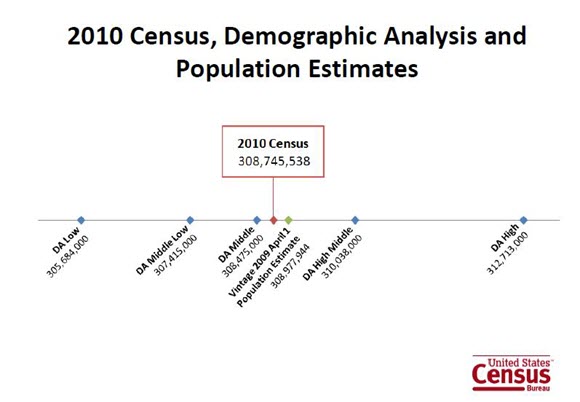
The range of the five demographic analysis estimates is from 305.7 million to 312.7 million. The middle estimate is 308.5 million. You can see the full documentation of the demographic analysis estimates here.
Throughout the decade we also estimate the population size by race/ethnicity, age, and gender using another method, which we call “population estimates.” These differ from those of demographic analysis because they are based on the 2000 census, with adjustments on that base for births, deaths, immigration, and emigration since the Census. These estimates are used in our population clock, which is continuously updated. On April 1, 2010, the population estimate was about 309 million.
When we released the official population count from the 2010 Census, of 308,745,538, we learned how close the national estimate came to the official count. There were very small differences between the official count, the demographic analysis, and the population estimate, all within .1% of one another.
This is comforting to the statisticians and demographers who are trying to evaluate the national totals. In short, when we try to measure the size of the national population in three different ways we achieve about the same national total.
It’s relevant to compare the graph above to the comparable numbers from the 2000 Census. In that year the official census count was 281,421,906, the initial demographic analysis estimate was 279.6 million, and the population estimate of April 1, 2000 was 274.6 million. The percentage disagreement between the census and the other two estimates was .65%, and 2.42%, respectively. Statisticians and demographers would generally prefer the closeness of the three measures we see in 2010 to that in 2000. Some of the closeness was likely due to improvements in the demographic analysis and population estimates, and some to improvements in the 2010 Census.
As more 2010 Census statistics are released, we can continue to compare them to the demographic analysis and population estimates. For example, although we don’t have sub-national demographic analysis estimates, we will have county- and state-level population estimates. Thus, we can do the same comparison at the state and county level.
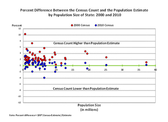
Statisticians and demographers expect that when population estimates for smaller geographical areas are examined, that they will be noisier, subject to more unexplained variability, than the comparison above on the national level. It’s common to see more variability for smaller areas. For example, look at the chart for the state level below.
The x-axis of the chart is the official census count of the state. The y-axis is the percentage difference between the census count and the population estimate. Each point is a state, with blue points from the 2010 and red points from 2000. The points above the x-axis are states where the population count was higher than the official census count; those below, where the count was lower than the estimate.
Note that all of the red points are above the x-axis, showing higher census counts versus population estimates for all states in 2000. We now believe the year 2000 population estimates underestimated net international migration during the 1990s. This was particularly true for Hispanics, especially Hispanic men in the younger working ages. We also believe that there was differential coverage between the 1990 census and Census 2000. The population estimates begin with the census as a base and build forward. In the 1990 Census, the census had a larger net undercount than the 2000 census.
In other words, the year 2000 population estimates were building off a base that we believe was too low (the 1990 census) and were being compared to a census that was much better in terms of net undercount. The 2010 blue points, in contrast, are nicely spread about the x-axis, showing more agreement with the 2010 official census counts. One can see that states with smaller populations tend to show a larger spread about the x-axis. Some states are above the line; some below, with much more variation than for larger states. This illustrates the noisier nature of the differences for smaller geographical areas.
So far, we like what we’re seeing on these comparisons. Soon we’ll be able to look at the county-level estimates, although the noise level gets even higher with those.


