
Official websites use .gov
A .gov website belongs to an official government organization in the United States.
Secure .gov websites use HTTPS
A lock (
) or https:// means you’ve safely connected to the .gov website. Share sensitive information only on official, secure websites.

Topics
Data & Maps
Surveys & Programs
Resource Library
New Interactive Tools Make Finding Data Faster, Easier
If a picture is worth a thousand words, is it also worth a thousand data points and the stories those data tell?
The U.S. Census Bureau is betting it is. Charts and maps are nothing new for the nation’s leading source of data about our people and economy. For more than a decade, the Census Bureau’s Longitudinal Employer-Household Dynamics has given users the ability to zoom in on local jobs data.
We’re expanding that capability.
Interactive charts and maps allow you to drill down to the data that matters to you — data about your town, your age group, your data interests.
“We release about 11 billion new estimates from the American Community Survey every year, covering more than half a million separate geographies,” said Jennifer Ortman, an assistant division chief with the American Community Survey Office. “It can be overwhelming. Visualizations make it easier to find patterns in the data and get what you need.”
Interactive upgrades:
- QuickFacts: No longer just static data tables, QuickFacts now lets you find and see data by clicking on maps and charts.
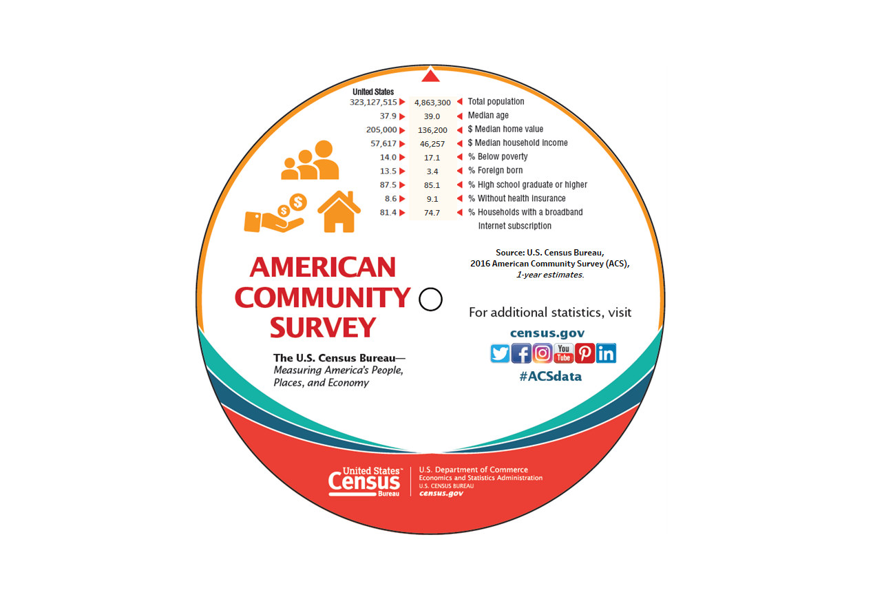
- Tableau Data Release Visualizations: Using the data visualization tool Tableau, the Census Bureau can now add interactivity to just about any data. Check out this interactive data map for the 2016 American Community Survey (ACS) one-year data release, or this ACS interactive data wheel.
- Data Linkage: This interactive tool from Census Bureau administrative records experts illustrates the kind of information made possible when state-level Supplemental Nutrition Assistance Program (SNAP) data are combined with ACS data.
- Data.Census.Gov Beta Site: This beta site will ultimately combine all data searches in the Census Bureau web site into one search-driven, interactive, data discovery experience. It’s a work in progress with ongoing updates.
To see more, visit our interactive maps and data visualizations pages.
Shelly Hedrick is special assistant in the U.S. Census Bureau's Communications Directorate.
America Counts Story
Are Smartphones the Key to Crossing the Digital Divide?
Handheld devices, such as smartphones, may be a game changer when it comes to increasing internet access for low-income households.
America Counts Story
Millennials Are Helping Philadelphia Rebound
Philadelphia's population had fallen to its lowest levels since 1900. Millennials now are key to Philadelphia's population turnaround.
America Counts Story
What's in a Name?
The five most frequent surnames in 2010 remained mainly reported by whites and blacks but Hispanic surnames rose in popularity.
Page Last Revised - January 20, 2022
✕
Is this page helpful?
 Yes
Yes
 No
No
 Yes
Yes
 No
No✕
NO THANKS
255 characters maximum
 255 characters maximum reached
✕
Thank you for your feedback.
Comments or suggestions?

Comments or suggestions?