
Census.gov > Library > Infographics & Visualizations > 2013 > Shifting Occupational Shares by Sex: 2000 to 2006-2010
Library
Shifting Occupational Shares by Sex: 2000 to 2006-2010
July 15, 2013These two treemaps show change in labor force representation (or share) of men and of women between two time periods, while indicating the extent of this shift and the size of the occupation group relative to other occupations. The smaller treemap is for 22 occupation groupings, while the larger treemap is for more than 500 occupations within those 22 groupings. The relative size of the block signifies the size of the occupation; color shade and intensity show the shift in gender representation, i.e., the deeper the color, the larger the shift. Overall, men’s representation grew in computer occupations and in some production occupations. We also see an increase in women’s representation among many health care occupations, including dentists, veterinarians, pharmacists, and physicians. Little changed among occupations that were mostly male- or female-dominated, such as construction workers and school teachers.This graphic represents a portion of a larger poster that is available at www.census.gov/people/io/publications/wp_posters.html.

SOURCE: 2000 and 2006-2010 Equal Employment Opportunity Tabulation.
NOTE: For more information on the EEO tabulation, please visit www.census.gov/people/eeotabulation/
Recent Data Visualizations
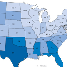 Population Without Health Insurance
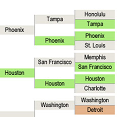 Population Bracketology
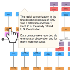 Measuring Race and Ethnicity Across the Decades: 1790-2010
 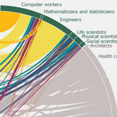 Where do college graduates work?
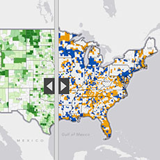 Story Maps Illustrate Population Change
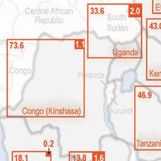 HIV/AIDS Impact in Africa
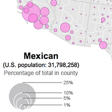 Distribution of Hispanic or Latino Population by Specific Origin: 2010
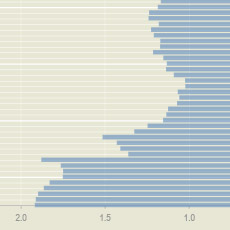 A Century of Population Change in the Age and Sex Composition of the Nation
 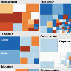 Shifting Occupational Shares
 Metro Area Density
 Work-Life Earnings
 Census Flows Mapper
 Migration Between Calif. & Other States
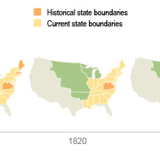 U.S. Territory and Statehood Status
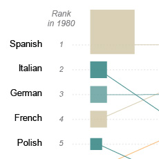 Spoken Languages Other than English
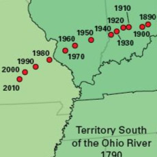 Center of Population, 1790-2010
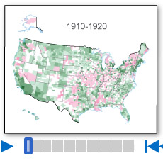 Population Change by Decade
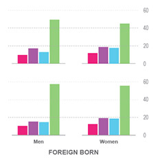 Without A High School Education
 A Decade of State Population Change
 State-to-State Migration for States of 8 Million or More
 Population Under 5 Years Old by Congressional District
 Components of Metro Area Change
 Blooming States
 Coastline County Population
 Coastline County Population
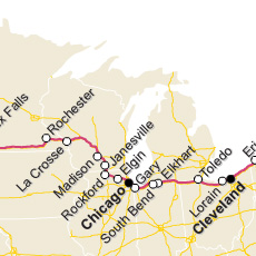 I-90 Population Density Profile, 2010
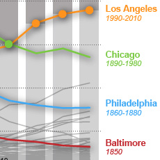 Second Cities: Keeping Pace with a Booming New York
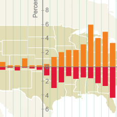 By the Grid: Population Shift to the West and South
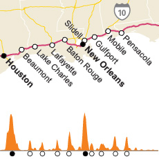 I-10 Population Density Profile, 2010
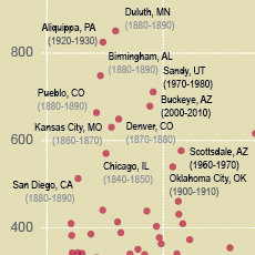 Booming Cities Decade-to-Decade, 1830-2010
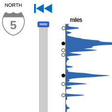 I-5 Population Density Profile, 2010
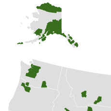 Islands of High Income
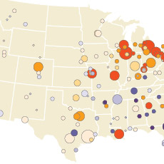 The Great Migration, 1910 to 1970
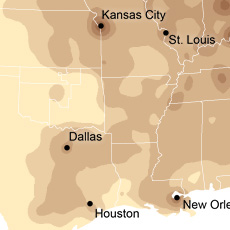 Following the Frontier Line, 1790 to 1890
 Changing Ranks of States by Congressional Representation
 Cartograms of State Populations in 1890, 1950, and 2010
 Before and After 1940: Change in Population Density
 From Physical to Political Geography
 Differential City Growth Patterns
 I-95 Population Density Profile
 Increasing Urbanization
 Gaining and Losing Shares
 Top 20 Cities
By the Grid: Population Shift to the West and SouthI-10 Population Density Profile, 2010