Title Core
The Core Component Title Component is a section heading component that features in-place editing.
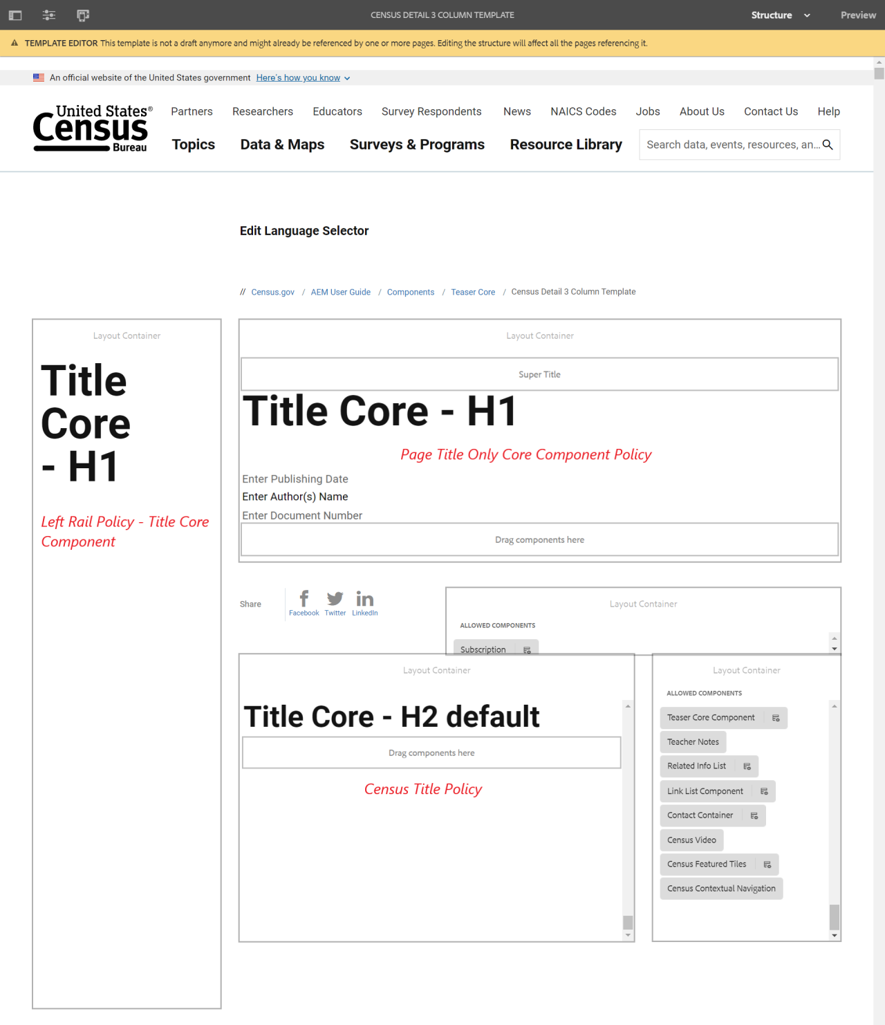
Example
View on public site:

Examples by Template
When to Use
The Title Component is intended to be used as the title or heading of a section of content. The available heading levels can be defined by the template author in the design dialog. The content editor can select from available headings levels in the edit dialog. For added convenience, simple in-place editing of the heading text is also available.
Usage
The Title Core component is intended to be used as the title or heading of a section of content. Headings are used for highlighting important topics. They provide valuable information and tell us about the structure of the document.
H1 is reserved for the main page title and should only be one H1 tag per page. Content authors can select from available headings levels in the configure dialog. There are 5 additional heading elements h2, h3, h4, h5, and h6; with h2 being the highest level and h6 being the lowest. Header sizes should be used in order of the hierarchy of the page.
Title Core - h2 (default)
Title Core - h3
Title Core - h4
Title Core - h5
Title Core - h6
Configure Dialog
The configure dialog allows the content author to define the title text as well as select the heading level.
Tab: Properties

- Title - If empty the page title will be used
- Type / Size - Defines the heading level of the title
- Link - Defines the content to which the title will link. This can be a path to a content page, an external URL, or a page anchor.
- Open link in new tab - When checked, the link will open in a new browser tab.
- ID - This option allows to control the unique identifier of the component in the HTML and in the Data Layer.
- If left blank, a unique ID is automatically generated for you and can be found by inspecting the resulting page.
- If an ID is specified, it is the responsibility of the author to make sure that it is unique.
- Changing the ID can have an impact on CSS, JS and Data Layer tracking.
The following attributes are disabled per component policy:
- Link - Defines the content to which the title will link. This can be a path to a content page, an external URL, or a page anchor.
- Link Label - Value of an aria-label attribute for the title's link, which describes the title's link.
- Link Title Attribute - HTML TITLE attribute to apply to the component's link.
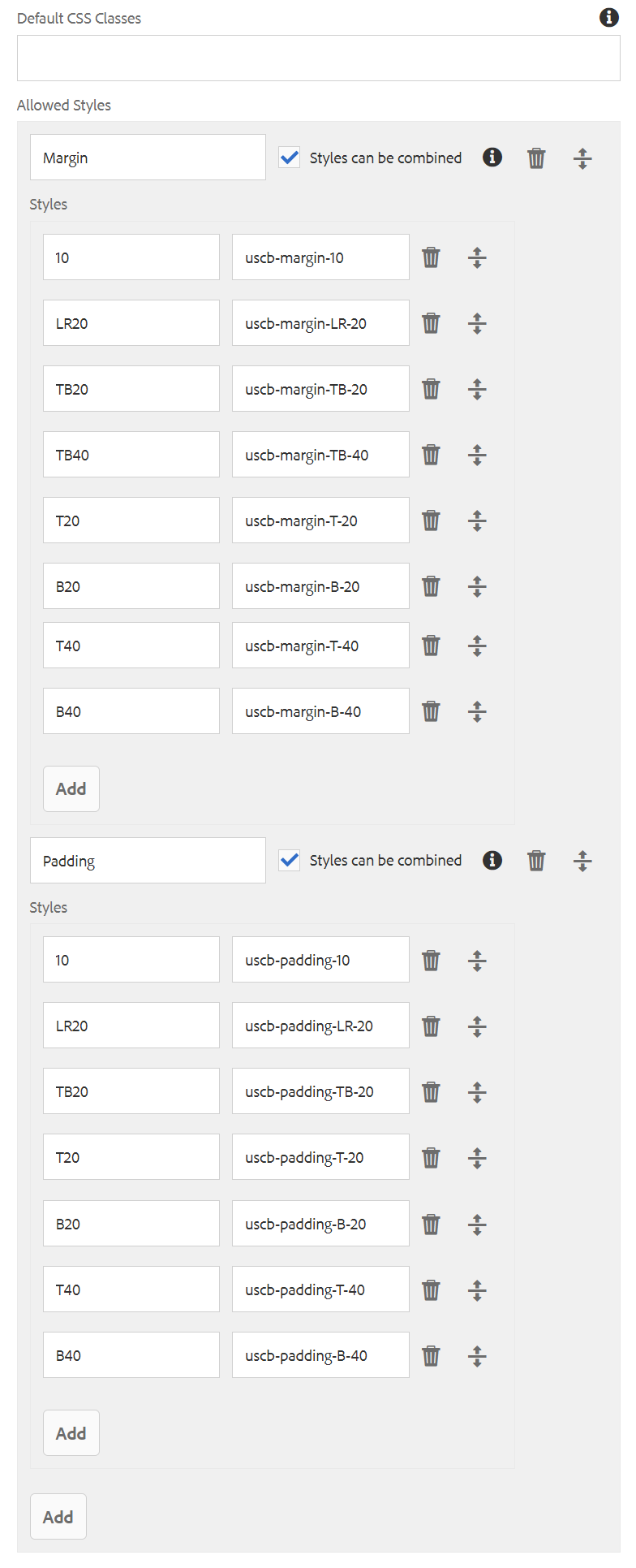
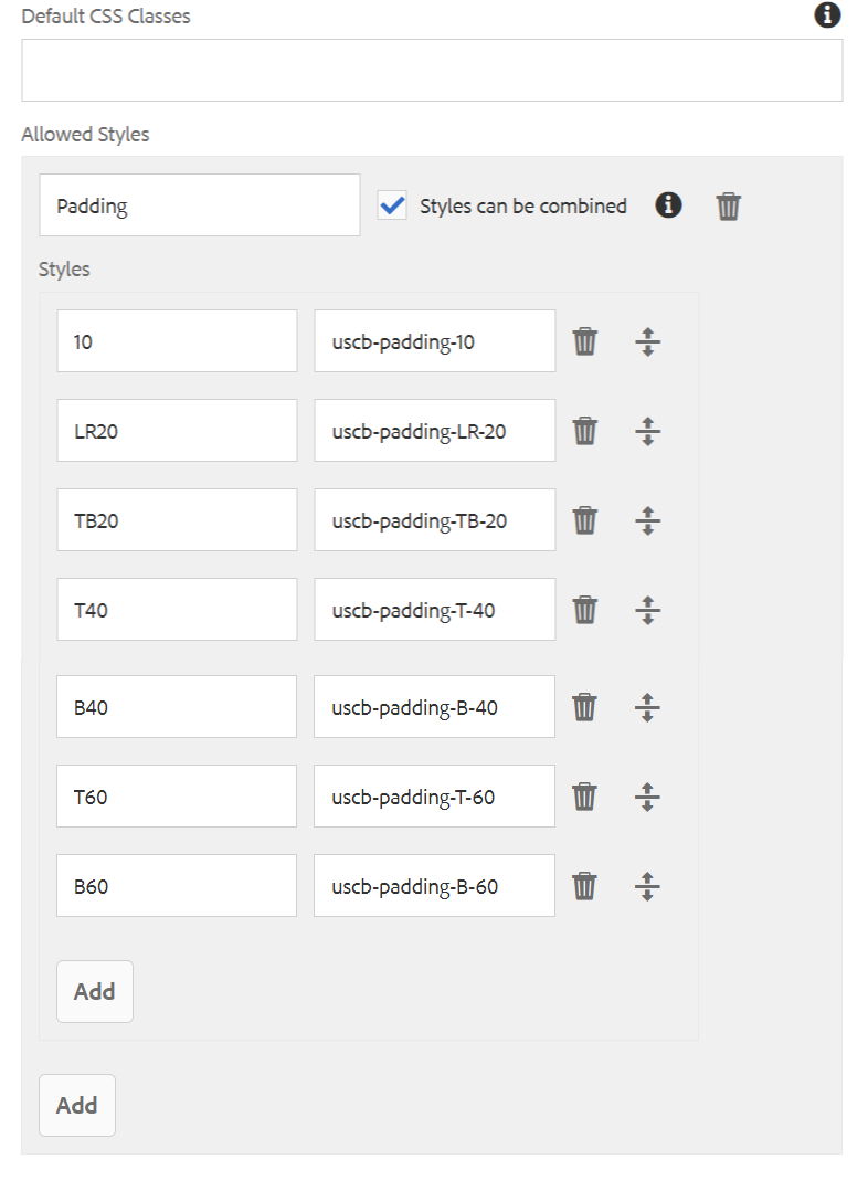
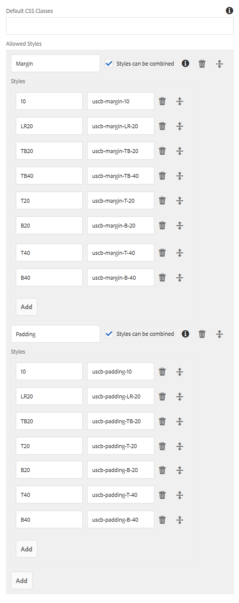
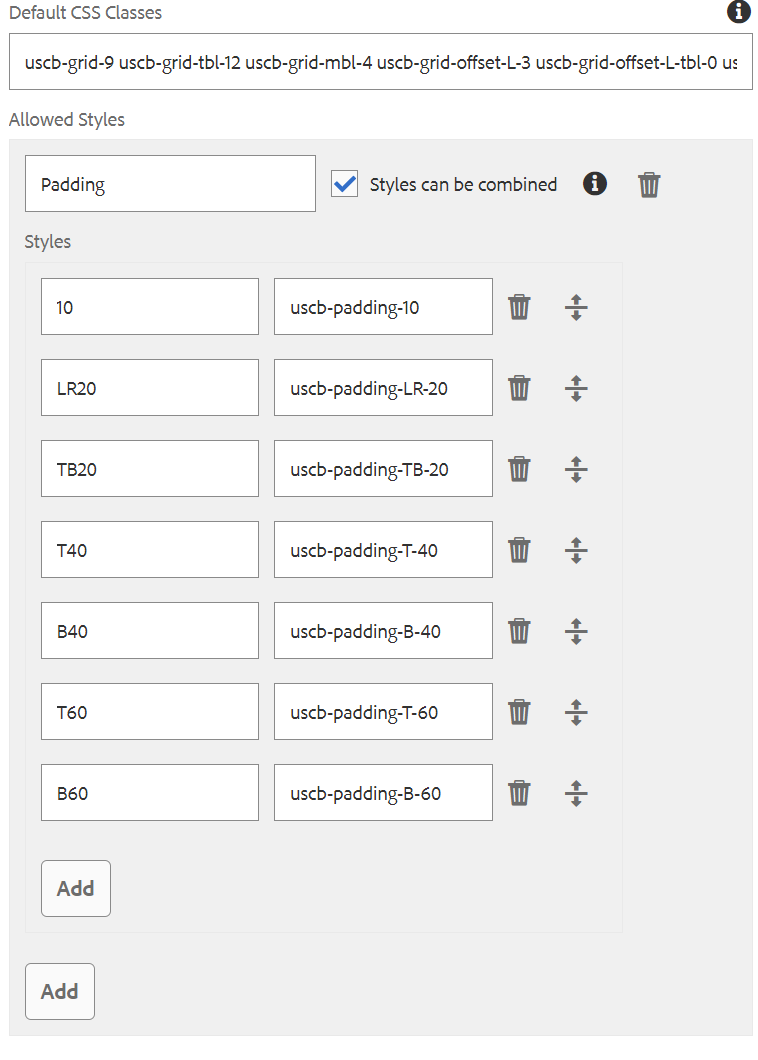
Tab: Styles

The Title Component supports the AEM Style System.
Use the drop-down to select the styles that you want to apply to the component. Selections made in the edit dialog have the same effect as those chosen from the component toolbar.
Styles must be configured for this component in the design dialog in order for the drop down menu to be available.
How to Edit
The content author can use the In-place Editor on the component toolbar to edit the text of the title simply without having to enter configure dialog:
1. Select the Title Core component and choose the "Edit" button
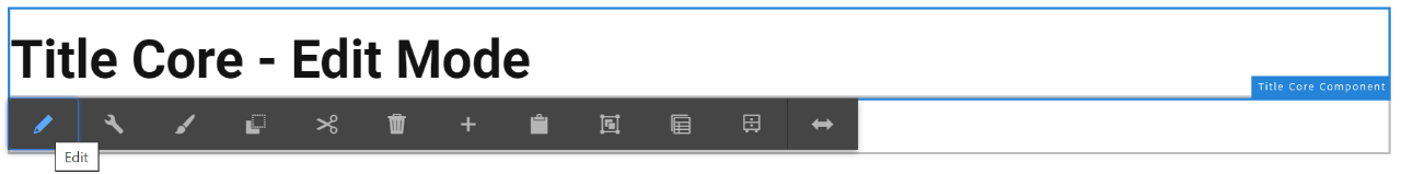
2. Edit the title directly on the page.

How to Style
The content author can use the Styles System on the component toolbar to customize the layout and positioning of the title:
1. Select the Title Core component and choose the "Styles" button
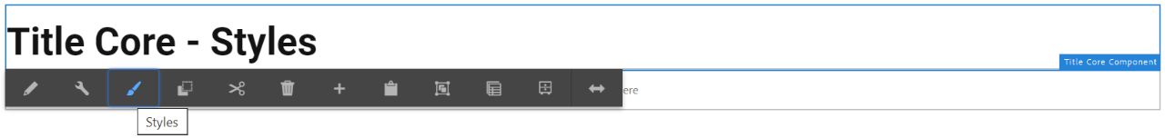
2. Use the drop-down to select the styles that you want to apply to the component. Available styles will vary by template and component policy.
Selections made in the component toolbar have the same effect as those chosen from the edit dialog.
Component Policy
Census Title Policy
Page Title Only Core Component Policy
Left Rail Policy - Title Core Component
Census 2colRight Title Core Component Policy
Faceted Page Title Only Core Component Policy
 Yes
Yes
 No
No 255 characters maximum reached
Comments or suggestions?