Text Core
The Text Core component is a text-composing component that offers rich text editing and formatting options.
Usage
The Text Core component is used to place body text onto an AEM page. It offers a robust rich text editor that allows for easy text editing.
The Edit dialog features in-line editing with limited options.
The Configure dialog features full-screen editing with full functionality.
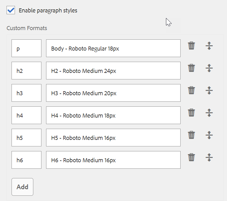
Using the Design dialog, text formatting options such as headings, special characters, and paragraph styles can be configured for the template for the content author.
Edit Dialog

The Edit dialog features simplified, in-line editing with limited options.
Properties and Styles must be configured for this component in the Design dialog in order for them to be available to authors.
Below are the formatting options typically available on the in-line editor along with an explanation of their use.

Used to apply bold formatting to selected text or bold text entered after the cursor.

Used to apply italicized formatting to selected text or italicize text entered after the cursor.

Used to convert the selected text into a hyperlink, or to modify an already defined hyperlink. This option is only active when text is already selected. It will open a window with additional options for setting the link.
As a best practice, you typically should not use in-line links on your page.
The Path is the URL to the page you are linking to.
If the path is not located on census.gov, then the full URL should be used.
If the path is located on census.gov, then the domain of the URL should be replaced with:
/content/census/en/
Please see an example of this below.
By selecting the checkmark next to the Path field, you can link to a page within AEM if you do not have the URL.

The Alt Text is the text that will show when you hover your mouse over the hyperlinked text.
As a best practice, you should always include alt text when the context of the sentence including the hyperlink does not clearly state where the link will lead. You should ensure you are clear and concise when entering alt text.

The Link Behavior is the dropdown selection at the bottom of the hyperlink pop-up. This is used to determine what happens when a user clicks on the linked text. The default selection in the dropdown is Target.
As a best practice:
- Links leading to a page on census.gov are opened in the Same Tab.
- Links leading to a page with a data tool on census.gov may be opened in a New Tab.
- Links leading to a page outside of census.gov are opened in a New Tab.
The Target selection is identical to Same Tab.
The Parent Frame and Top Frame selections are not used.

Used to remove a link already applied to the selected text. This option is only active when a link is already selected.

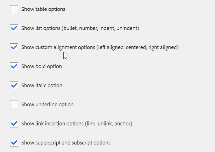
Used to align the text to the left margin.

Used to center the text.

Used to align the text to the right margin.

Used to align text so that both the left and right sides of the text block are even.

Used to format the selected text as a bulleted list or begin the insertion of a bulleted list after the cursor.
To end a bulleted list, tap or click the Bullet button again or enter two carriage returns.

Used to format the selected text as a numbered list or begin the insertion of a numbered list after the cursor.
To end a numbered list, tap or click the Numbered button again or enter two carriage returns.

Used to decrease the indentation level of the selected text or text entered after the cursor.
Only active if the selected text or position of the cursor is already indented.

Used to increase the indentation level of the selected text or text entered after the cursor.
Configure Dialog

The Configure dialog features full-screen editing with full functionality.
Properties and Styles must be configured for this component in the Design dialog in order for them to be available to authors.
Tab: Properties

The Properties tab of the Configure dialog offers the standard rich text formatting tools a user would expect to compose text.
Properties must be configured for this component in the Design dialog in order for them to be available to authors.
Below are the formatting options typically available in the Properties tab along with an explanation of their use.

Used to apply bold formatting to selected text or bold text entered after the cursor.

Used to apply italicized formatting to selected text or italicize text entered after the cursor.

Used to apply underlined formatting to selected text or underline text entered after the cursor.

Used to format selected text or text entered after the cursor as subscript.

Used to format selected text or text entered after the cursor as superscript.

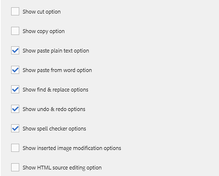
Pastes any copied text as plain text without any formatting.
When selecting this option, a window opens where the text can be pasted as a preview before it is inserted into the text.

Pastes any copied text while maintaining its formatting.
When selecting this option, a window opens where the text can be pasted as a preview before it is inserted into the text.

It is also possible to paste formatted text directly without selecting this option.

Used to convert the selected text into a hyperlink, or to modify an already defined hyperlink. This option is only active when text is already selected. It will open a window with additional options for setting the link.
As a best practice, you typically should not use in-line links on your page.
The Path is the URL to the page you are linking to.
If the path is not located on census.gov, then the full URL should be used.
If the path is located on census.gov, then the domain of the URL should be replaced with:
/content/census/en/
Please see an example of this below.
By selecting the checkmark next to the Path field, you can link to a page within AEM if you do not have the URL.

The Alt Text is the text that will show when you hover your mouse over the hyperlinked text.
As a best practice, you should always include alt text when the context of the sentence including the hyperlink does not clearly state where the link will lead. You should ensure you are clear and concise when entering alt text.

The Link Behavior is the dropdown selection at the bottom of the hyperlink pop-up. This is used to determine what happens when a user clicks on the linked text. The default selection in the dropdown is Target.
As a best practice:
- Links leading to a page on census.gov are opened in the Same Tab.
- Links leading to a page with a data tool on census.gov may be opened in a New Tab.
- Links leading to a page outside of census.gov are opened in a New Tab.
The Target selection is identical to Same Tab.
The Parent Frame and Top Frame selections are not used.

Used to remove a link already applied to the selected text. This option is only active when a link is already selected.

Used to search the text for occurrences of a specified text string. If you are looking for an exact match according to the case, select Match Case before searching.
If a match is found, it is highlighted, and the search dialog is dimmed. Select the Find button again in the dimmed dialog to search for the next occurrence of the text string.
If no additional occurrences are found, a message will be displayed, and the search will restart from the beginning of the text.

Used to search the text for occurrences of a specified text string and replace the matches with another text string.
Enter the text you are searching for as well as the text it should be replaced with. Select Find to begin the search. If you are looking for an exact match according to the case, select Match Case before searching.
If a match is found, it is highlighted, and the search dialog is dimmed. Select the Find button again in the dimmed dialog to search for the next occurrence of the text string.
If no additional occurrences are found, a message will be displayed, and the search will restart from the beginning of the text.
When the text you want to replace is highlighted, select Replace. If you want to replace all occurrences of the searched text, select Replace All.

Used to align the text to the left margin.

Used to center the text.

Used to align the text to the right margin.

Used to format the selected text as a bulleted list or begin the insertion of a bulleted list after the cursor.
To end a bulleted list, tap or click the Bullet button again or enter two carriage returns.

Used to format the selected text as a numbered list or begin the insertion of a numbered list after the cursor.
To end a numbered list, tap or click the Numbered button again or enter two carriage returns.

Used to decrease the indentation level of the selected text or text entered after the cursor.
Only active if the selected text or position of the cursor is already indented.

Used to increase the indentation level of the selected text or text entered after the cursor.

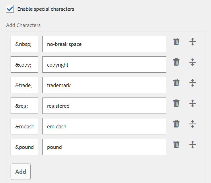
Used to insert special characters into the text. Selecting this option opens a window where the available characters are displayed.

Used to reverse the last edit made to the text in the Text Core. Can be used multiple times in succession to reverse multiple edits.

Used to restore edits that were reversed by the undo action.

Used to check the spelling of the text content. Possible misspellings are underlined with broken, red lines.
Tab: Styles

The Text Core component supports the AEM Style System.
Use the drop-down to select the styles that you want to apply to the component. Selections made in the Configure dialog have the same effect as those chosen from the component toolbar.
Styles must be configured for this component in the Design dialog in order for the drop down menu to be available to authors.
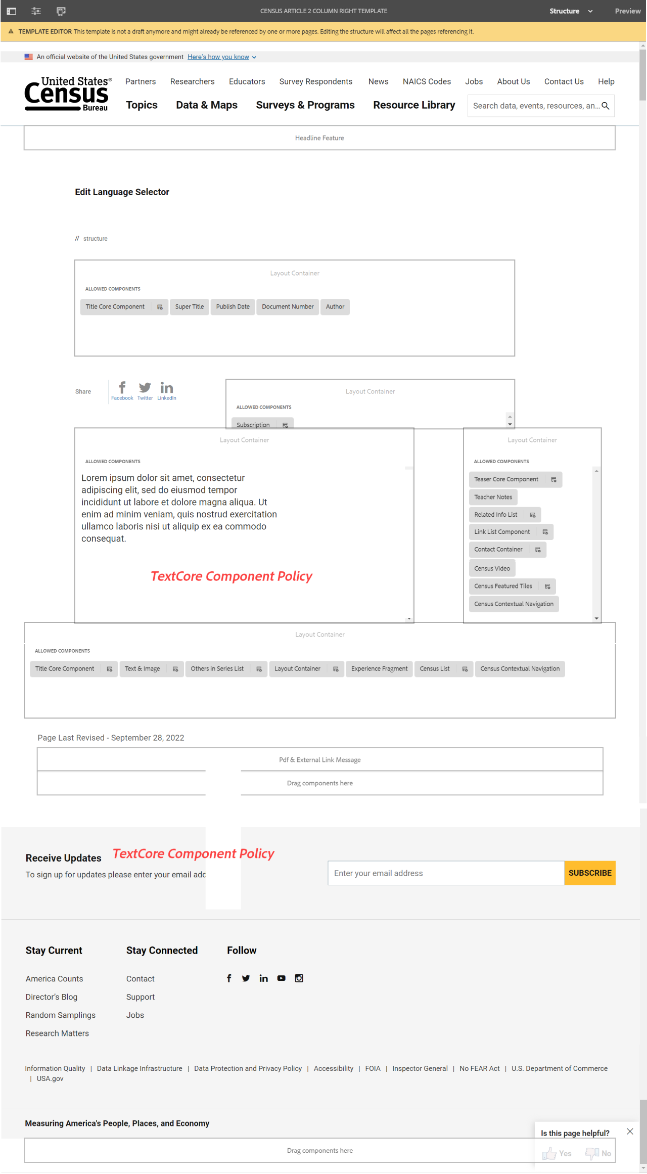
Examples
View these examples on the public site:

Examples by Template
Census 2 Column Right