Layout Container
The Layout Container component is available in the component browser and provides a way for authors to organize content and components. The Layout Container widths for different views/windows is defined using the available styles.
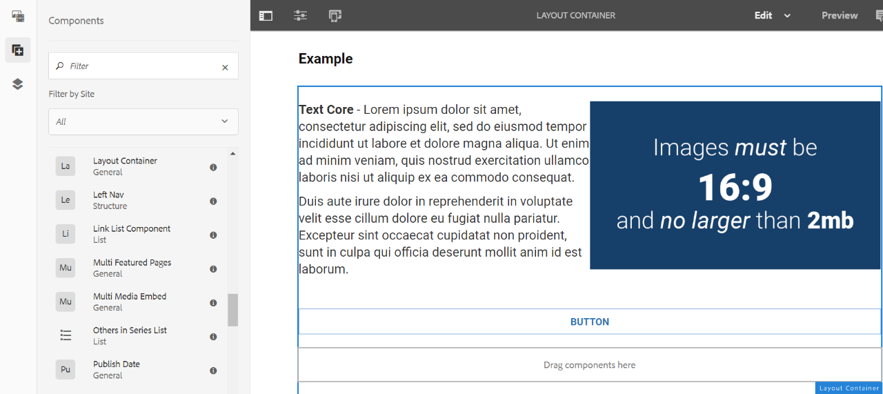
Example
View on public site:

Example By Template
Usage
A Layout Container is a paragraph system that:
- Contains other components.
- Defines the layout.
- Responds to changes.
Layout Containers are best used to control the layout of content in different views, such as mobile versus desktop.
Authors can set the width for each layout container using the available styles for desktop, tablet and mobile.
The example below shows three layout containers:
This example to get 2 columns on the 2 column left template uses 3 layout containers. Each layout container has borders applied using styles so you can see their placement.
1. The full size layout container to hold the 2 smaller layout containers.
2. The second layout container to the left is 5 columns wide in desktop and tablet and 4 in mobile.
3. The third layout container to the right is 4 columns wide in desktop and tablet and 4 in mobile.
Layout container 2
Text Core - Lorem ipsum dolor sit amet, consectetur adipiscing elit, sed do eiusmod tempor incididunt ut labore et dolore magna aliqua. Ut enim ad minim veniam, quis nostrud exercitation ullamco laboris nisi ut aliquip ex ea commodo consequat.
Duis aute irure dolor in reprehenderit in voluptate velit esse cillum dolore eu fugiat nulla pariatur. Excepteur sint occaecat cupidatat non proident, sunt in culpa qui officia deserunt mollit anim id est laborum.
Layout container 3
How to Style
The content author can use the Styles icon (the paintbrush) on the component toolbar to enable the various available styles, including controlling the component width at different breakpoints.
The maximum number of columns on the page is 12, but the amount of columns varies depending on template. See the Component Policy Styles for more information.
3 Column Template
A 3-column template has three sections on the page: a left navigation area, the middle main content area, and the right rail (related items, etc.). If you are attempting to do a 2-column layout in the main content area, each layout container would have a designated width of 2 for desktop, 6 for tablet, and 4 for mobile.
Main content area: desktop is 6 columns, tablet is 12 columns, mobile is 4 columns. Authors can control the width of layout containers within this area.
Bottom content area: desktop is 12 columns, tablet is 12 columns, mobile is 4 columns. Authors can control the width of layout containers within this area.
Left rail area: desktop is 3 columns, tablet is 12 columns, mobile is 4 columns. Authors are unable to edit or change these values.
2 Column Left Template
A 2-column template has two sections on the page: a left navigation area and the main content area. If you are attempting to do a 2-column layout in the main content area, one layout container would have a designated width of 4 or 5 for desktop, 6 for tablet, and 4 for mobile. The other layout container would have either 4 or 5 for desktop, 6 for tablet, and 4 for mobile.
Main content area: desktop is 9 columns, tablet is 12 columns, mobile is 4 columns. Authors can control the width of layout containers within this area.
Bottom content area: desktop is 12 columns, tablet is 12 columns, mobile is 4 columns. Authors can control the width of layout containers within this area.
Left rail area: desktop is 3 columns, tablet is 12 columns, mobile is 4 columns. Authors are unable to edit or change these values.
2 Column Right Template
A 2-column right template has two sections on the page: the main content area and a right rail. If you are attempting to do a 2-column layout in the main content area, one layout container would have a designated width of 3 or 4 for desktop, 6 for tablet, and 4 for mobile. The other layout container would have either 3 or 4 for desktop, 6 for tablet, and 4 for mobile.
Main content area: desktop is 7 columns, tablet is 12 columns, mobile is 4 columns. Authors can control the width of layout containers within this area.
Bottom content area: desktop is 12 columns, tablet is 12 columns, mobile is 4 columns. Authors can control the width of layout containers within this area
How to Edit
The Layout Container is available as a standard component in the Components list. From here you can put it in the required location on the page after which you will see the "Drag Components here" placeholder.
Authors can then add components to the layout container. These components will hold the actual content. As with other components, you can select and then take action on (cut, copy, delete) a Layout Container.
Configure Dialog
Use the available styles to set the width of layout containers for the different views.
Tab: Styles
Padding
Padding is the space between the edge of the layout container and the content within it.
Authors can select one or more spacing options to apply to the layout content to increase the space between the layout container and other content.
For the options on the menu, T - top, B - bottom, L - left, R - right and the amount of spacing, in pixels, that will be added.

Margin
Margin is the space between the edge of the layout container and the content surrounding it.
Authors can select one or more to apply to the layout content to increase the space between the layout container and other content.
For the options on the menu, T - top, B - bottom, L - left, R - right and the amount of spacing, in pixels, that will be added.

Border
Border places thin black line on the edge of the layout container.
Authors can select one or more options to apply to the layout content for where the border should appear.
For the options on the menu, T - top, B - bottom, L - left, R - right and the amount of spacing, in pixels, that will be added.

Grid - Desktop
Select the width needed for the layout container based on the How To Style section above.
Be sure you are selecting the appropriate width for the template area that contains the layout container.

Grid - Tablet
Select the width needed for the layout container based on the How To Style section above.
Be sure you are selecting the appropriate width for the template area that contains the layout container.

Grid - Mobile
Select the width needed for the layout container based on the How To Style section above.
Be sure you are selecting the appropriate width for the template area that contains the layout container.

Layout Condensed
CondenseListSpacing removes the spacing between any list component and the component that follows. This option is either on or off by selecting the option.

 Yes
Yes
 No
No 255 characters maximum reached
Comments or suggestions?