Accordion Core Extended
Accordion Core Component allows users to create expandable and collapsable sections. It is often used to organize and simplify long or complex text by breaking it up into smaller, more manageable sections. Each section of an accordion is typically represented by a header, which the user can click to expand or collapse the corresponding content.
On This Page:
Usage
The Accordion Core Component is used to organize related information and shorten pages reducing user scroll, particularly if space is at a premium and long content does not need to display all at once.
The Accordion Core Component creates a vertically stacked list of headers that reveal or hide associated sections of content. It functions as an accordion with authorable sections, allowing the user to show and hide sections of related content on a page.
Example
View on public site:
Configure Dialog
The configure dialog allows the content author to define the accordion item, its panels, and how it will behave and appear for a visitor to the page.
After adding the Accordion component to the page, authors will need to add components within the accordion.
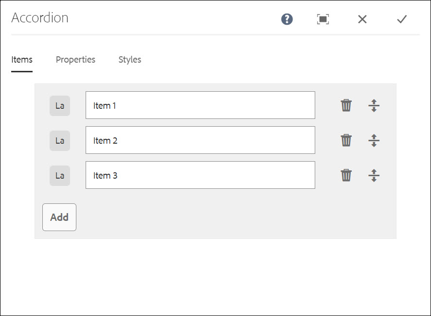
Tab: Items
After adding the Accordion component, click on the wrench to configure the Accordion.
Use the Add button to open the component selector to choose which component to add as a panel. Once added, an entry is added to the list, which contains the following columns:
- Icon - The icon of the component type of the panel for easy identification in the list. Mouse over to see the full component name as a tooltip.
- Description - The description used as the text of the panel, defaulting to the name of the component selected for the panel.
- Delete - Tap or click to delete the panel from the accordion component.
- Rearrange - Tap or click and drag to rearrange the order of the panels.
Tab: Properties
- Single item expansion - When selected, this option forces a single accordion item to be expanded at a time. Expanding one item will then collapse all others.
- Expanded items - This option defines the items that are expanded by default when the page is loaded. By default no panel is selected or expanded when the page is loaded.
- When Single item expansion is selected, one panel must be selected and is expanded when the page is loaded.
- When Single item expansion is not selected, multiple panels may be selected and are expanded when the page is loaded.
- Heading Element - This option allows authors to control the accordion item heading HTML element and range from h2 to h6.
- ID - This option allows to control the unique identifier of the component in the HTML and in the Data Layer.
- If left blank, a unique ID is automatically generated for you and can be found by inspecting the resulting page.
- If an ID is specified, it is the responsibility of the author to make sure that it is unique.
- Changing the ID can have an impact on CSS, JS and Data Layer tracking.
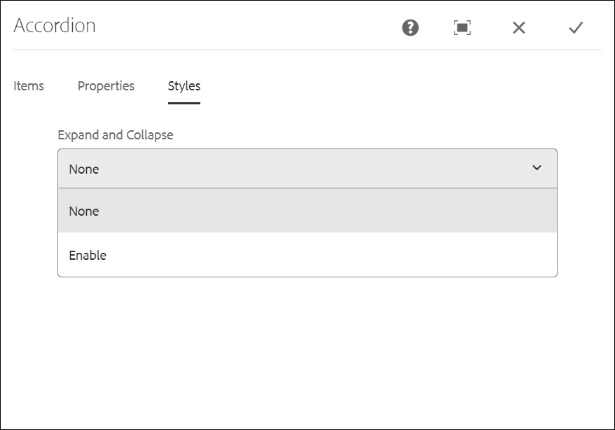
Tab: Styles
How to Edit
Select Panel
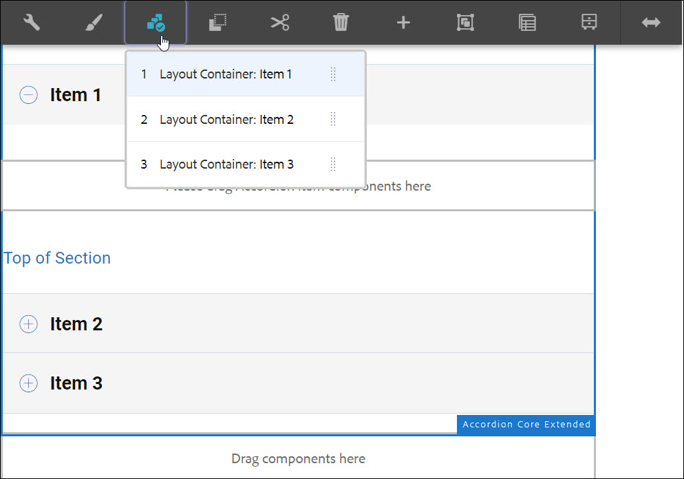
The content author can use the Select Panel on the component toolbar to change to a different panel for editing as well as to easily rearrange the order of the panels within the accordion.
The Select Panel pulldown allows content authors to select the panel to which content can be added/edited on the page. Upon selecting the Select Panel from the toolbar, a list with the configured accordion panels appears. Users can select which panel to edit or users can rearrange the panels using the drag handles.
- The list is ordered by the assigned arrangement of the panels and is reflected in the numbering.
- The component type of the panel is displayed first, followed by the description of the panel in lighter font.
- Tapping or clicking an entry in the dropdown, switches the view in the editor to that panel.
- The panels can be rearranged in-place by using the drag handles.
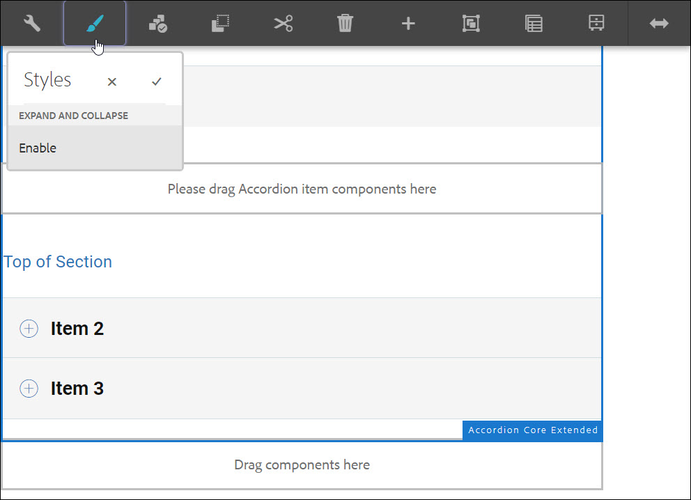
How to Style
Enable Expand All / Collapse All
Developer Resources
Expand the sections below to see the Accordion Core Component's HTML and JS output.
<div>
<div class="uscb-layout-row uscb-layout-align-start">
<button class="uscb-transparent-button uscb-padding-L-0 uscb-padding-R-10 uscb-accordion-expand-all">Expand All</button>
<hr class="uscb-vertical-hr uscb-accordion-hr">
<button class="uscb-transparent-button-disabled uscb-padding-L-10 uscb-padding-R-10 uscb-accordion-close-all">Collapse All</button>
</div>
<div class="uscb-accordion">
<div class="uscb-layout-row uscb-layout-align-start-center uscb-accordion-header uscb-accordion_panel_head"><span class="uscb-chevron-icon-img o-angle-down-1" alt=""></span><span class="uscb-margin-L-45 uscb-sub-heading-2 uscb-bold-text">Option 1</span></div>
<div class="uscb-accordion_panel uscb-accordion-show-panel">
<p>Lorem ipsum dolor sit amet, consectetur adipisicing elit, sed do eiusmod tempor incididunt ut labore et dolore magna aliqua. Ut enim ad minim veniam, quis nostrud exercitation ullamco laboris nisi ut aliquip ex ea commodo consequat.</p>
</div>
</div>
<div class="uscb-accordion">
<div class="uscb-layout-row uscb-layout-align-start-center uscb-accordion-header uscb-accordion_panel_head"><span class="uscb-chevron-icon-img o-angle-down-1" alt=""></span><span class="uscb-margin-L-45 uscb-sub-heading-2 uscb-bold-text">Option 2</span></div>
<div class="uscb-accordion_panel uscb-accordion-show-panel">
<p>Lorem ipsum dolor sit amet, consectetur adipisicing elit, sed do eiusmod tempor incididunt ut labore et dolore magna aliqua. Ut enim ad minim veniam, quis nostrud exercitation ullamco laboris nisi ut aliquip ex ea commodo consequat.</p>
</div>
</div>
<div class="uscb-accordion">
<div class="uscb-layout-row uscb-layout-align-start-center uscb-accordion-header uscb-accordion_panel_head"><span class="uscb-chevron-icon-img o-angle-down-1" alt=""></span><span class="uscb-margin-L-45 uscb-sub-heading-2 uscb-bold-text">Option 3</span></div>
<div class="uscb-accordion_panel uscb-accordion-show-panel">
<p>Lorem ipsum dolor sit amet, consectetur adipisicing elit, sed do eiusmod tempor incididunt ut labore et dolore magna aliqua. Ut enim ad minim veniam, quis nostrud exercitation ullamco laboris nisi ut aliquip ex ea commodo consequat.</p>
</div>
</div>
<div class="uscb-accordion">
<div class="uscb-layout-row uscb-layout-align-start-center uscb-accordion-header uscb-accordion_panel_head"><span class="uscb-chevron-icon-img o-angle-down-1" alt=""></span><span class="uscb-margin-L-45 uscb-sub-heading-2 uscb-bold-text">Option 4</span></div>
<div class="uscb-accordion_panel uscb-accordion-show-panel">
<p>Lorem ipsum dolor sit amet, consectetur adipisicing elit, sed do eiusmod tempor incididunt ut labore et dolore magna aliqua. Ut enim ad minim veniam, quis nostrud exercitation ullamco laboris nisi ut aliquip ex ea commodo consequat.</p>
</div>
</div>
</div>
var isOpenCount = 0;
function handleOpenCount() {
if (isOpenCount == 0) {
$('.uscb-accordion-expand-all').switchClass('uscb-accordion-expand-collapse', 'uscb-accordion-expand-collapse-disabled');
$('.uscb-accordion-close-all').switchClass('uscb-accordion-expand-collapse-disabled', 'uscb-accordion-expand-collapse');
}
else if (isOpenCount == $(".uscb-accordion").length) {
$('.uscb-accordion-expand-all').switchClass('uscb-accordion-expand-collapse-disabled', 'uscb-accordion-expand-collapse');
$('.uscb-accordion-close-all').switchClass('uscb-accordion-expand-collapse', 'uscb-accordion-expand-collapse-disabled');
} else {
$('.uscb-accordion-expand-all').switchClass('uscb-accordion-expand-collapse-disabled', 'uscb-accordion-expand-collapse');
$('.uscb-accordion-close-all').switchClass('uscb-accordion-expand-collapse-disabled', 'uscb-accordion-expand-collapse');
}
}
$('.uscb-accordion-expand-all').click(function () {
$(".uscb-accordion").each(function (index, element) {
$(element).children('.uscb-accordion_panel').removeClass("uscb-accordion-show-panel");
var $icon = $(this).children('.uscb-accordion_panel_head').children('.uscb-chevron-icon-img');
$icon.removeClass("o-angle-down-1");
$icon.addClass("o-angle-up-1");
});
handleOpenCount();
isOpenCount = $(".uscb-accordion").length;
});
$('.uscb-accordion-close-all').click(function () {
$(".uscb-accordion").each(function (index, element) {
$(element).children('.uscb-accordion_panel').addClass("uscb-accordion-show-panel");
var $icon = $(this).children('.uscb-accordion_panel_head').children('.uscb-chevron-icon-img');
$icon.removeClass("o-angle-up-1");
$icon.addClass("o-angle-down-1");
});
handleOpenCount();
isOpenCount = 0;
});
$(".uscb-accordion").each(function (index, element) {
$(element).click(function () {
$(this).children('.uscb-accordion_panel').toggleClass("uscb-accordion-show-panel");
if ($(this).children('.uscb-accordion_panel').hasClass("uscb-accordion-show-panel")) {
--isOpenCount
if (isOpenCount <= 0) {
isOpenCount = 0;
}
var $icon = $(this).children('.uscb-accordion_panel_head').children('.uscb-chevron-icon-img');
$icon.removeClass("o-angle-up-1");
$icon.addClass("o-angle-down-1");
} else {
++isOpenCount;
var $icon = $(this).children('.uscb-accordion_panel_head').children('.uscb-chevron-icon-img');
$icon.removeClass("o-angle-down-1");
$icon.addClass("o-angle-up-1");
}
handleOpenCount();
});
});


